Industry Craft > Typography
MERIDIAN
KOTO, Los Angeles / MERIDIAN / 2024
Overview
Credits
OVERVIEW
Why is this work relevant for Industry Craft?
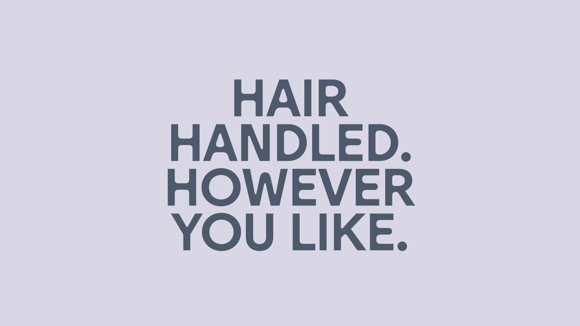
Grooming for hair, anywhere.
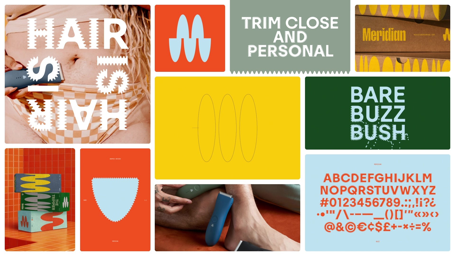
When Meridian came to us, their grooming products were aimed at men—specifically their bits ’n pieces. After TikTok grooming advocate Maeve went viral showcasing the advantages of using a Meridian trimmer on any and every body, the decision was made: Meridian is not for men, but anyone with hair. The backbone of our execution can be seen through the brand’s typeface, with weights ‘Bare’, ‘Buzz’, and ‘Bush’ representing the wide range of grooming preferences.
Please provide any cultural context that would help the Jury understand any cultural, national or regional nuances applicable to this work.
Men’s grooming has largely been seen as something to be ignored, or veiled by an attempt to maintain preconceived notions of masculinity. Conversely, women’s grooming products have historically been made with inferior materials, and sold at a higher price point.
In our Meridian work we were tasked to take on both of these truths, and change the narrative around hair self care. This was best represented by the use of typography we introduced throughout the brand.
Background:
Don’t hide your haircare.
Our brief from Meridian was to capitalize on the rush of their growing, more diverse audience, and give them a strong narrative to drive all creative communication.
This meant creating brand materials and guidelines, as well as assisting them with product, web, and package design—all centered around our bespoke typeface.
Tell the jury about the typography.
Buzzcut, bush, or barely there...
We worked with type foundry AllCaps to craft a versatile typeface expressing three distinct cuts—or grooming preferences: ‘Bare’, ‘Buzz’, and ‘Bush’.
When each cut is used in-line, the typeface speaks to the growth process, emphasizing the full spectrum of self-expression.
When set in motion, the typeface grows or shaves off its follicle add-ons, expressing the fluid nature of wherever and however you'd like your hair. Anywhere.