Design > Graphic Design & Design Crafts
NEW THEATRE POSTERS
INTERBRAND AUSTRALIA, Sydney / NEW THEATRE / 2012
Overview
Credits
OVERVIEW
BriefExplanation
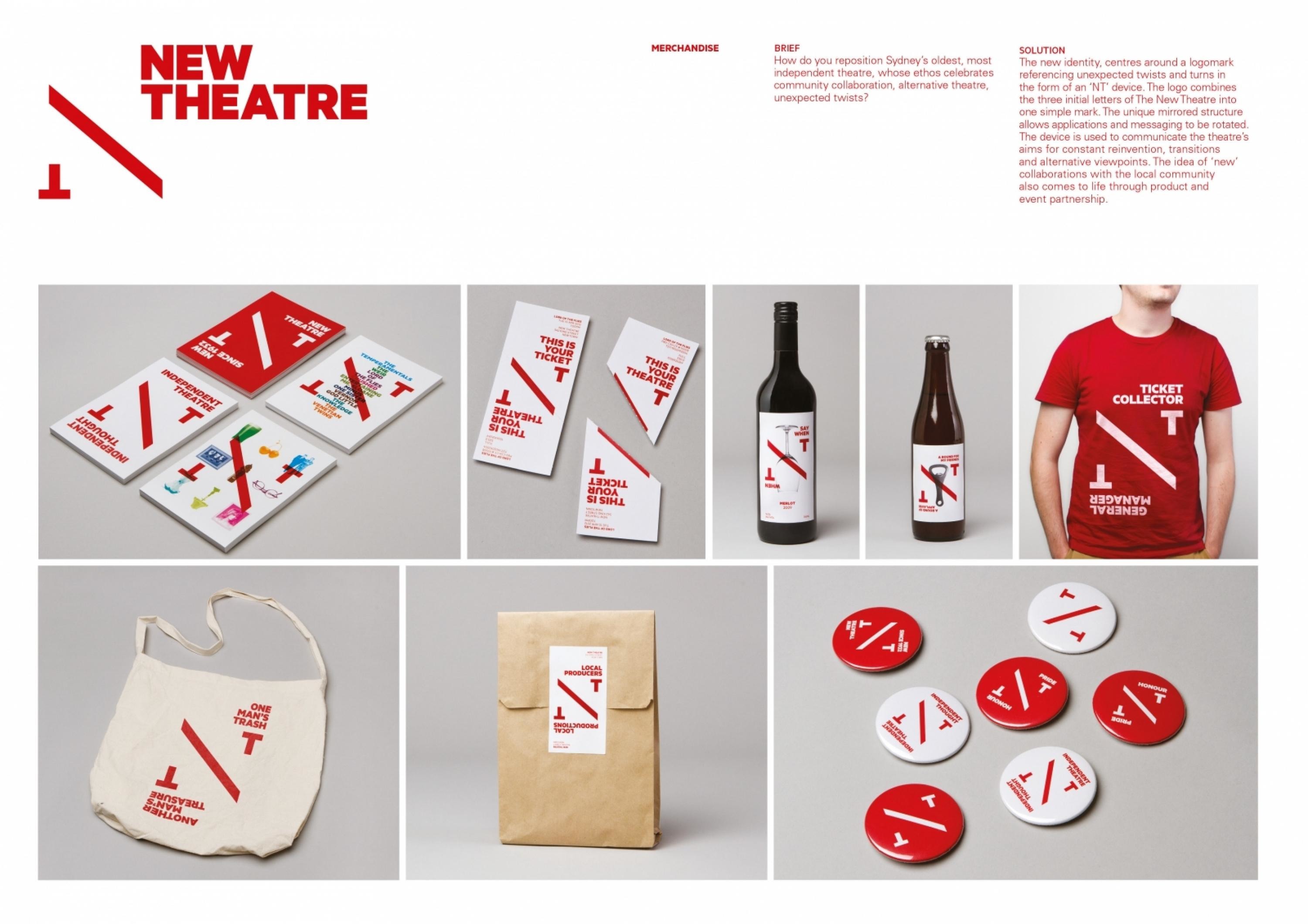
We were tasked with breathing new life into a tired theatre brand. New Theatre is one of Sydney’s oldest, proudest and most independent theatres. It’s a people’s theatre in the truest sense. Their ethos is about celebrating alternative theatre, offering unique perspectives and unexpected twists, engaging experiences and helping to grow the careers of those involved. New Theatre already had a great personality; we just had to help them express it.
ClientBriefOrObjective
New Theatre needed an identity that was economical, flexible, and iconic. It also needed a visual and verbal system that would allow the theatre, and the team working there to play more of a starring role. They needed to take ownership of their Seasons, presenting their own takes on shows and find a way to communicate the strong, proud culture that has been the foundation of their rich 80-year history.
Effectiveness
Early indications are overwhelmingly positive – leading to an energised work force and an excited public. Following a sold out opening night and increased ticket sales, it looks as though 2012 will see New Theatre fully harness their culture, personality, and brand.
Execution
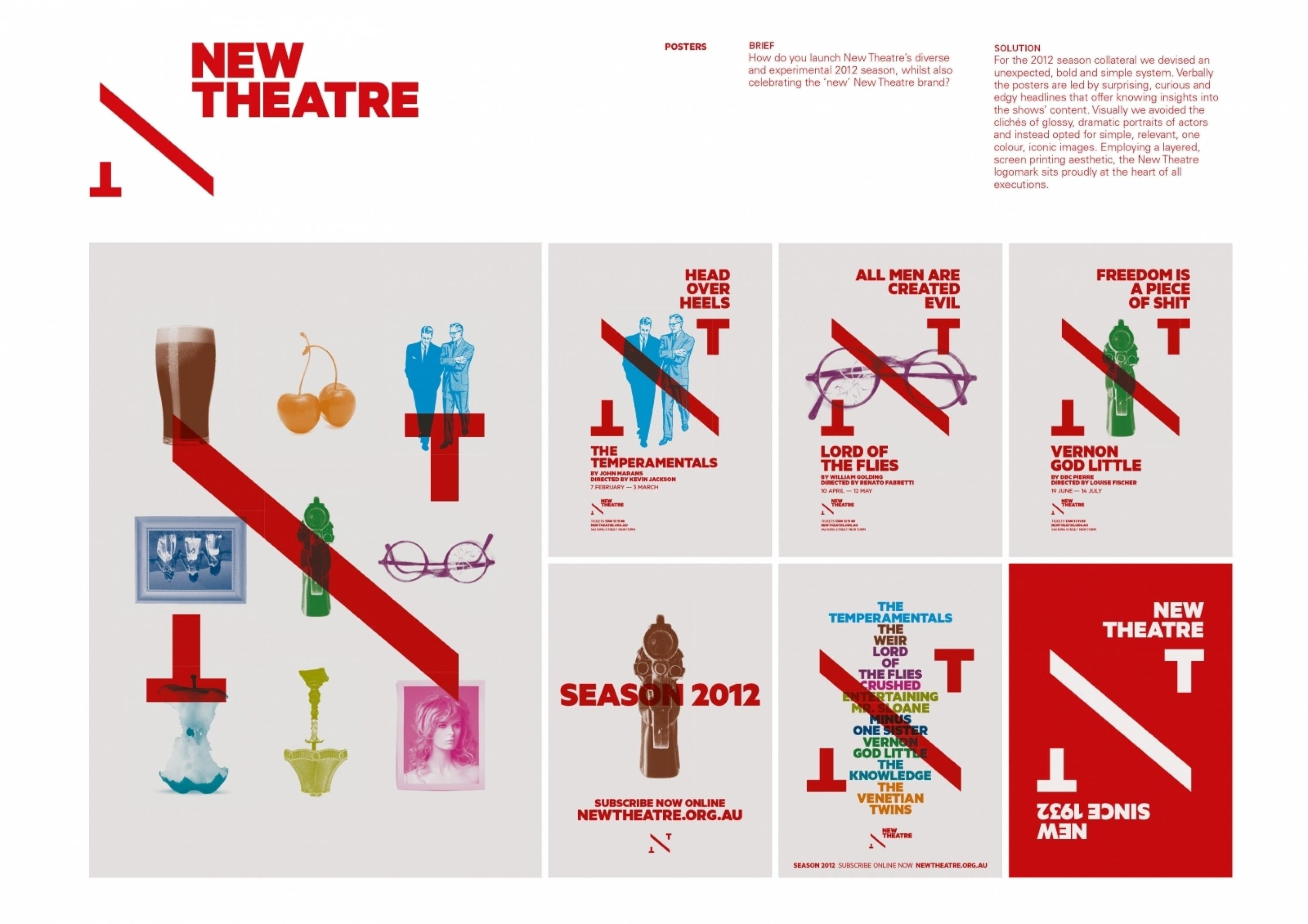
The logo combines the 3 initial letters of The New Theatre into 1 simple mark. It allows New Theatre to sit proudly at the centre of their communications, literally stamping their mark on event posters – claiming productions as their own.
For the 2012 season campaign, we devised an unexpected, bold, simple system. Verbally the posters are led by surprising and edgy headlines that offer knowing insights into the shows’ content. Visually we avoided the clichés of glossy, dramatic portraits of actors and instead opted for simple, relevant, one colour, iconic images – utilising a layered, screen printing aesthetic.
More Entries from Posters in Design
24 items
More Entries from INTERBRAND AUSTRALIA
24 items

