Design > Packaging Design
THE REBEL
FRANK., Oslo / GRANS BREWERY / 2012
Overview
Credits
OVERVIEW
BriefExplanation
Grans wanted a redesign for their brewery's profile and products, starting with their best seller Premium Pils.
ClientBriefOrObjective
Build and strengthen the position: Grans the rebel.Always fighting against the most industrial of the beer market, the back of the can tells the story of Grandfather Gran, and the struggles and hardship he experienced whilst building a brewery whose goal was to produce quality beer at low prices. Great beer for all!
Effectiveness
The new design is recently implemented. However, Grans reports that the supermarkets are very happy with the new design, and that they have orderer more beer than usual.
Execution
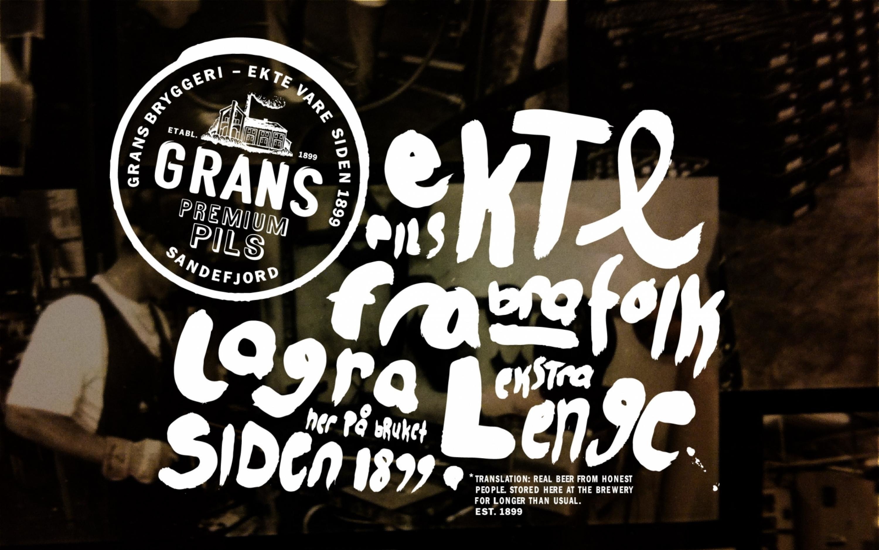
The new Grans logo was formed using an illustration of the old brewhouse that is still in use today, combined with typography we found on an old crate of Grans beer.
The can is testament to the rich Grans Family brewing adventure. The unusual copper colour takes it's inspiration from the brewery, making the can an extension of the brewing process. The patterned background tells of small snippets of Grans brewing history with a special focus on handcraft and quality, emphasised also by the use of matt printing inks for a tactile finish.
More Entries from i. Own Label and Private Label brands in Design
24 items


More Entries from FRANK.
9 items