Cannes Lions
A musical corporate font
SCHOLZ & FRIENDS, Berlin / BERLINER PHILHARMONIKER / 2017
Overview
Entries
Credits
OVERVIEW
Description
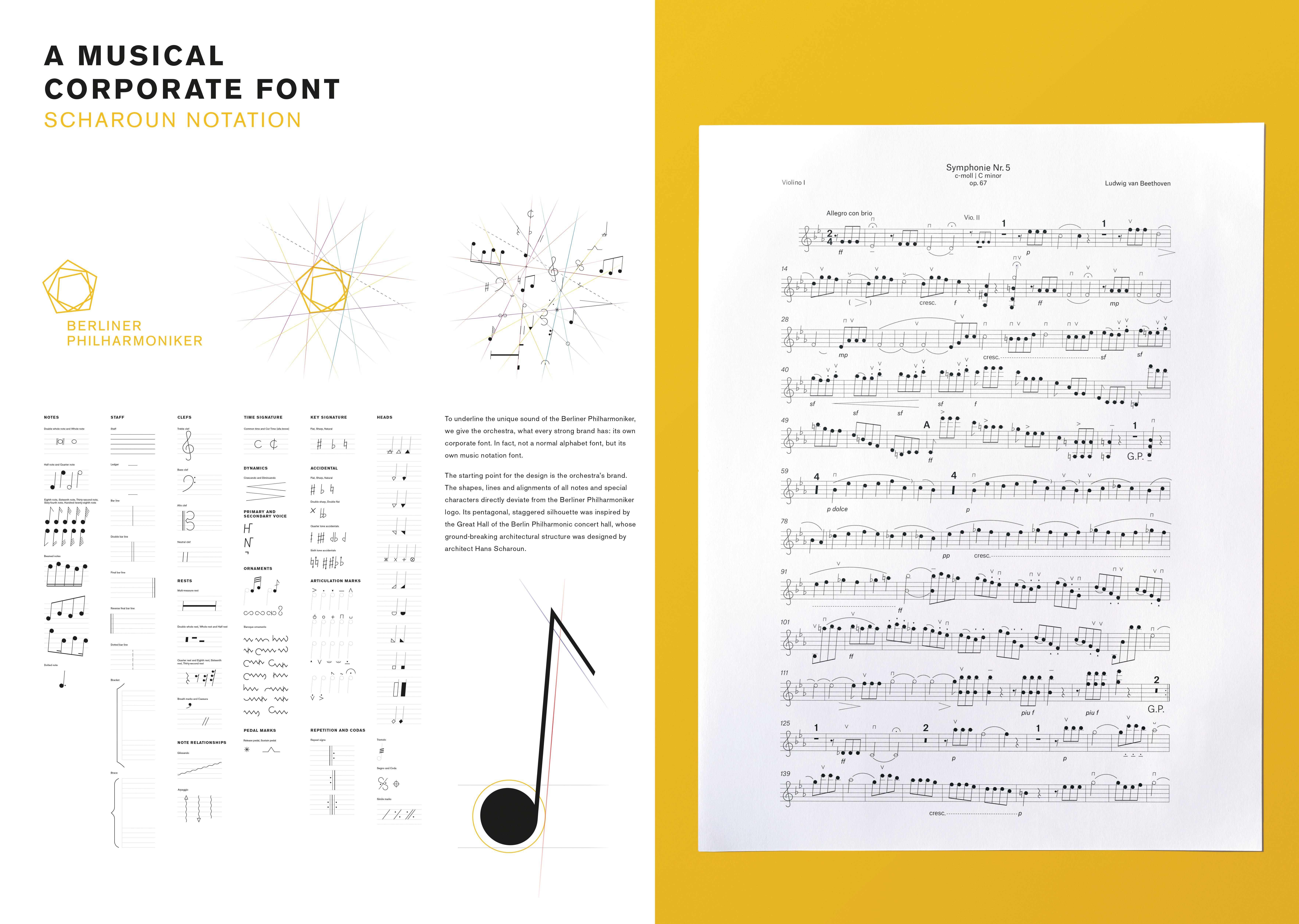
With a simple idea, we emphasise the orchestra’s singular status in the music world. We give them what distinguishes many strong brands: a corporate font. In fact, the first musical corporate font, a corporate notation font. Its design is based on the orchestra famous pentangular logo. With the Scharoun Notation, the orchestra that sounds like no other orchestra can write music like no other orchestra.
Execution
The starting point for the design is the orchestra’s brand. The shapes, lines and alignments of all notes and special characters directly deviate from the Berliner Philharmoniker logo. Its pentagonal, staggered silhouette was inspired by the Great Hall of the Berlin Philharmonic concert hall. The hall’s ground-breaking architectural structure was designed by architect Hans Scharoun, after whom the notation font was named.
Outcome
The Scharoun notation font elegantly brings the unique musical character of the Berliner Philharmoniker before you even hear a single note. As such, the notation font’s design focuses the singular quality of the orchestra and further strengthens the value of the orchestra brand – to its musicians, to the audience and to fans around the world.
Similar Campaigns
12 items