Cannes Lions
BEER
VBAT, Amsterdam / CCU / 2010
Overview
Entries
Credits
Overview
Description
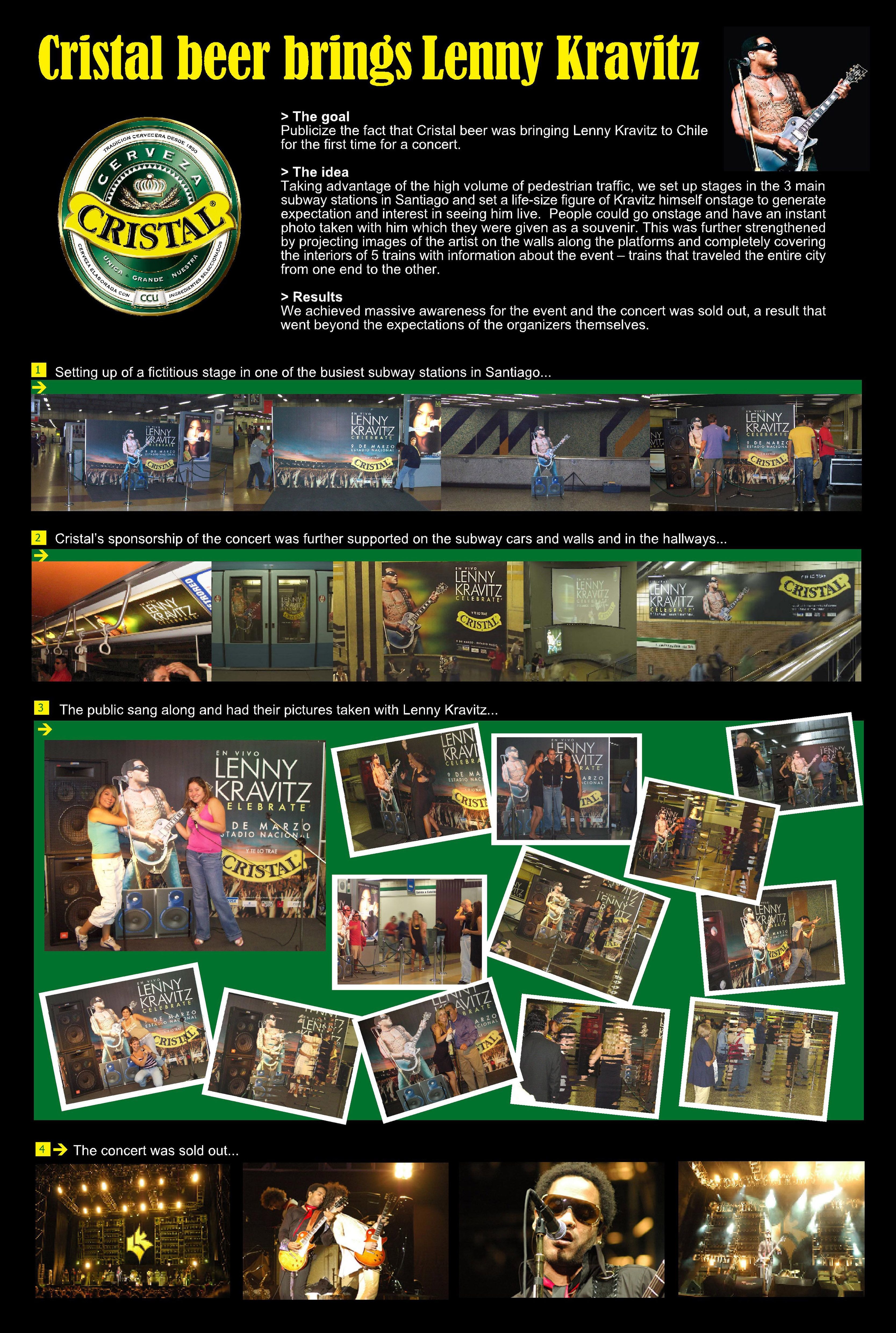
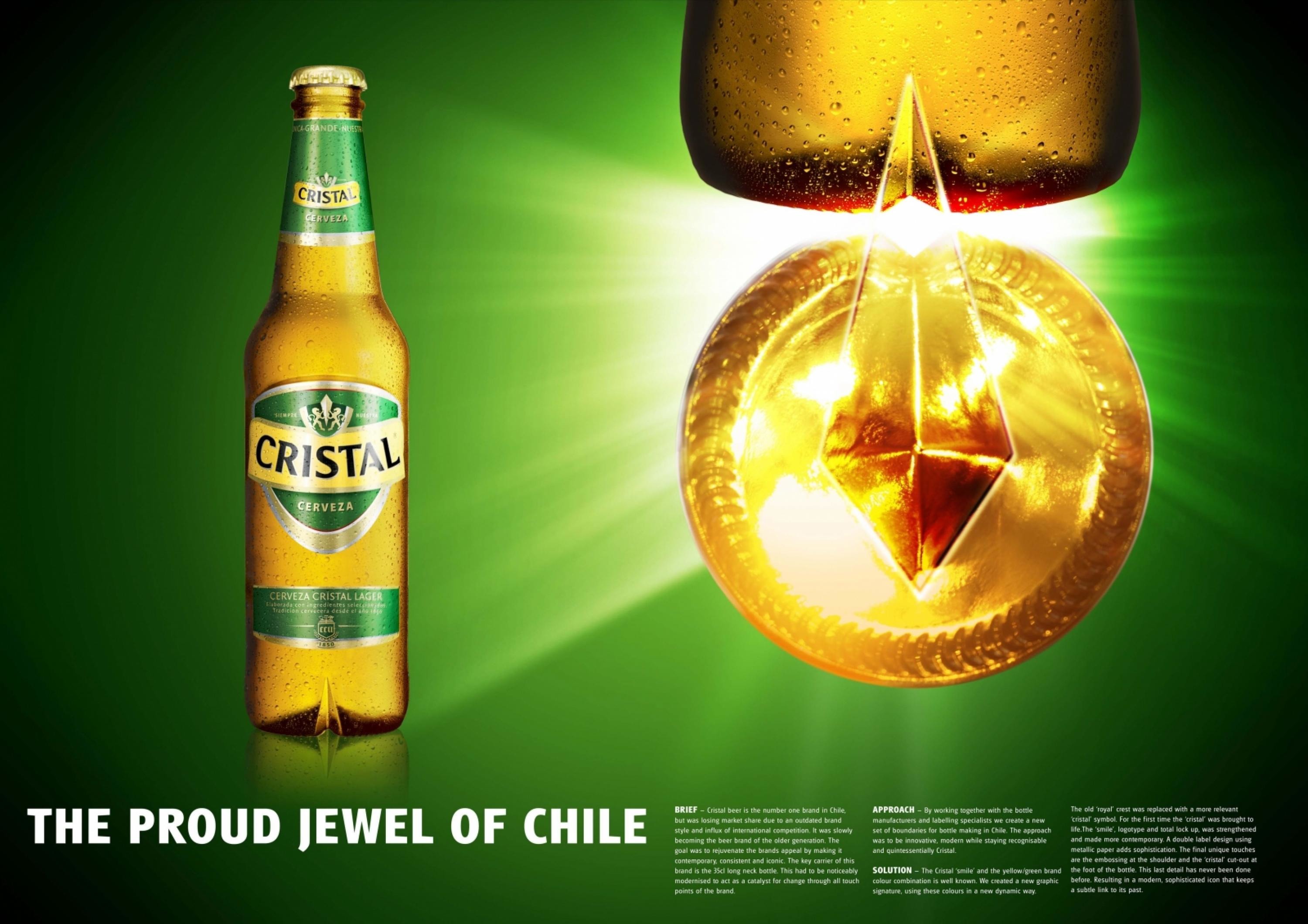
Cristal beer is the number one brand in Chile, but was losing market share due to an outdated brand style and influx of international competition. It was slowly becoming the beer brand of the older generation. The goal was to rejuvenate the brands appeal by making it contemporary, consistent and iconic. The key carrier of this brand is the 35cl long neck bottle. This had to be noticeably modernised to act as a catalyst for change through all touch points of the brand.
Execution
The Cristal ‘smile’ and the yellow/green brand colour combination is well known. We created a new graphic signature, using these colours in a new dynamic way. The old ‘royal’ crest was replaced with a more relevant crystal symbol. For the first time the crystal was brought to life. The ‘smile’, logotype and total lock up was strengthened and made more contemporary. A double label design using metallic paper adds sophistication. The final unique touches are the embossing at the shoulder and the crystal cut-out at the foot of the bottle. This last detail has never been done before, resulting in a modern, sophisticated icon that keeps a subtle link to its past.
Outcome
Although only recently launched into the market, the initial response to the new Cristal bottle has been overwhelmingly positive. Feedback from the market has shown that people find the new bottle something that they want to be seen holding, a true icon in Chile.
Similar Campaigns
12 items