Cannes Lions
FINANCIAL SERVICES
THE BRAND UNION, London / FIDELITY / 2012
Overview
Entries
Credits
Overview
Description
For tax and legal reasons, Fidelity are separating their US business from the European and Asian business. They want to position themselves as more of a retail brand yet they require a more professional look and feel. Our job was to look at the name and create a new visual identity for Fidelity.
Execution
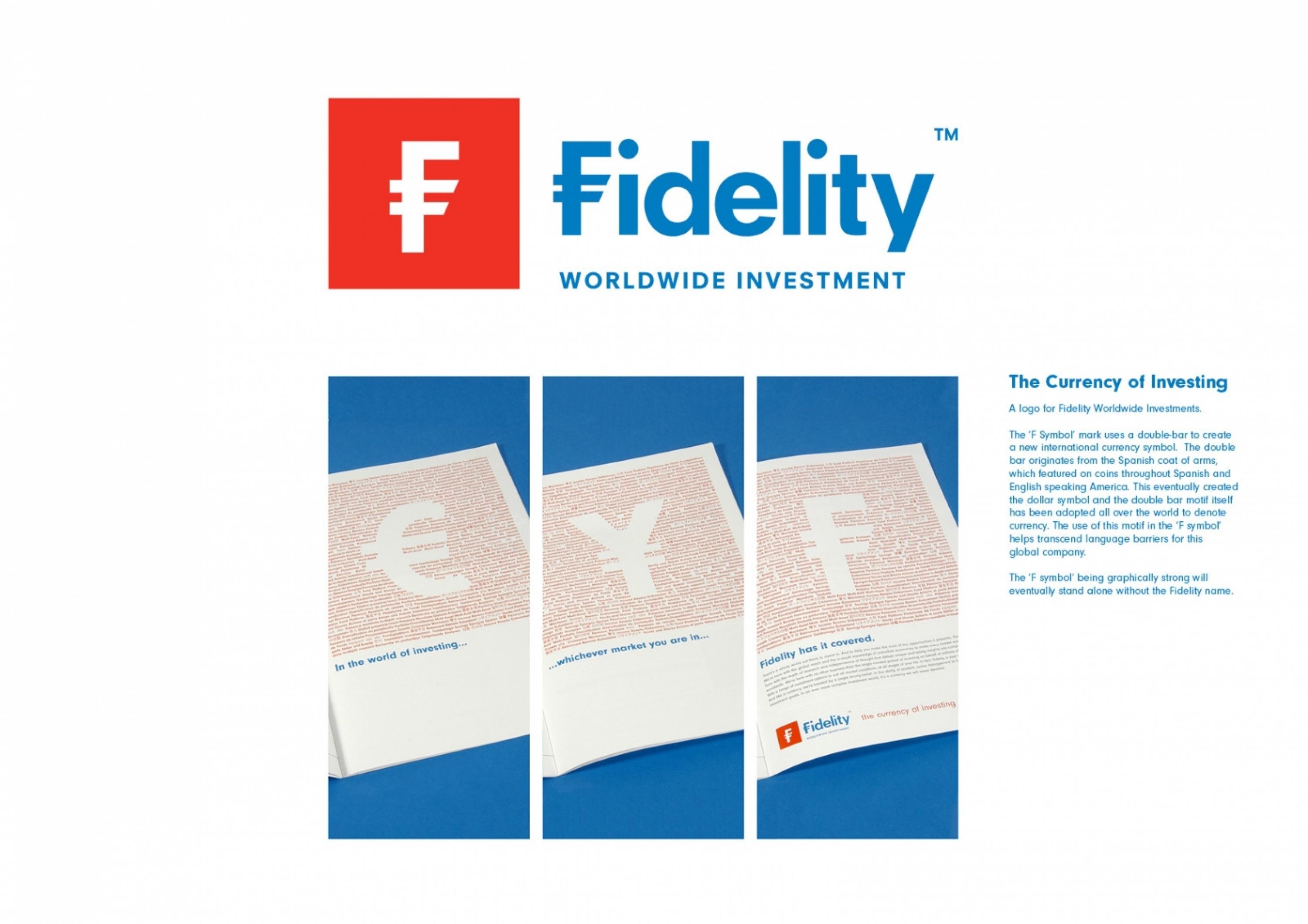
The ‘F Symbol’ mark uses a double-bar to create a new international currency symbol. The double bar originates from a twin column motif on the Spanish coat of arms, featured on coins throughout Spanish and America.
The ‘F’ symbol is a modern reflection of contemporary values through its clean, simplified look balanced by stand-out legibility of the Fidelity typeface which replaced a fussy italic font.The F symbol being graphically strong will eventually be internationally recognised and can stand alone without the wordmark, like the symbols for the Dollar and the Yen and will help transcend language barriers.
Outcome
The brand was only introduced into the market in the last 3 months. However, our client's testimonial indicates a successful project and it is poised to make a big impact in the market place.’It has been a real pleasure working with you all and I know that my colleagues around the company have been impressed by the way in which you have listened to feedback and helped me in adapting our initial plans to work in the context of all the channels and countries that we operate in and we are really pleased with the results’.
Similar Campaigns
10 items