Cannes Lions
HÄAGEN-DAZS
STERLING BRANDS, New York / DREYER'S / 2010
Overview
Entries
Credits
Overview
Description
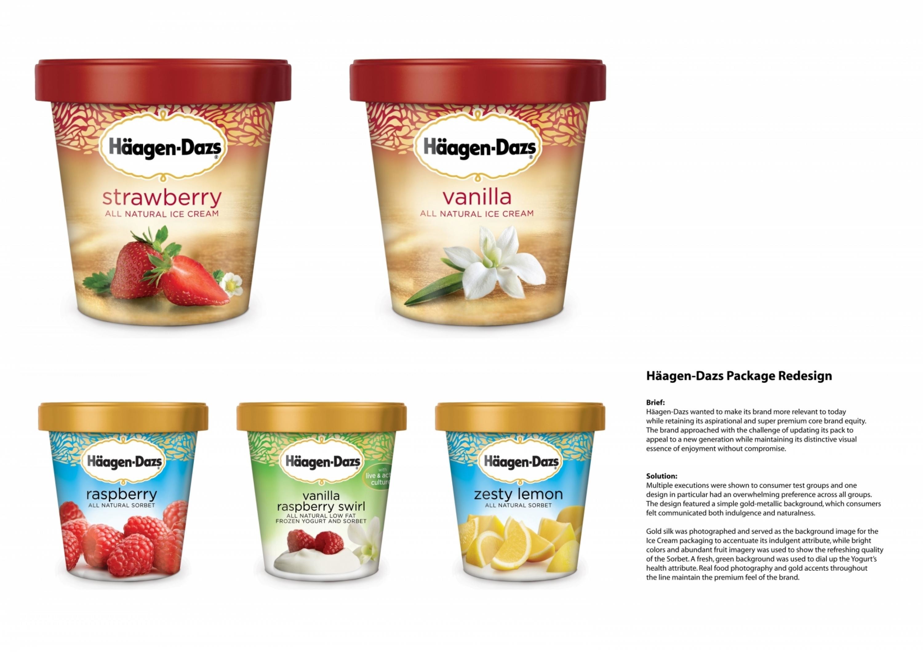
To refresh the Häagen-Dazs packaging - an amazingly good ice cream, crafted with really high quality ingredients and made with incredible enthusiasm and care.Häagen-Dazs wanted to make its brand more relevant to today while retaining its aspirational and super premium core brand equity. The brand approached with the challenge of updating its pack to appeal to a new generation while maintaining its distinctive visual essence of enjoyment without compromise.
Execution
Multiple executions were shown to consumer test groups and one design in particular had an overwhelming preference across all groups. The design featured a simple gold-metallic background, which consumers felt communicated both indulgence and naturalness.
Gold silk was photographed and served as the background image for the IceCream packaging to accentuate its indulgent attribute, while bright colours and abundant fruit imagery was used to show the refreshing quality of the Sorbet. A fresh, green background was used to dial up the Yogurt’s health attribute. Real food photography and gold accents throughout the line maintain the premium feel of the brand.
Outcome
The new packaging was just rolled out in February 2010; too soon to understand impact of design.
Similar Campaigns
10 items