Cannes Lions
Hennesy Brand Refresh
WIEDEN+KENNEDY, Amsterdam / HENNESSY / 2024
Overview
Entries
Credits
Overview
Background
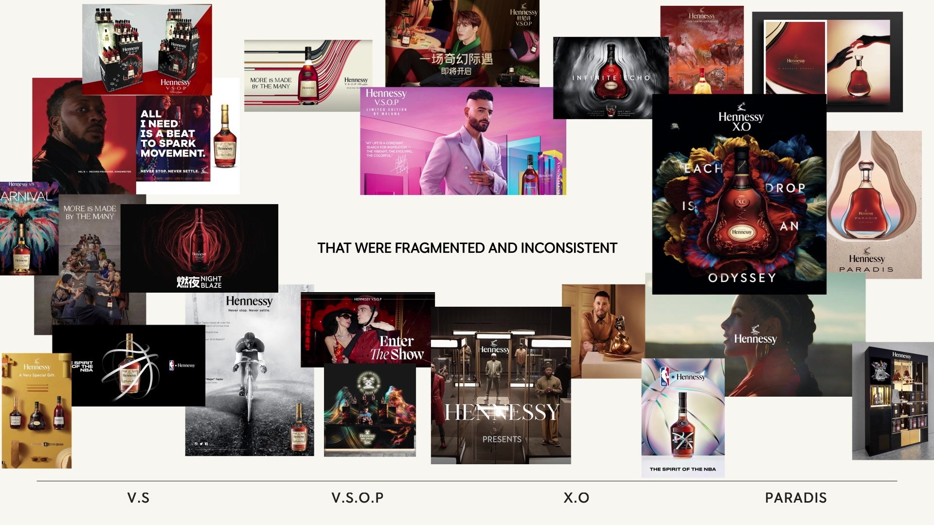
Founded in 1765, Hennessy’s rich history, its expansion in different corners of the world and its large product portfolio had stretched it to the limits of inconsistency. Instead of one strong brand, the Maison was building multiple product brands, leaning into the dark, serious visual tropes of the category, resulting in a fragmented brand world and a weakening connection to people and culture.
How could we show up once again as one single, powerful brand, whilst appealing to a new generation of drinkers and accommodating a wide range of markets, cultures and multiple product qualities with different price points?
With a budget of €300.000, we created a powerful and unified brand identity with flexibility to cover several products within the Hennessy portfolio. We delivered a full brand identity guideline as well as proofs over 55 formats. The identity is already live in three key brand initiatives, across multiple channels globally.
Idea
To reintroduce Hennessy to a new generation, who saw us as an iconic but traditional brand with nothing new to offer, we leaned into bold, new luxury codes that would break us free from conventional cognac tropes and allow us to reconnect with younger drinkers. We created one unified visual system that could flex, allowing Hennessy to show up as one modernised and confident brand wherever it needed to.
We shed light on this historically dark category by using a sophisticated palette of brighter tones, to show the world how well we mix in both day and night.
Much like Hennessy’s craft, our brand world is carefully considered and cared for; a rich, complex entanglement of its finest details.
As a new luxury brand, we give ourselves the freedom to mix high culture with popular culture. Freedom to combine elegance with play as well as explore new technologies.
Execution
We created a refreshed brand identity including one unified design system, a brighter art direction and a new tone of voice that could flex across products, placements and markets. Given Hennessy’s high brand awareness, we were able to take liberties with their strong brand codes. By separating the wordmark and logo, two elements that had never been apart, each could stand alone with a confidence and attitude befitting the brand’s luxury credentials. Additionally, we developed Hennessy Neutral, a versatile typeface with the ability to adapt and bring consistency across the system. On top of that we introduced a brighter visual world through photography and motion, which brings the brand out of the darkness, making it fresher and more appealing. Finally, we simplified their use of color and introduced Hennessy Red, ensuring Hennessy could show up as one confident and iconic brand – wherever it needed to.
Outcome
Within 6 months more than a dozen markets have adopted the new identity and design system. All top-tier markets and stakeholders, previously championing their own sub brands identities, have adopted this new way forward. We’ve reached all corners of the world including the US, China, Singapour, Hong Kong, Malaysia, Taiwan, Philippines, Australia, the UK, Germany, Canada, Nigeria & South Africa. As a global brand with such reach, this metric is a powerful success driver. Now, the Hennessy brand, once fragmented visually around the world, will gain a halo effect for every initiative launched to build up one unified brand in the hearts and minds of consumers. Impressions (+1,254%), reached (+1,049%) and engagement (1,633%) metrics of the campaigns using the new Brand Identity, went up and the vast majority of comments were overwhelmingly positive, people sharing how much they love the new look & feel of the campaigns.
Similar Campaigns
12 items