Cannes Lions
Karhu Limited Edition
DESIGN BRIDGE, London / SINEBRYCHOFF / 2018

Overview
Entries
Credits
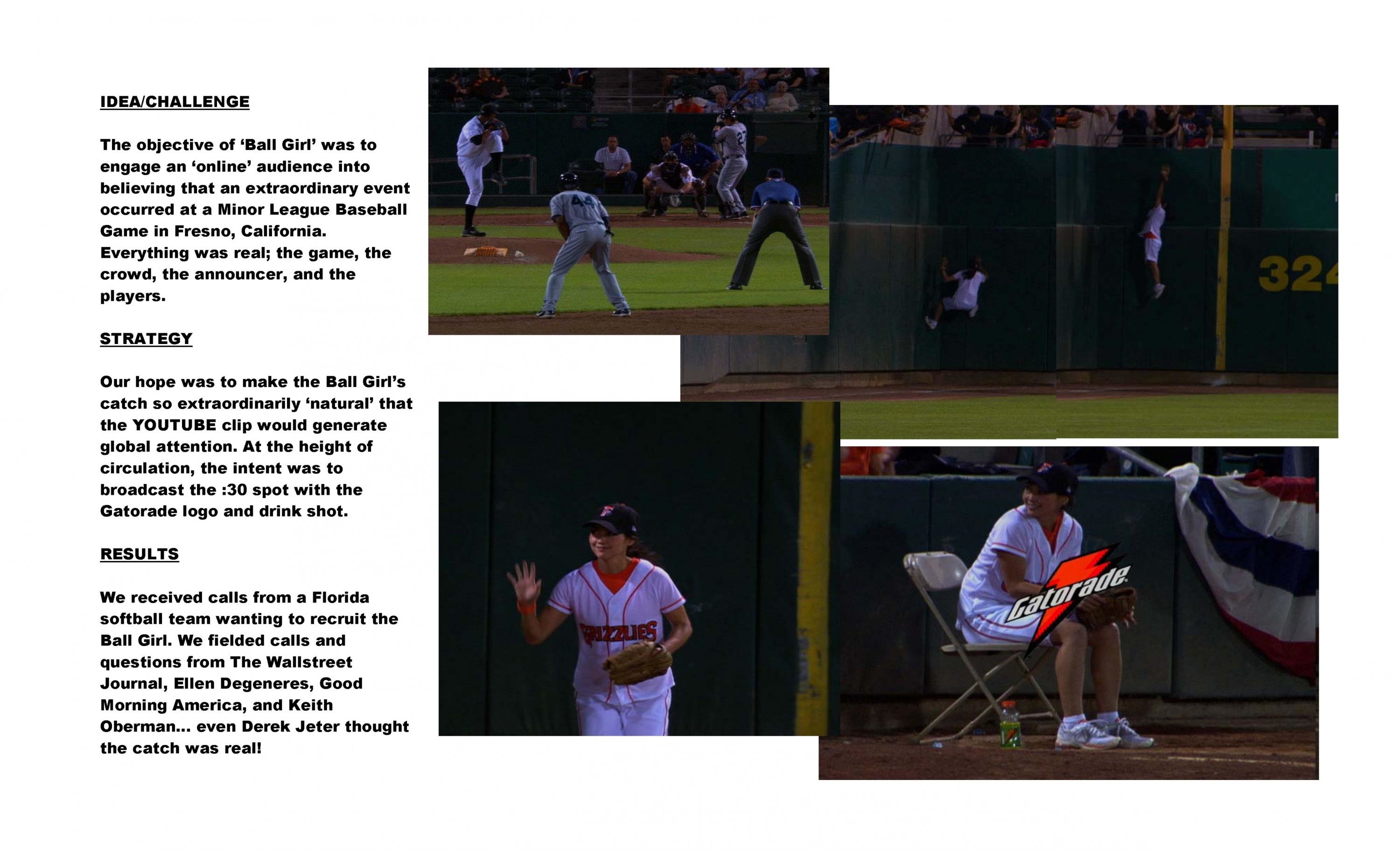
OVERVIEW
Description
A direct translation of the brand name itself, the bear is what Karhu is best known for. With such an iconic asset as our starting point, we set ourselves the challenge of reimagining the bear in a way that had never been done before.
Our textural ‘Raw Touch’ design is a powerful expression of both Karhu’s strongest equity and its brand idea, ‘Know your own strength’.
Execution
Pushing the boundaries, this is a bold design that is brave enough to not feature the brand name. It’s technically groundbreaking to boot; the sensorial, tactile print finish on aluminium takes a high level of expertise to achieve, and it’s a first amongst Finnish beer brands.
The gritty black-on-black design features a wraparound, tactile varnish that ingrains the iconic bear into the fabric of the can. Strikingly, the blood red tongue is the only pop of colour to stand out amongst the shadows of the bear’s face.
Outcome
Alluring, tonal and mysterious, the result successfully channels the tough, inner strength of the bear so that people can really feel the brand.
Having produced a limited edition batch that was projected to fill the shelves for at least 6 months, this intriguing can smashed all sales expectations, completely selling out in just 3 months.
Similar Campaigns
12 items