Cannes Lions
LETTERHEAD PIERCING
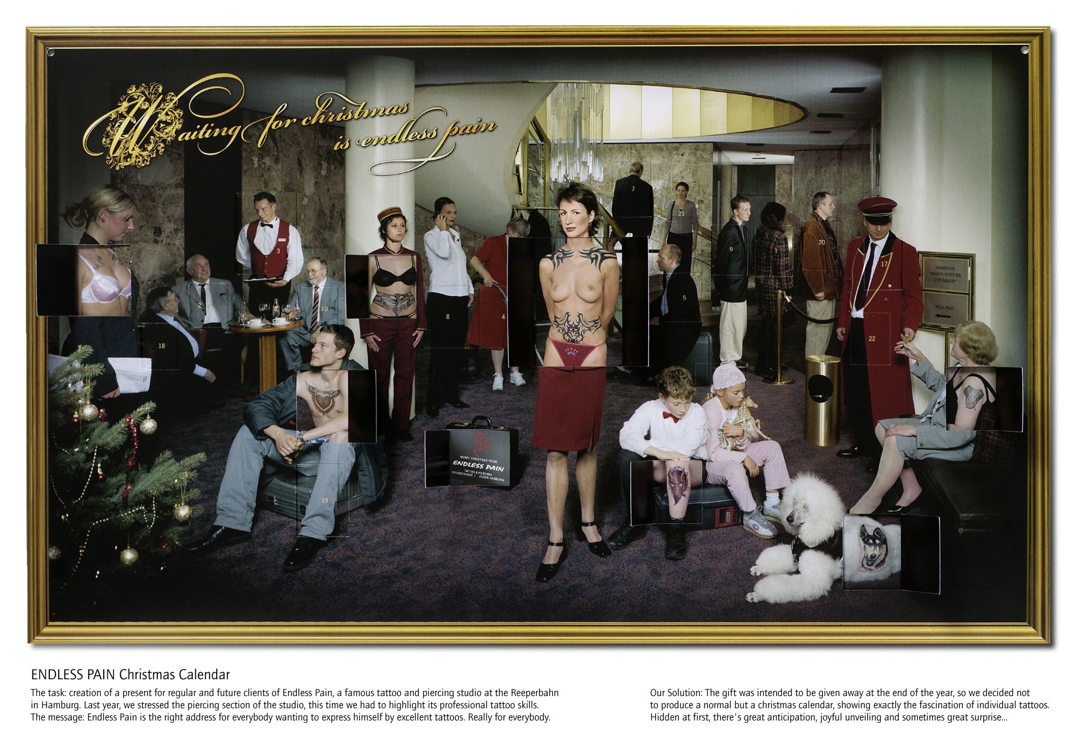
AMELUNG DESIGN , Hamburg / ENDLESS PAIN / 2015
Overview
Entries
Credits
Overview
Execution
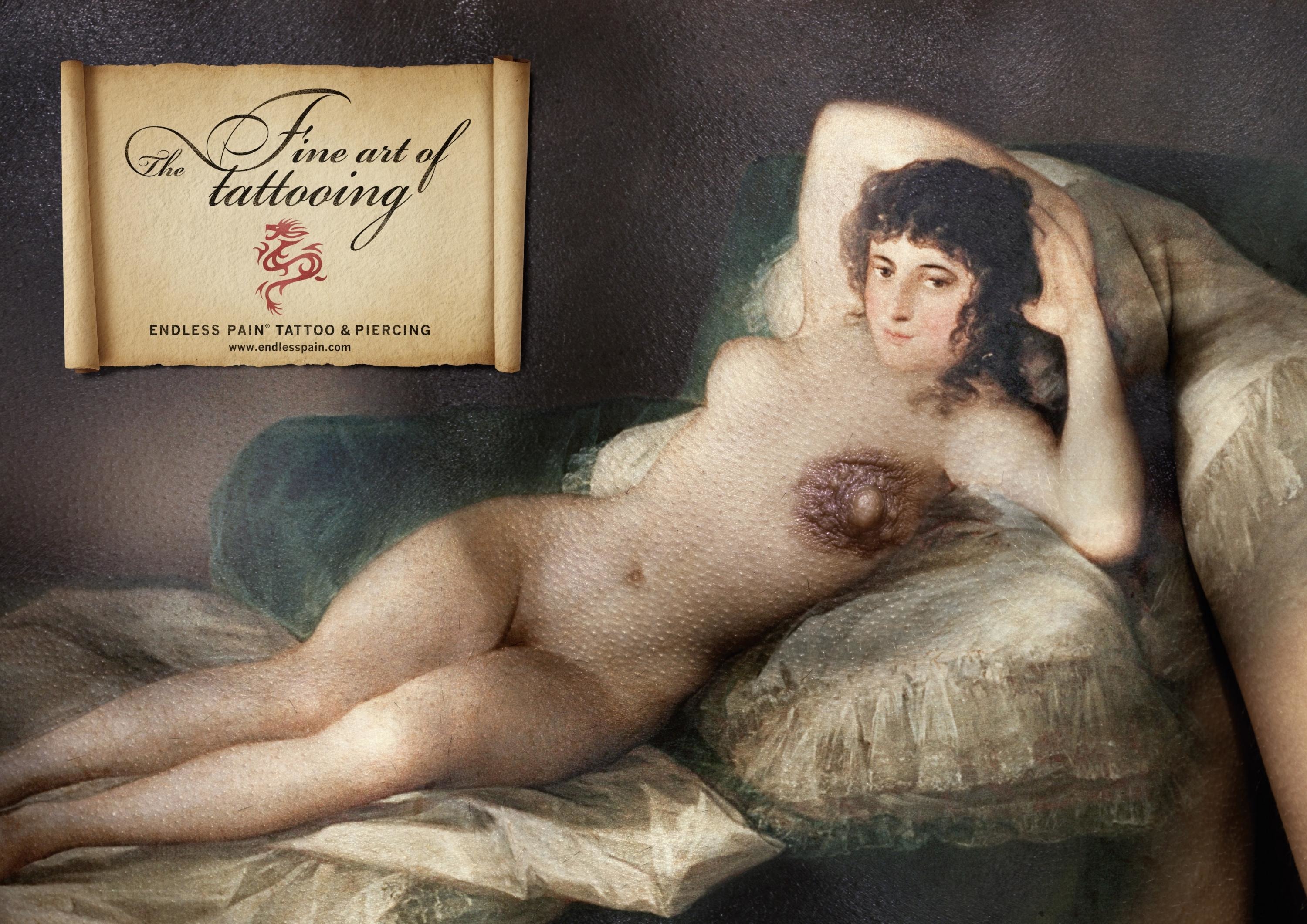
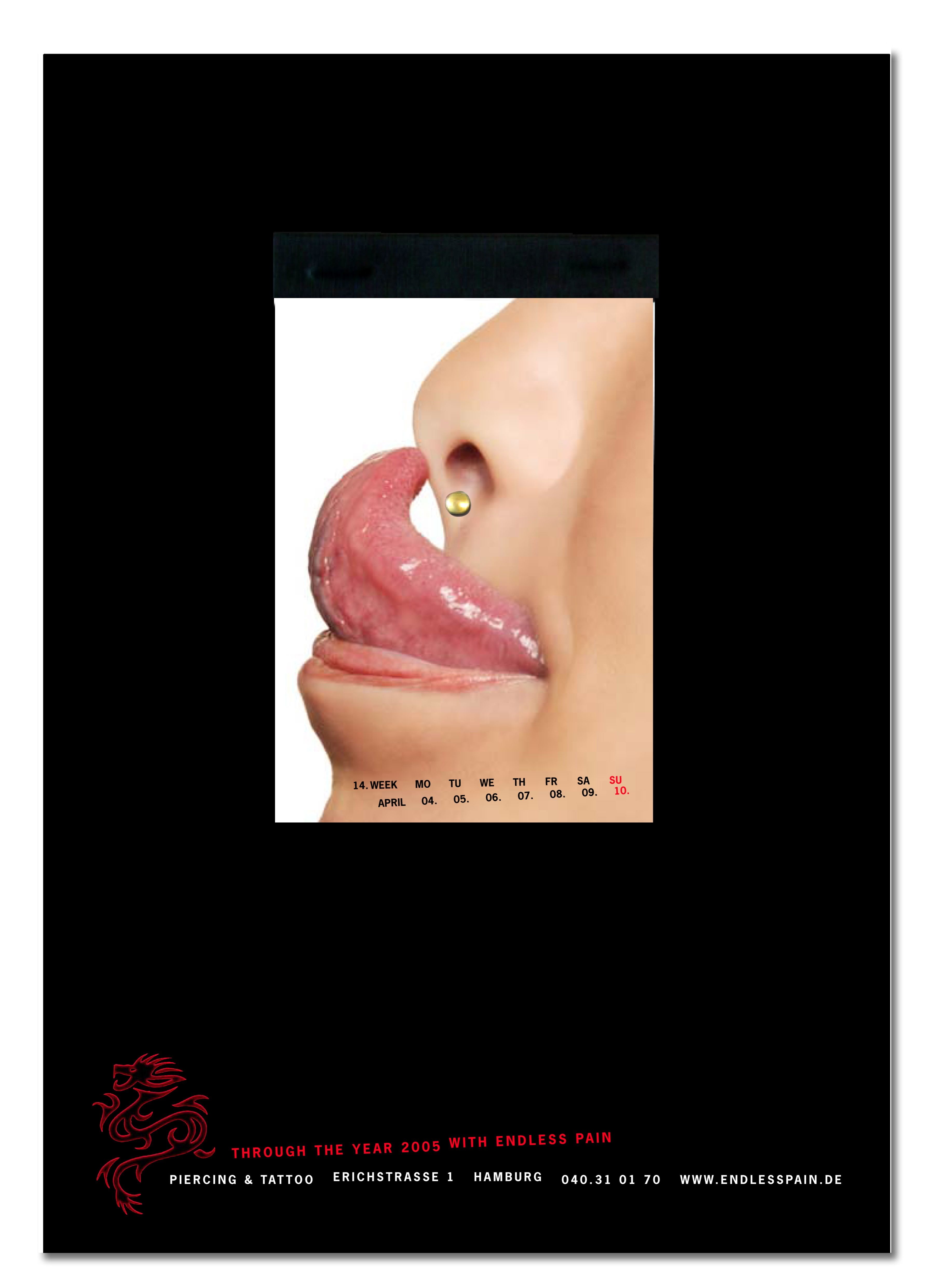
Indefinite pain? Not at Endless Pain. Derived from the name of the brand, our letterheads exhibit how piercing can be pain free. Be it tongue, nose, ear, nipple, upper lip or eyebrow – the simple activation of a hole punch actively “pierces” these drawn illustrations. Consequently an interaction originates between the letterhead and the addressee. When filing in a ring binder later on, the piercing effect is optically supported and permanently visible through the silver rings. Besides the piercing aspect we created a link in content to the tattoo subject via the sophisticated logo. A tattoo requires a tattoo machine – an engraving with steel, going under the skin. To visualize that, we went for a logo refinement using the high class and unique steel engraving technique. The Endless Pain logo is depicted so that it represents high acuity and intricacy in detail, reflecting the tattoo standards of Endless Pain and their customers. Next to the visual effect it has a haptic sensation, producing an innovative appearance. Combined with the bleeded illustrations it succeeds in giving a first impression of this creative craftsmanship and the mechanics of piercing.
Outcome
The client received consistently positive reactions for his innovative stationary with it’s high-class design and the creative idea of interaction between the letterhead and the addressee. The challenge and the key objective was to create an extraordinary letterhead that equally combines the domains of tattoo and piercing and because of the displayed high quality additionally helps in making a choice for the right studio – Endless Pain.
Similar Campaigns
12 items