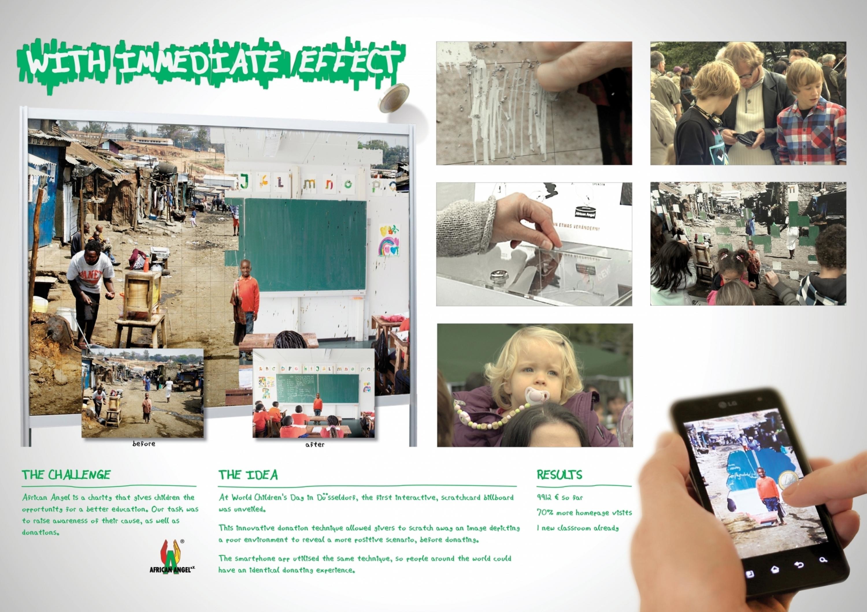
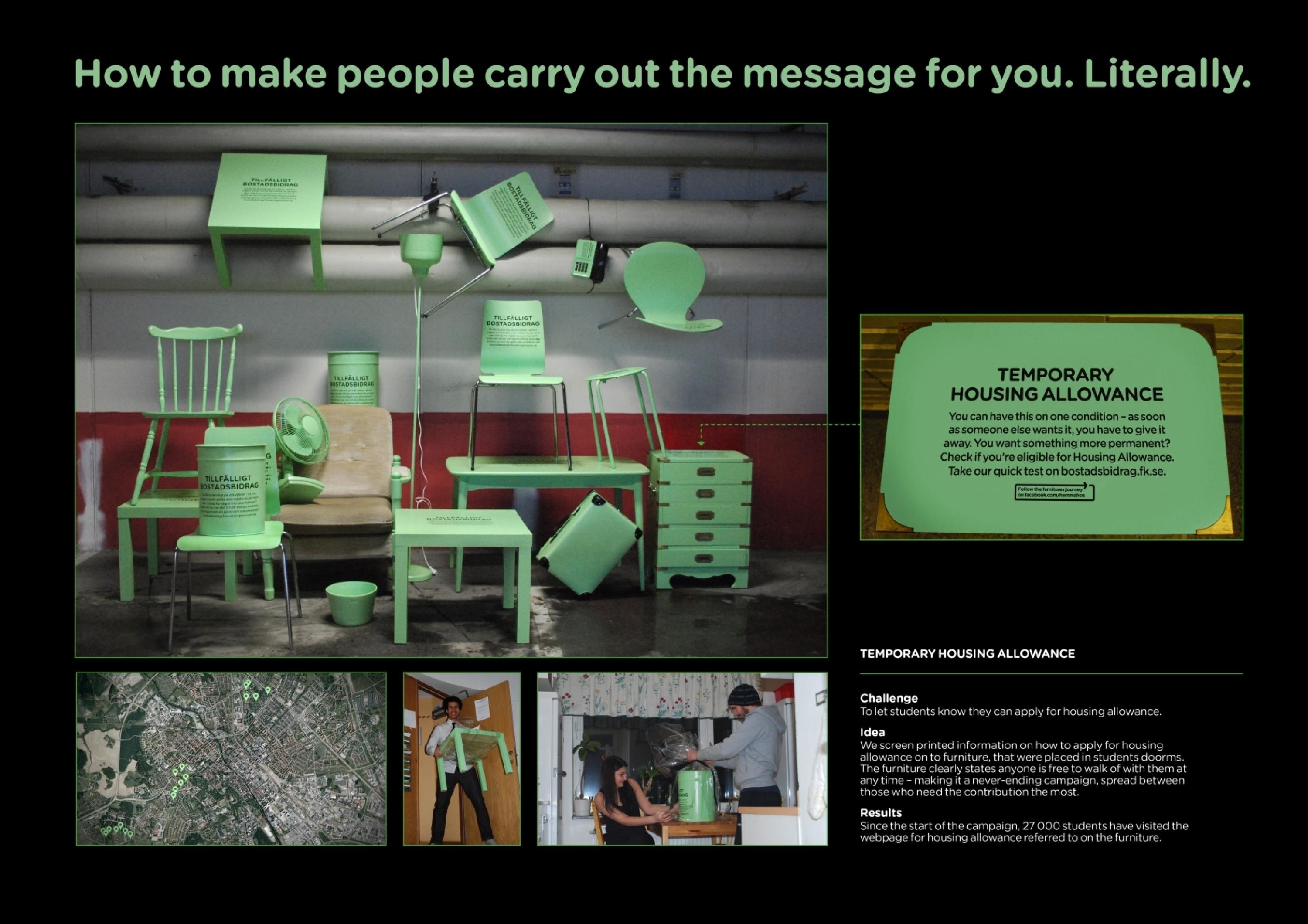
Cannes Lions
MOCA Rebrand
LEO BURNETT, Toronto / MUSEUM OF CONTEMPORARY ART / 2019

Overview
Entries
Credits
Overview
Background
Contemporary Art is often misunderstood and underappreciated, commonly thought of as rather niche, intellectually intimidating and something for only the exclusive art community to enjoy.
Previously a small, overlooked, and undifferentiated gallery, in 2018, Toronto’s Museum of Contemporary Art (MOCA) was relaunching. The museum was moving from a small, nondescript space into an iconic 100-year-old factory. This big new space presented a big opportunity to relaunch the brand, from the ground up, and build a world-class MOCA.
The objectives for the re-launch were twofold:
1) Create a unique but simple brand identity that would differentiate MOCA from other art institutes; and,
2) Appeal to the art community and beyond; making Contemporary Art accessible to all and appreciated by all.
Our task to was rebrand MOCA across all touchpoints, from design system to gift-shop merchandise, and even a city-wide outdoor campaign.
Idea
To reach Culturally active Canadians, both those in the Contemporary Art community and beyond, we created a unique design idea for MOCA that would be the basis for all touchpoints for the brand.
The idea: From the Ground Up.
Our design idea was inspired by the building’s most dominant feature – columns that narrow as they climb through all floors. This treatment of thick to thin is a simple, yet a unique system which was born directly out of the building columns. This treatment became the brand pattern and was represented across all materials – even the chocolate bars sold in the gift shop.
Execution
The design needed to be simple and neutral, so it wouldn’t detract from the art itself. Inspired by the building’s thick to thin columns, we developed a new typographic system where each line of copy got thicker as it moved down, just like the building. The thick to thin treatment was also integrated into the colour palette which consisted of shades of grey, from dark to light. This system was also applied across all merchandise including notebooks and plates, which were made in different sizes from big to small. This unique and versatile treatment helped bring the essence of MOCA to life at every touchpoint.
The new MOCA identity told a story of a century-old building that housed a contemporary world of art.
Outcome
Toronto’s Museum of Contemporary Art got a new brand identity inspired by their new home. With the launch of its new look and space, MOCA went from an overlooked gallery to a must-see museum, achieving 40% of its annual attendance in the first 3 months. Finally, Toronto had a contemporary art museum it could be proud of.
Similar Campaigns
11 items