Spikes Asia
Now in Fruit Flavours
GREYnJ UNITED, Bangkok / FERRERO / 2017


Overview
Entries
Credits
Overview
Background
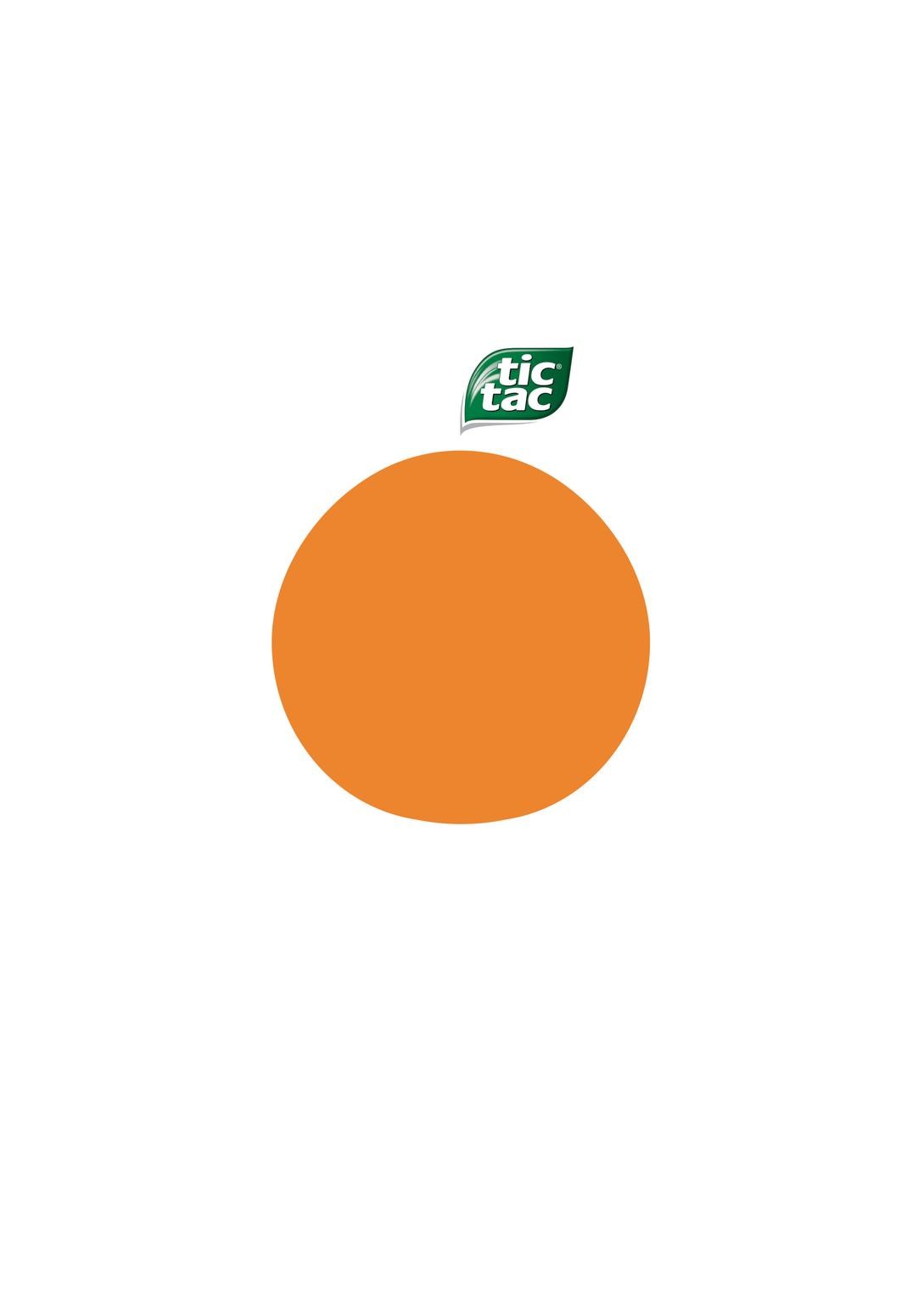
In Thailand, Tic Tac is mostly known for its mint variants. In 2016, new fruit flavours were introduced in the market and we were tasked to create awareness of its fruity range through a series of OOH posters, press ads and in-store posters around Bangkok.
Execution
To reinforce Tic Tac’s positioning on freshness, we turned its iconic logo to become a fruit leaf by strategically placing it above a simple illustration of a mango, apple and orange. With lots of white space, the graphic stood out from all the clutter in a retail environment, from the other advertising messages in the city, as well as in the newspapers. Simplicity was the key, so we carefully minimize, reduce and got rid of all the elements that was found unnecessary during the design process.
Similar Campaigns
12 items