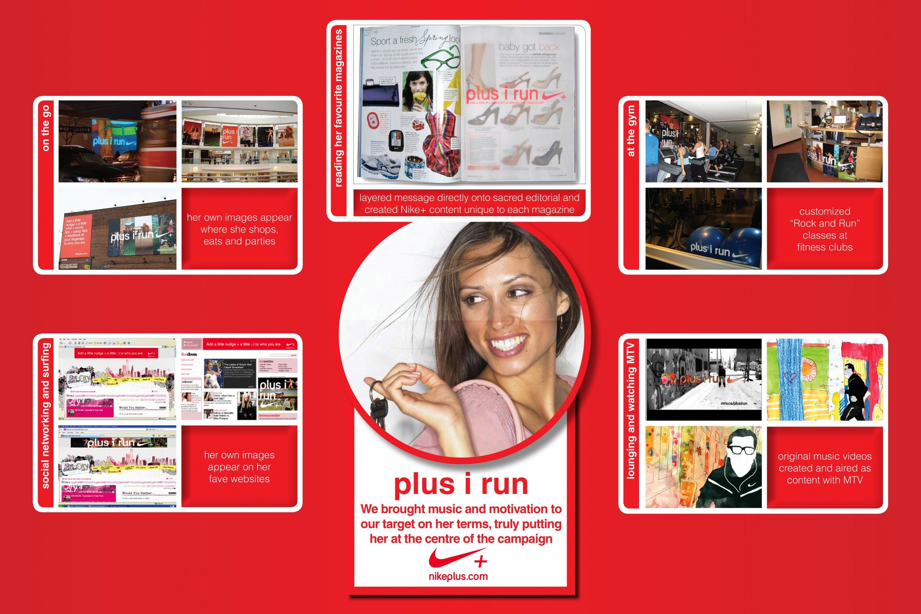
Cannes Lions
Oslo – A Nike typeface
BABUSJKA, Oslo / NIKE / 2018
Overview
Entries
Credits
Overview
Description
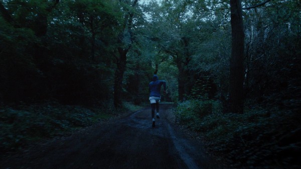
«Oslo – A Nike typeface» is an intense abstract audio-visual journey on a race from start to finish. We get to see an exterior struggle to achieve the highest possible speed, energy and velocity. At the same time we are also dragged into an internal battle to maintain concentration, focus and serenity.
«Oslo» is a typeface designed by graphic designer Hans Christian Øren at Oh Yeah Studio, and is used in the new Nike brand-store located in the most crowded street of Oslo.
We were given free reigns to find the best way to showcase a typeface using sound and motion. The design of the typeface is based upon the running tracks of a track and field stadium. We see a race happening, but not on a ordinary track. It is occurring through line and elements being traced up, that in the end creates the word "OSLO".
Execution
The film is created to showcase the work and design behind the Nike - Oslo typography by Hans Christian Øren, Oh Yeah Studio. The film is an abstract visualization of a race from start to finish. Using only sound and design elements part of the OSLO typography we describe the high velocity and mental serenity required to win the race.
Similar Campaigns
12 items