Cannes Lions
PAINT
DRAFTFCB, Chicago / VALSPAR / 2012
Overview
Entries
Credits
Overview
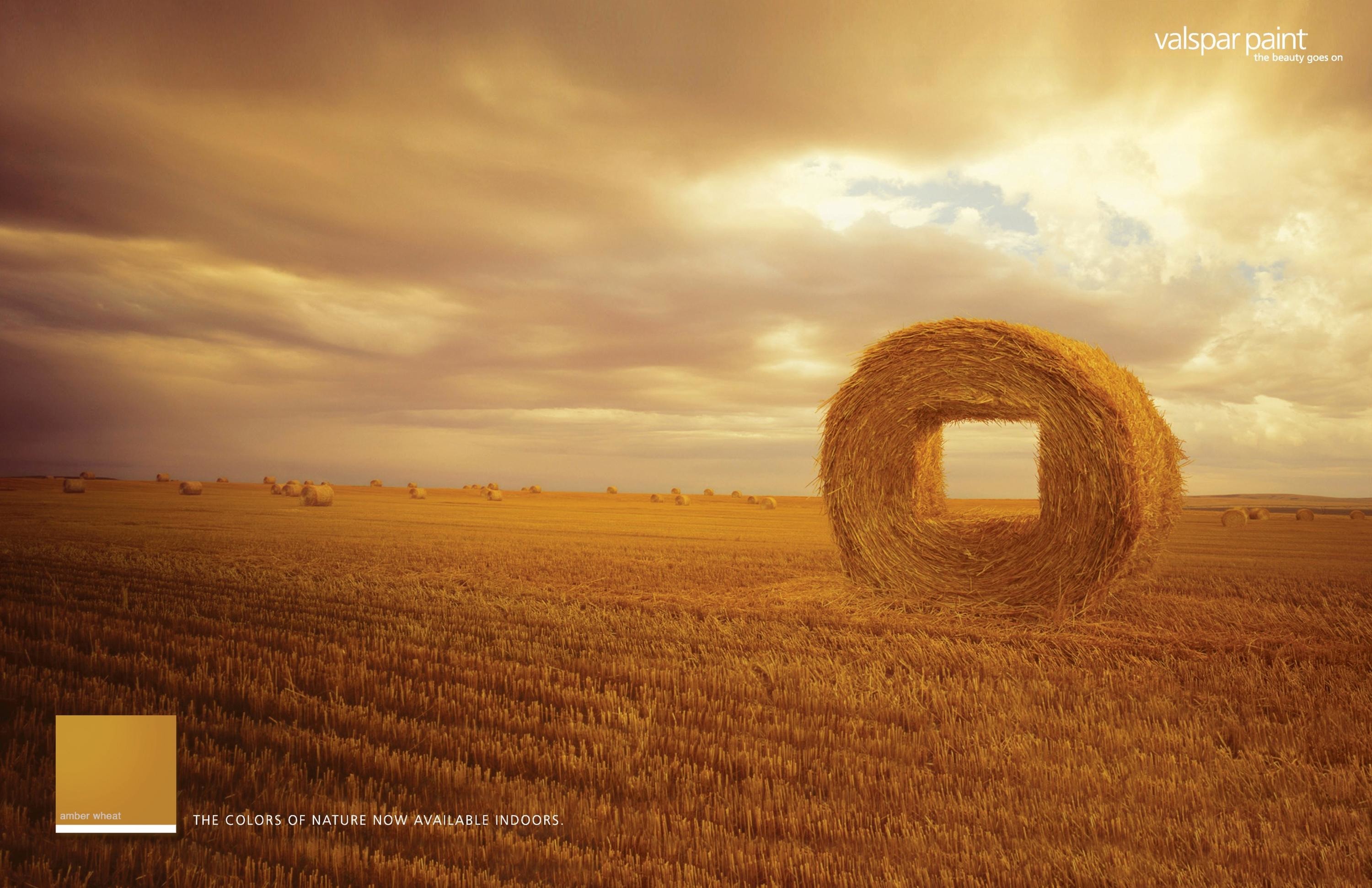
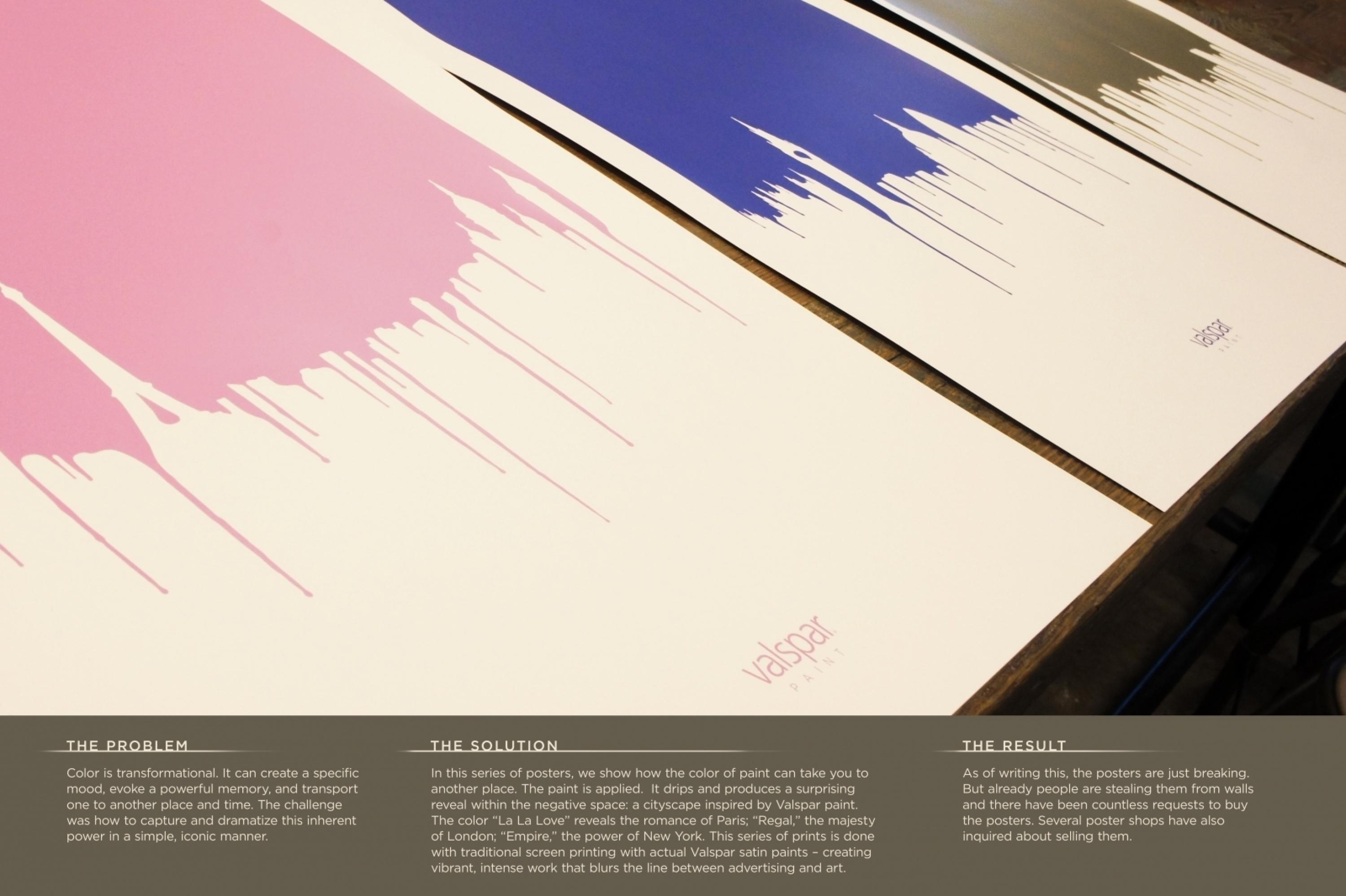
Description
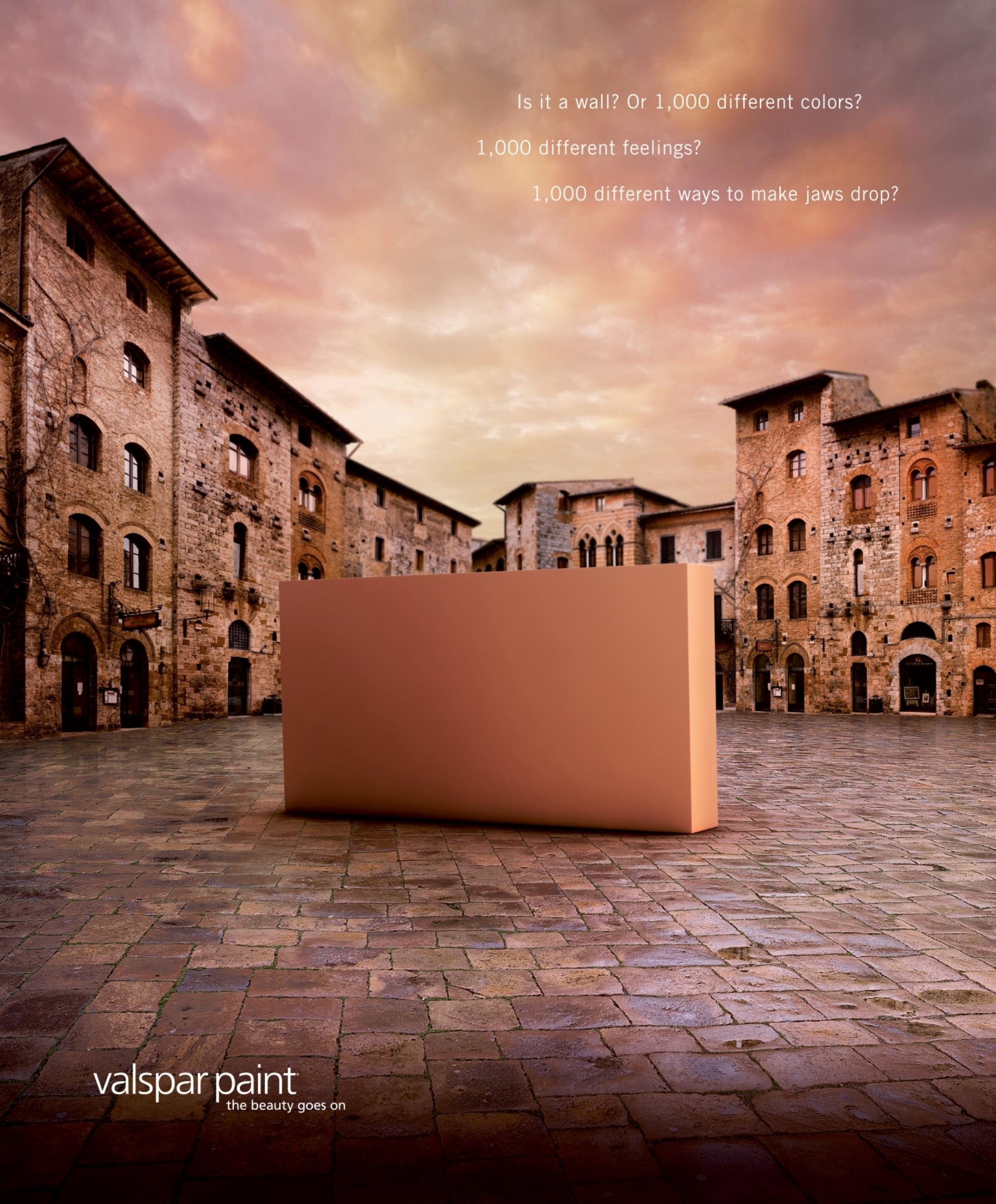
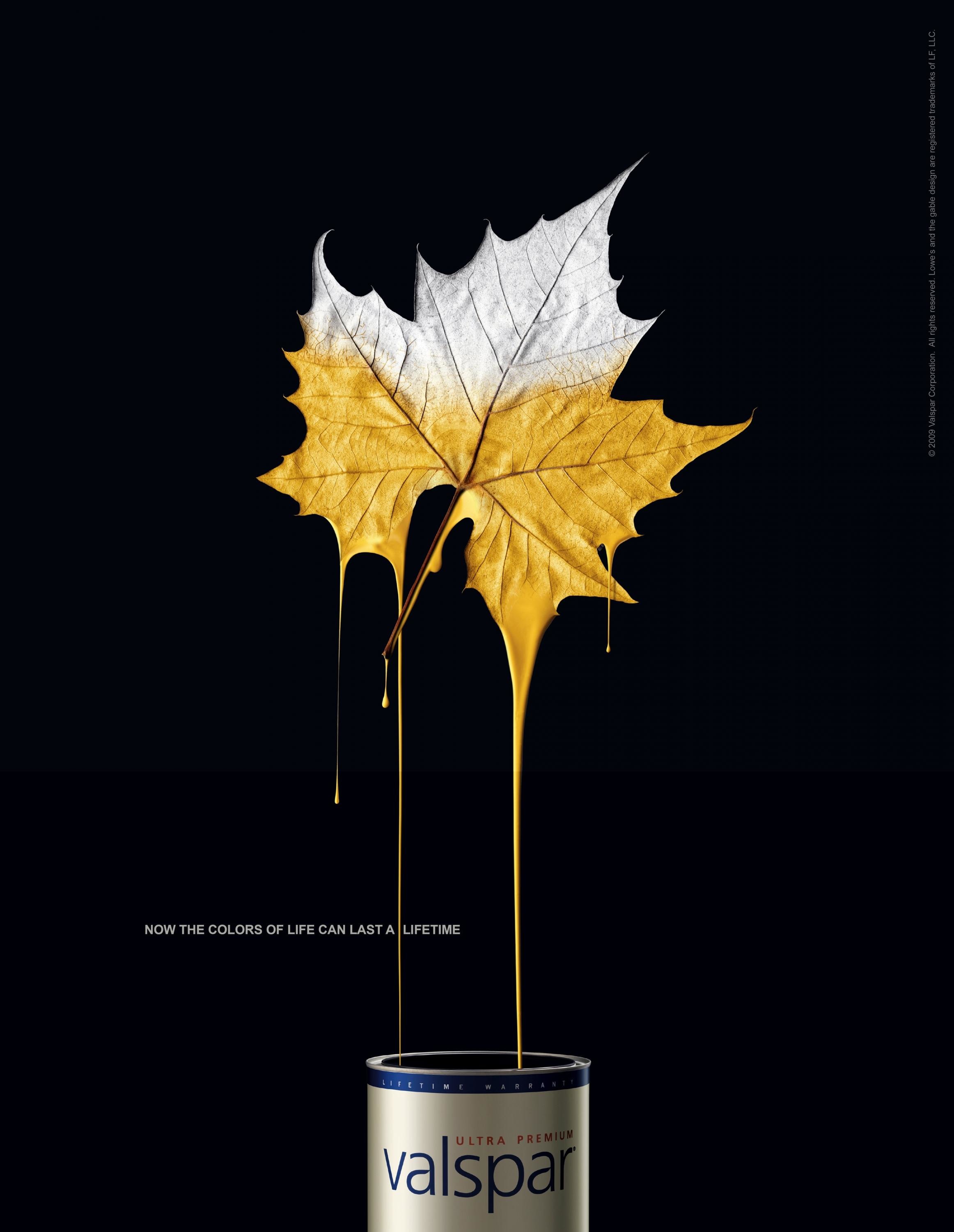
The brand proposition centres on connecting people to the power in colour. So, for this work, we needed to conceive and execute an idea that draws people in and makes a deeper connection to colour.
Execution
The concept was born out of the very nature of what paint does – if you apply a lot of paint to a wall, it drips. From those drips came an idea: create iconic cityscapes in the negative space, inspired by Valspar colours.Once we had the cities and colour names, we began to perfect the details. To make this look as organic and natural as possible, we physically created a cityscape in paint drips and studied it – the slight curves, drips a nuances that can’t be simulated. Finally, we screen printed using real Valspar paint, uniting art and advertising.
Outcome
As of this writing, the posters are just breaking. However, already people are stealing them from walls and there have been countless requests to buy the posters. Several poster shops have also inquired about selling them.
Similar Campaigns
12 items