Cannes Lions
PARALYMPIC LOGO
TÀTIL, Sao Paulo / BRAZILIAN PARALYMPIC COMMITTEE / 2012
Overview
Entries
Credits
OVERVIEW
Description
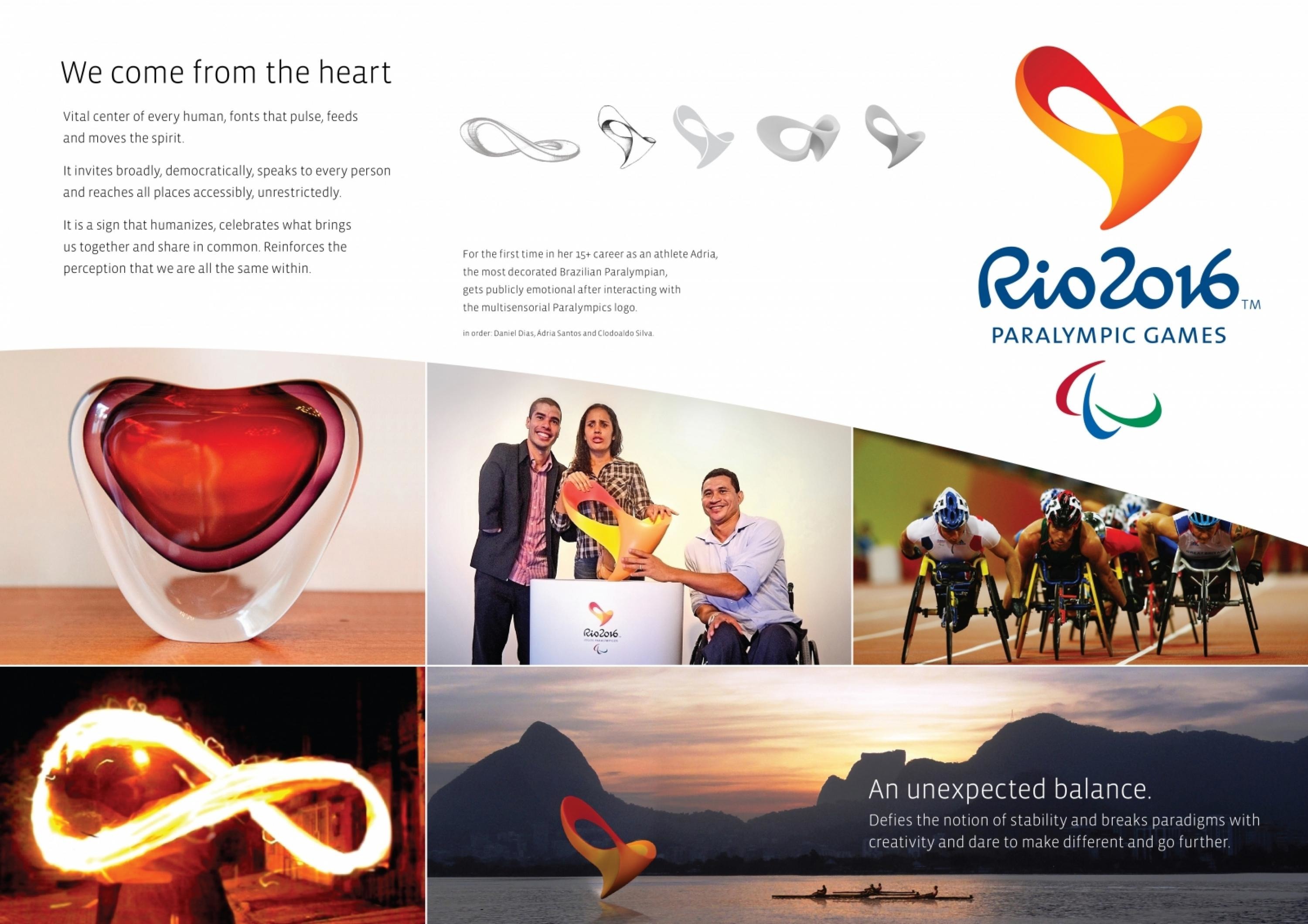
How do you create a brand that is recognised, understood, felt and experienced in as universal a way as possible?In designing the brand for the Rio 2016 Paralympic Games™, we felt an even greater challenge and responsibility. A 3D design was no longer a novelty and had become the norm. We had to create an even more innovative symbol with the same presence, while also possessing a global ability to reach out and speak to people around the world.Our challenge was to find symbols, with a power of communication that would simultaneously reflect the spirit of the Rio 2016 Olympic Games and the ideals of the international Paralympic movement.
Execution
We decided that this brand should be multisensory.The first choice was to stimulate the sense of touch. Its curves and shape should represent the aggression of the athletes in achieving their goals.The second sensory choice was sound. An appealing vibration is created by the ‘sound’ that the brand emits. This sound both simulates the breathing that accompanies the heartbeat, as well as the roars from the crowd.Our third choice was to materialise the propelling force of the spirit in motion. We created a design that resembles the infinity symbol, reinforcing the idea that this is a truly infinite resource.
Outcome
Our experience on the day of the launch exceeded our wildest imagination: moving statements, surprising compliments and a sense of joy, satisfaction and gratitude.“When I touched it, with the sound of the crowd and the beating heart, I saw my entire career flash before my eyes. It moved me so much. It was very beautiful”- Adria dos Santos.Our greatest Paralympic medallist, Adria dos Santos, said that for the first time in her 24-year career, she was able to interact with a brand that represented the most important element in her life.
Similar Campaigns
6 items
