Cannes Lions
SENSE
SENSE, Miami / SENSE / 2024
Awards:


Overview
Entries
Credits
OVERVIEW
Background
Generation Z: Despite their undeniable charms, their rituals of physical intimacy are astonishingly rare. The data doesn’t lie — they’re having way less sex.
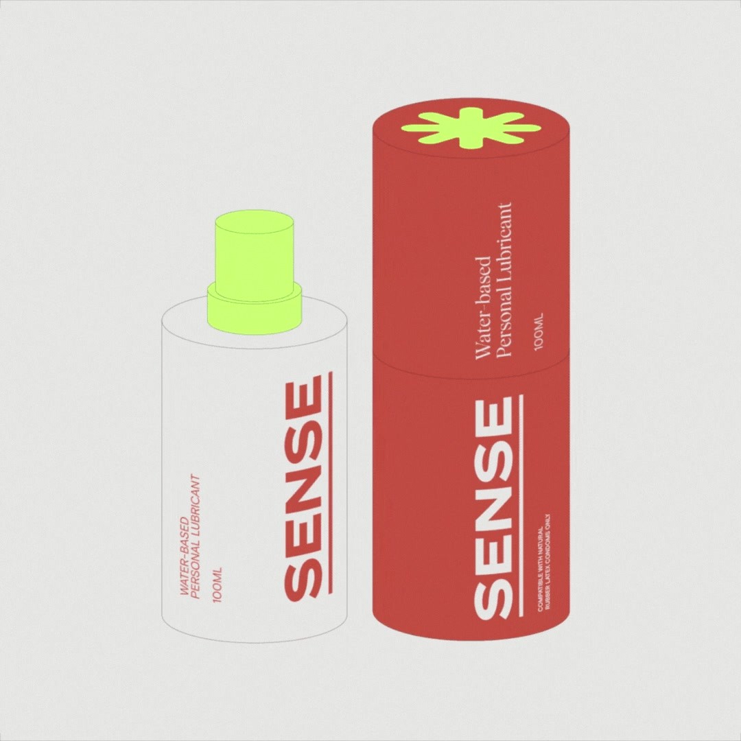
In a world where most sexual wellness and contraceptive products are designed to blend in, SENSE desired a bold visual identity, tantalizing product packaging, and sultry brand voice for their North American product launch.
Idea
The creative idea is centered on “body language.” Immersive and inclusive, the identity design mimics the bodily curves of a diverse audience. We play with tension and anticipation, getting off on vibrant pops of color and lush type treatments to create an ownable style that excites as much as it delights.
Our goal was to create visuals and packaging that shines on the shelf amid the darker tones of competitors. SENSE’s products are destined to be displayed on the nightstand, not hidden away in a drawer.
We embrace a sex positive approach, combining wild chemistry and well-being by giving one condom away for every one bought. Partnering with URGE (Unite for Reproductive and Gender Equality) the brand is making a meaningful impact while introducing its clear-cut voice of sexual freedom to the world — no shame, no censorship, and no b.s.
Execution
The 360-degree brand build for SENSE has a design system that begs to be played with and the visuals shine on the shelf amid the darker tones of sexual wellness competitors.
We know the sexiest thing you can be is straightforward. We put confident language at the forefront of the web, marketing, and social touchpoints.
We invite audiences to feel our words through evocative imagery. The tone of voice focuses on "foreplay," striking a balance between sexy and serious. A sophisticated typeface interacts with curvy, abstract shapes, where design references came from adult sex toys. The packaging is edgy, colorful, and tactile while still feeling accessible and open to exploration.
Outcome
The brand design contributed to SENSE becoming the first condom brand to be stocked in Urban Outfitters across the United States and was profiled in the book Designing Brand Identity (2024).
From the co-founders:
"The brand design is fundamental to our mission of normalizing and celebrating sexual wellness. The creative team created an expressive and purposeful design for a global and inclusive audience. The branding challenges outdated attitudes and empowers individuals to prioritize their sexual health, all while enjoying the experience."
Public customer reviews:
Saul G. - “Trying a new condom brand sometimes can be difficult, but this people just blew my mind! Not just the quality of the condom, but the brand makes you feel happy, and in the mood of getting laid all day long!!”
Benjamin M. - “Great product, love the packaging!”
Website metrics since launch:
Traffic: 123% growth MoM
Total Sales: 92% growth MoM
Conversion Rate: 27% growth MoM
Similar Campaigns
8 items


