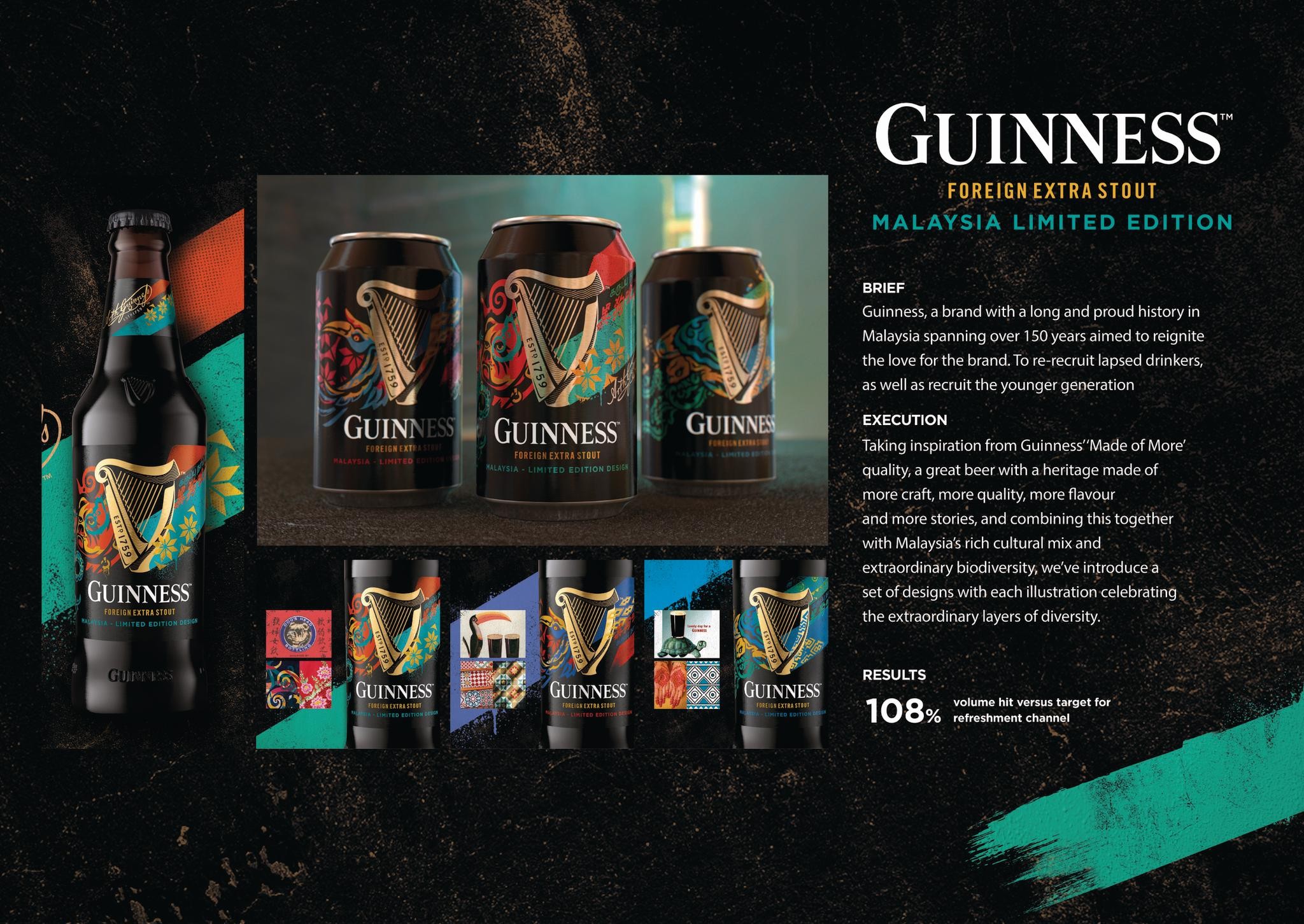
Cannes Lions
Tanqueray Flor De Sevilla
DESIGN BRIDGE, London / DIAGEO / 2018

Overview
Entries
Credits
Overview
Description
It was Charles Tanqueray's expeditions to Spain's sun-soaked groves in the 1860s that inspired the new 'orange' Tanqueray Flor de Sevilla liquid. With the Mediterranean in mind, and on the tip of our tongues, the design is a window into the zinging citrus colours and tastes of a summer in the Med.
The window itself uses the bold angles of Moorish architecture to capture a sense of provenance and ingredients. Beyond this are segmented, hand-drawn tiles – an homage to the cooling, patterned, handmade tiles that pave villa floors, and decorate the walls and paths in Mediterranean villages.
Execution
The illustrations are a nod to the iconic tiles seen in and around Spain, where fruit is depicted in its zesty, summered glory and sprawls from tile to tiles, connected by a vibrant green, leaf-like border. These tiles are finished in gloss to distinguish them from the matte elsewhere in the label design. Just like real tiles, the gloss provides an intriguing, man-made tactility.
The fresh sunset red and citrus yellow cap uses the same joyous colours of the Spanish flag. To further celebrate taste and place, the colour palette has been designed to complement the liquid profile of Tanqueray Flor de Sevilla.
Outcome
For this unique gin – with its blushing, sun-kissed hue – we crafted a story brimming with authenticity and provenance. With its distinct personality, Tanqueray Flor de Sevilla stands out in the gin market, immediately brightening the Tanqueray family with a taste of the Mediterranean.
Wrapping up this beautiful bottle is a premium gifting paper, which features elements of the bottle's design to echo the traditional wrapping of oranges in paper in a Spanish fruit store.
The result reconfirms Tanqueray’s high quality positioning, whilst using the provenance of the product’s zesty ingredient to create a real point of difference.
Similar Campaigns
12 items