Cannes Lions
The new illustration style of Itaú
ITAU UNIBANCO S.A, São Paulo / ITAU / 2024
Overview
Entries
Credits
Overview
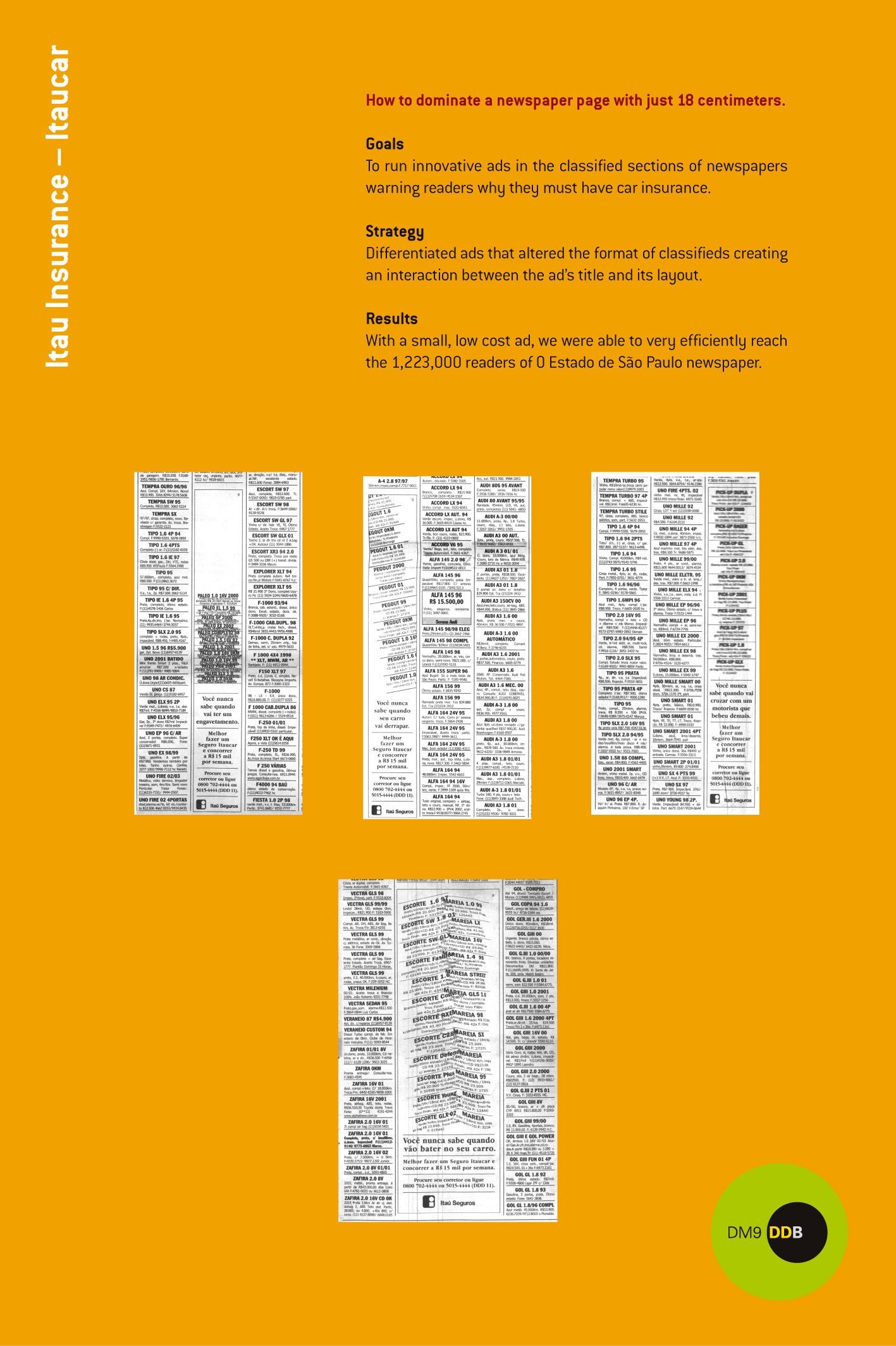
Background
The bank embarked on the biggest rebranding in its history with the aim of revitalizing its image and strengthening its connection with young audiences, without losing its appeal to other generations. The project introduces a visual innovation while preserving the solidity and history of the brand.
The illustrations play a significant role, incorporating modernity and flexibility through a geometric style that symbolizes transformation and diversity, fundamental attributes for the bank's new positioning.
Idea
Rebranding rekindles cultural elements. Itaú means "black stone" in Tupi, the main linguistic axis of Brazil's Indigenous peoples. With this inspiration, the project roots the brand in the national identity.
The creative idea for the illustrations focused on introducing the "stone" as a unifying element, everything is part of it or represents it in some way, whether as a central object, frame or creating shapes inspired by its curves. The cogency of the form helps the bank to build an icon while reflecting attributes of solidity and transformation.
This natural element has evolved to represent contemporaneity and inclusion through illustrations that use soft, rounded curves and vibrant colors. This approach updates the brand visually, making it more accessible and relevant to a global audience, reflecting the diversity of people and cultural dynamics of Brazil.
Execution
The illustration process was developed to strengthen the connection with the brand through the strategic use of the "stone". This element is essential in creating objects and shapes that reflect their smooth curves and round corners, providing a cohesive visual base.
The illustration approach is based on simple geometric shapes that, combined, bring different ideas and contexts to life. The illustrations range from micro to macro, detailing everything from singular moments to broad narratives showing the interaction between characters in complex scenes. Micro illustrations focus on a single moment, emotion, or situation, with more details on characters and objects. Macro illustrations show the overview of a story and interactions between characters as part of a larger picture.
As a global brand, it is important to reflect the diversity of ethnicities, genders, cultures, and skills. The color palette offers a wide range of skin tones and illustrations should be sensitive to different hair types, body types, facial features, and cultural expressions. Furthermore, the vibrant color palette helps create scenes full of life, reflecting energy and positivity.
The modularity of the illustrations facilitates their adaptation in different formats and media, from applications to out-of-home campaigns, reinforcing the brand's relevance in digital and physical environments. Created in Adobe Illustrator, they offer precision vectorization that translates into scalability and flexibility.
The bank's new illustrations visually communicate the values of warmth, trust, diversity, and optimism, reaffirming the brand's commitment to innovation and design excellence.
Similar Campaigns
12 items