Cannes Lions
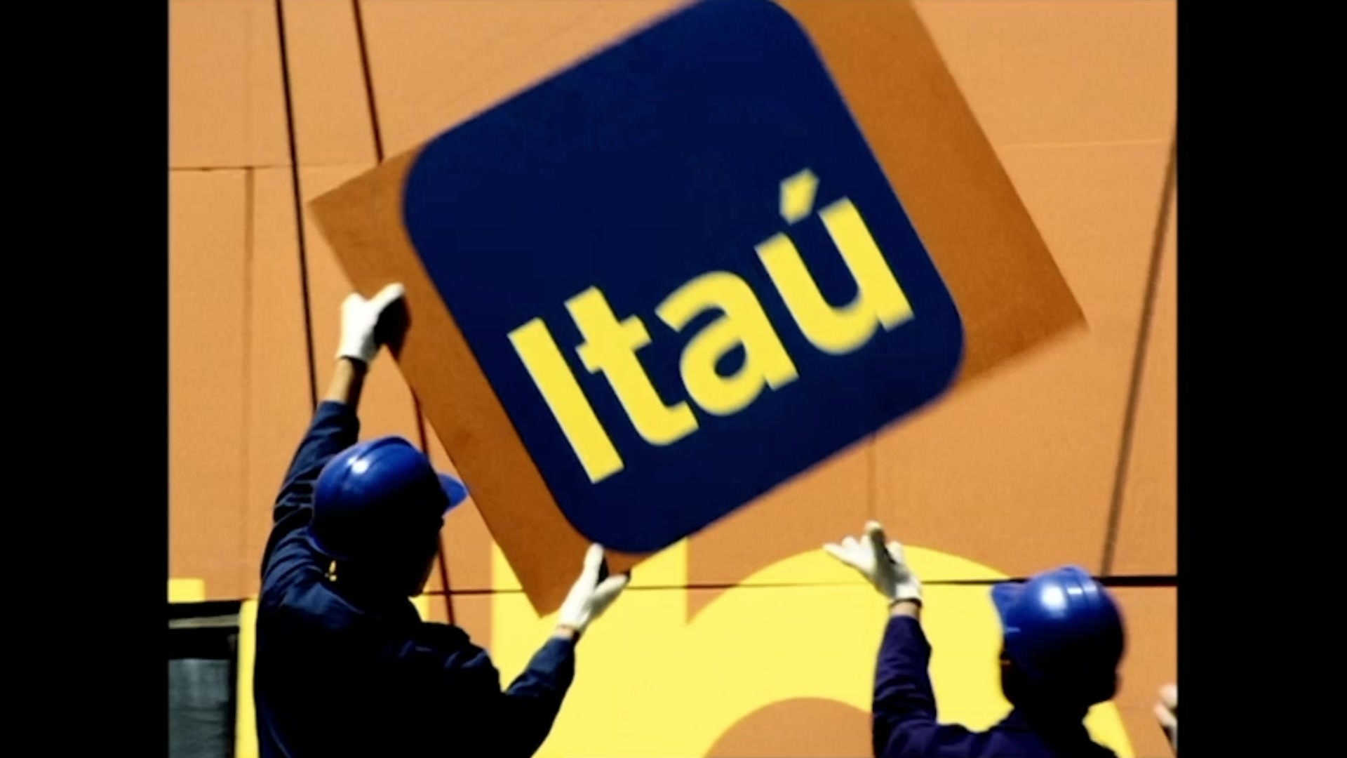
The rebranding for the next 100 years
ITAU UNIBANCO S.A, São Paulo / ITAU / 2024
Overview
Entries
Credits
OVERVIEW
Background
One of the challenges of rebranding was to contribute to a meaningful change in brand perception. This includes its rejuvenation and strengthening among younger audiences, without losing connection with other generations.
With more than seventy million clients, the bank has a very broad audience profile. The brand unfolds across different touchpoints, physical and digital. For a consistent and impactful construction, the bank needed a more flexible and contemporary identity.
The rebranding also aligns with the bank's transformation capacity: evolution in management, review and cultural change, a new vision of client-centricity and Itaú as a Tech Company.
The project was conducted with a significant budget focused on reflecting the bank's values of innovation and modernity. This included the development of a new positioning, a new visual, verbal, and sound identity. It took 22 months of work, more than seventy color studies and around one hundred typographic and logo studies.
Idea
Rebranding rescues cultural elements. Itaú means "black stone" in Tupi, the main linguistic axis of Brazil's Indigenous peoples. With this inspiration, the project roots the brand in the national identity.
The shape of the logo has evolved. Now more rounded, it expresses a “stone” that has changed and evolved over time, indicating movement and transformation. This new form was also inspired by Brazilian modernist art. Hence the new palette colors and textures connecting us to the country's natural resources and ecosystems.
The use of orange, historically associated by people with the bank, but absent from its previous logo, carries deep emotional and cultural connections with Brazilians, symbolizing energy, and optimism. This evolution helps to build an even more proprietary brand and organize the bank's architecture as a whole, dividing what is the institutional brand from the banking services brand.
Execution
The shape of the logo is deployed as graphics in the identity, being used as hero, pattern, and support, offering more possibilities for creation. Its modularity helps with scalability and responsiveness, in addition to adapting to communication contexts, channels and vocation – creating an iconic symbol for the bank. The development of the graphic system encompasses the evolution of assets such as the bank's proprietary typography, motion, and photography, in combination with a new color palette. In addition to the more vibrant orange, the colors of Brazil – blue, green, and yellow – modernize and bring more dynamism. This flexibility with an extended palette expresses the idea of an Itaú for everyone, bringing diversity to the identity. The illustrations also derive from the logo: a set of geometric shapes with rounded corners that can be combined. A consistent and proprietary illustration system, for simple or more complex executions.
Outcome
With the rebranding video:
. Brand consideration at 70.3% compared to the bank's overall ratio of 53.8%
. 16.5% increase in consideration, where the person is asked whether they consider themselves to be a bank client
. 60% of people related Itaú to trust and solidity
. 50% associated the brand with being simple to use and innovative
. The day after the launch of the new brand, Itaú reached its record value on the stock exchange, reinforcing the impact of branding on the perception of business transformation, aligning itself with the strategic objectives of the project and marking an effective alignment with the bank's long-term vision.
Similar Campaigns
12 items
