Eurobest
The Witcher - Welcome to the Continent
MEDIA.MONKS, Amsterdam / NETFLIX / 2022
Awards:

Overview
Entries
Credits
OVERVIEW
Idea
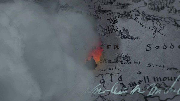
The Continent, the dark fantasy world of Netflix’s The Witcher, is a fascinating realm where magic, politics, and beasts collide. Its abundant history, cast of characters, and interwoven timelines inspired our interactive map for season one. Fans responded enthusiastically to this digital space that helped onboard them into the complex world and chronology of The Witcher.
We expanded our original interactive map to a new digital platform for The Witcher season two. This new iteration is an evergreen space that will evolve alongside the franchise as the ultimate companion website. Created as a comprehensive compilation of everything Witcher-related, Welcome to the Continent aims to satisfy every fan with its design and content.
Execution
Welcome to the Continent is a digital ecosystem that meets fans’ needs while delighting their imaginations. From sound to icon design, we built every detail of the website to align with the lore and legacy of The Witcher. The result is recognizably in-world: a companion website that pays homage to the compelling atmosphere of the show and recreates its magic.
The storytelling of the show lies at the very heart of this platform. Royce Pierreson (or Istredd to fans) welcomes users to the site, creating an immersive experience from the offset. We then journey to the mighty monolith, a navigational feature chosen for its narrative significance in season two, which users can explore or use to travel to other key areas.
With hundreds of pages detailing every character, event, location, and more, Welcome to the Continent is an encyclopedia of original content that doesn’t feel overwhelming to search through. We designed unique pages to capture fans’ imaginations, including songs, letters, and diary entries; Jaskier’s page, for example, was crafted to reflect his personality.
The mood, typography, and visuals perfectly match the show’s aesthetics. Dust particles, light rays, and metallic textures reference season two in look and feel. The free-roaming navigational style of our library lets users organically discover content, while light and airy text components ensure information is easy to dive into.
Welcome to the Continent brings together a world of information in a single space. Equally magnificent on mobile and desktop, our website attracted eyes from all over the planet. The fan community raved on Reddit as they explored far corners of the Continent, encountered curious creatures, and retraced characters’ steps. By handing fans the content they’d craved since season one, we earned the highest accolade possible: “even as a book reader, this is perfect.”
Similar Campaigns
12 items


