Cannes Lions
TOYOTA CARE
SAATCHI & SAATCHI LA, Los Angeles / TOYOTA / 2011
Overview
Entries
Credits
OVERVIEW
Description
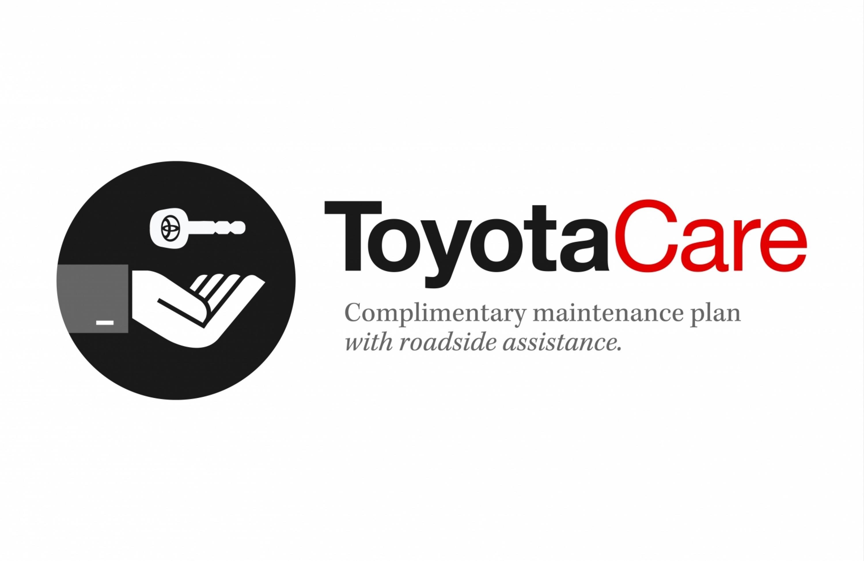
Being the first of its kind, the new free maintenance program (ToyotaCare) had to be memorable, and one of the most important parts of a memorable brand is a memorable logo. So, Saatchi LA was tasked with creating a logo for this new brand-wide program, as well as an entire campaign built around it, in 19 days. The logo would be everywhere from print to TV and all over the internet, not to mention heavily used by dealerships in their commercials and in their showrooms.
Execution
We started with ideas of what we wanted the logo to represent. Worry-free, peace of mine, taken care of, all sprang to mind so we set out visualizing what these feelings could look like. We ultimately decided on paying homage to a more retro style and producing the logo you may very well see everywhere if you pay attention. It’s understated, slick, and most importantly comforting.
Outcome
Results for a logo are always hard to quantify, and in this case the release of the logo coincided with the release of a full-blown campaign. The program was covered extensively by many press outlets including the New York Times, Fox Business, and a number of blogs which all feature that helpful hand cupping a key. The majority of people exposed to the logo later recognized the program of being Toyota’s and not as competitors’. It’s become memorable, ubiquitous, well-publicized, and an eye-catching reminder of the peace of mind that comes with a Toyota.
Similar Campaigns
12 items
