Cannes Lions
VISUAL IDENTITY
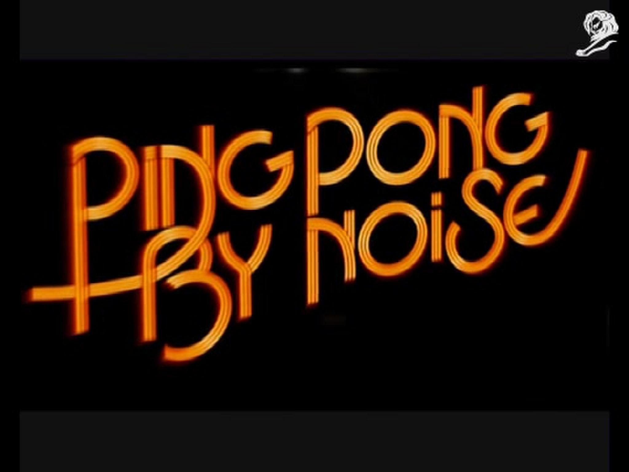
NOISE INTERNATIONAL, Sydney / NOISE INTERNATIONAL / 2013
Awards:

Overview
Entries
Credits
Overview
Description
After brainstorming with the key creatives on the project, and the team at Noise, a question was raised and a strategy was devised to incorporate the essence of what Noise is and does into their new identity... "What does Noise look like".
This sparked the idea of conducting a series of experiments to create a visual representation of the word "Noise".
Objectives... to find interesting ways to make these visual representations.
Execution
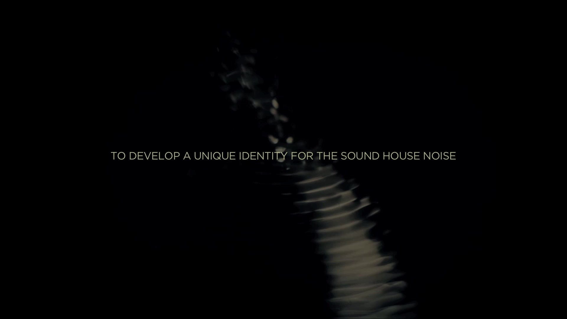
After recording each member of the Noise team saying the word "noise", we conducted a series of experiments using a variety of raw materials.
We pumped the sound (using a speaker cone) through these materials, creating different and interesting visual outputs.
The experiments aimed to generate a highly tailored outcome, by creating visual interpretations of the word ‘noise’ for each team member.
The more successful of the experiments were combined with the digital EQ readings from the recordings to craft distinct visual identities, or ‘soundflakes’.
Outcome
This change in visual identity was aimed at encapsulating the company’s progressive and innovative approach to manipulating and creating unique sound, to showing our clients (current and potential) the creative contribution Noise could bring to their projects.
This new identity/brand was implemented across all platforms... Website, socialmedia, sponsorship etc.. and a casestudy video accompanied it. Highlighting the process (and an intriguing a soundtrack designed by the team at Noise).
This video along with other forms of outreach, increased traffic to the Noise website from only a few a week, to hundreds over the first 2 weeks of it's launch.
Similar Campaigns
11 items