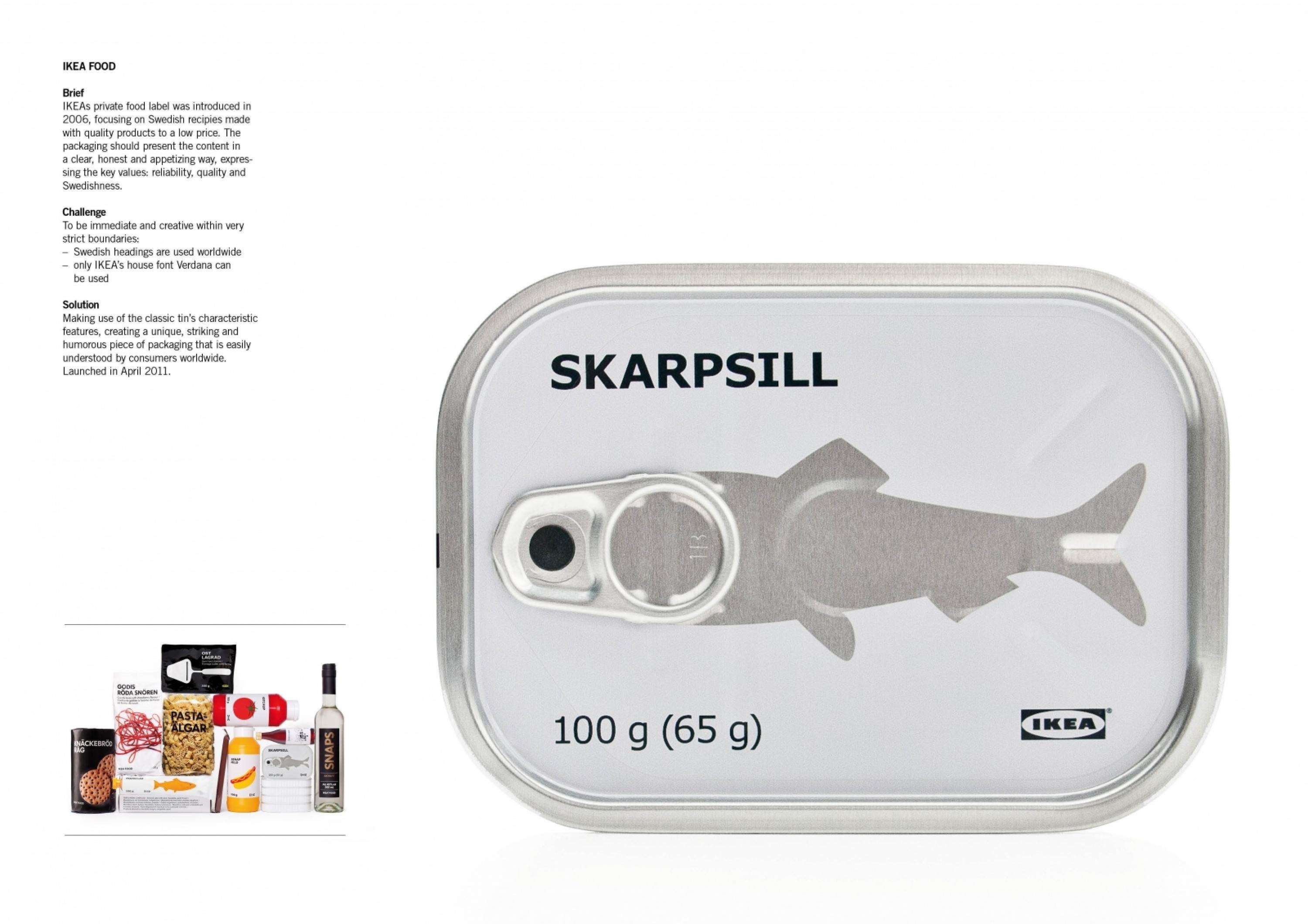
Design > Packaging Design
IA
EDUARDO DEL FRAILE, Murcia / INTERAPOTHEK / 2012

Overview
Credits
OVERVIEW
BriefExplanation
Redesign of a body care products line for a pharmacy.
ClientBriefOrObjective
Several years ago, Interapothek had the second most sold body care products in Spanish pharmacies. Sales were slowly decreasing and the brand needed a change.
Effectiveness
In terms of sales, the results were very positive. Some products increased a 30% of their sales in the first 3 months. Moreover, customers began to identify ‘ia’ easily as Interapothek’s brand. Nowadays, it is a brand with clear identification and with a great ability to expand, in fact its sales abroad are improving and its philosophy of selling a good quality product in a basic and direct way is becoming more successful.
Execution
The design work was based first on its legibility and brand name. Although Interapothek is an elegant name and well-known within pharmacy products, it was hard for customers to memorise. The first step in the design was to shorten the name with an acronym formed with the initials of the words - ‘I’ stands for Inter and ‘A’ for Apothek resulting in ‘ia’, an easy way of consolidating a name.The typography applied to all the range of products was Helvetica, thanks to its wide variety of typography variants; each range of products has a variant of Helvetica.
More Entries from i. Own Label and Private Label brands in Design
24 items


More Entries from EDUARDO DEL FRAILE
9 items