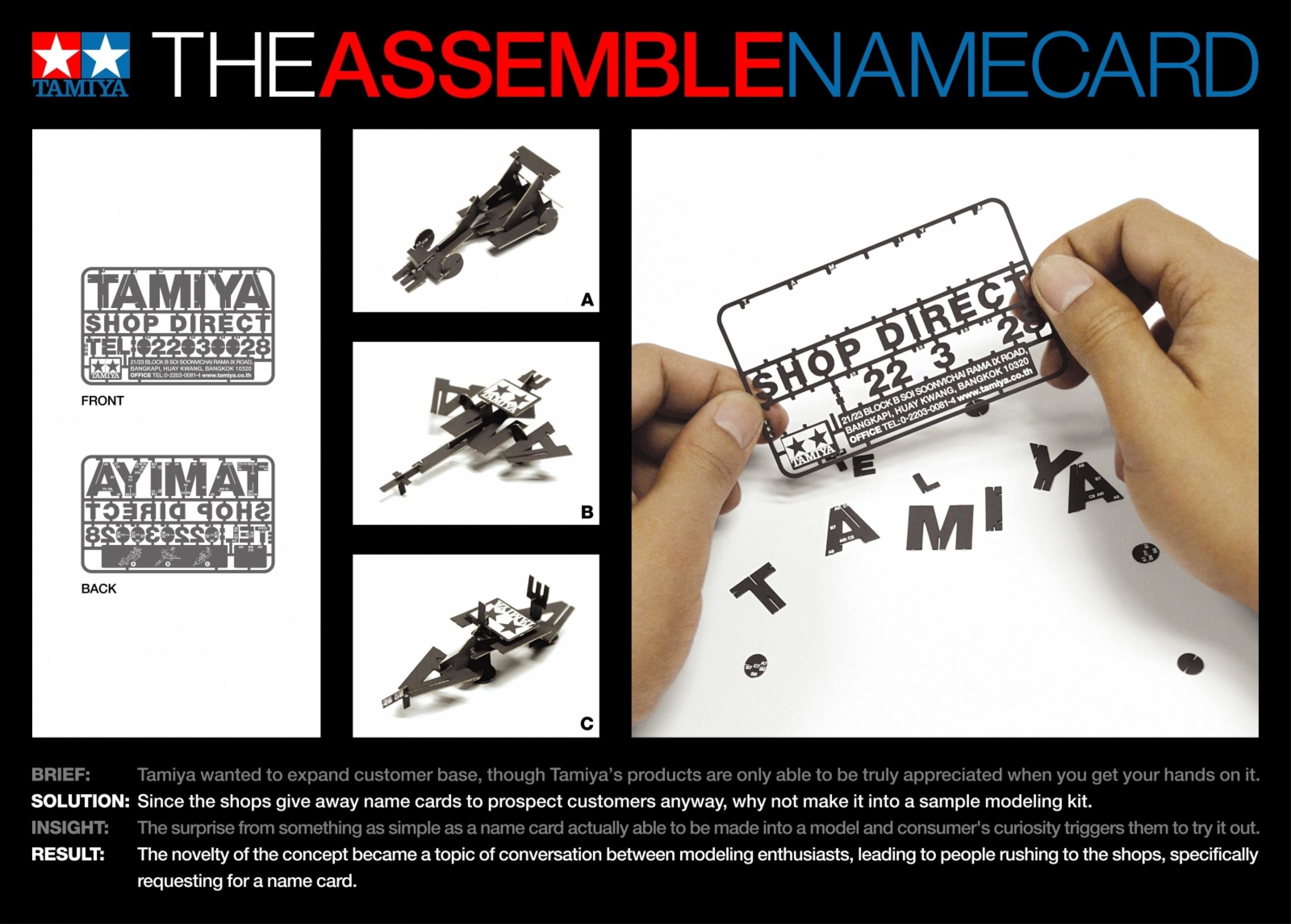
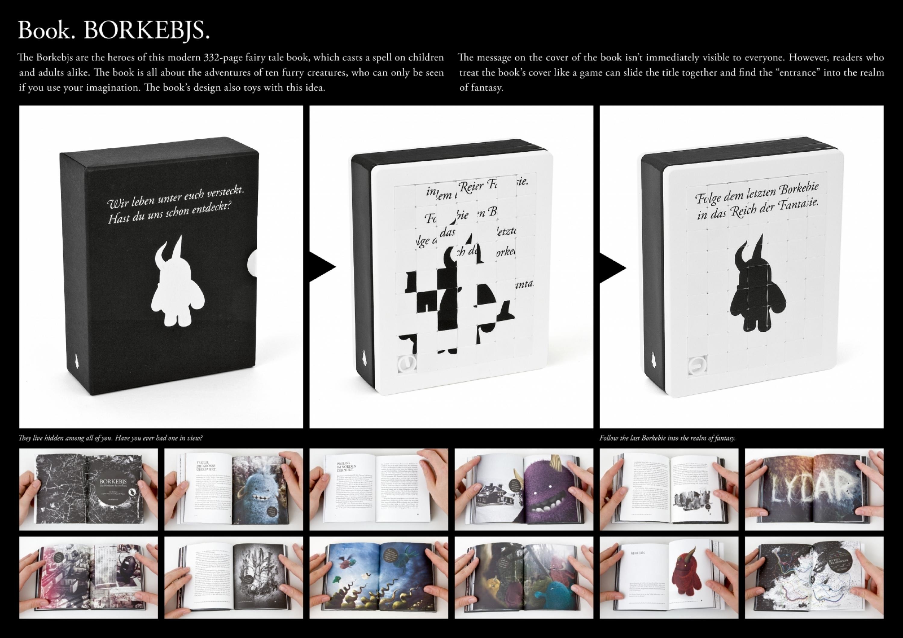
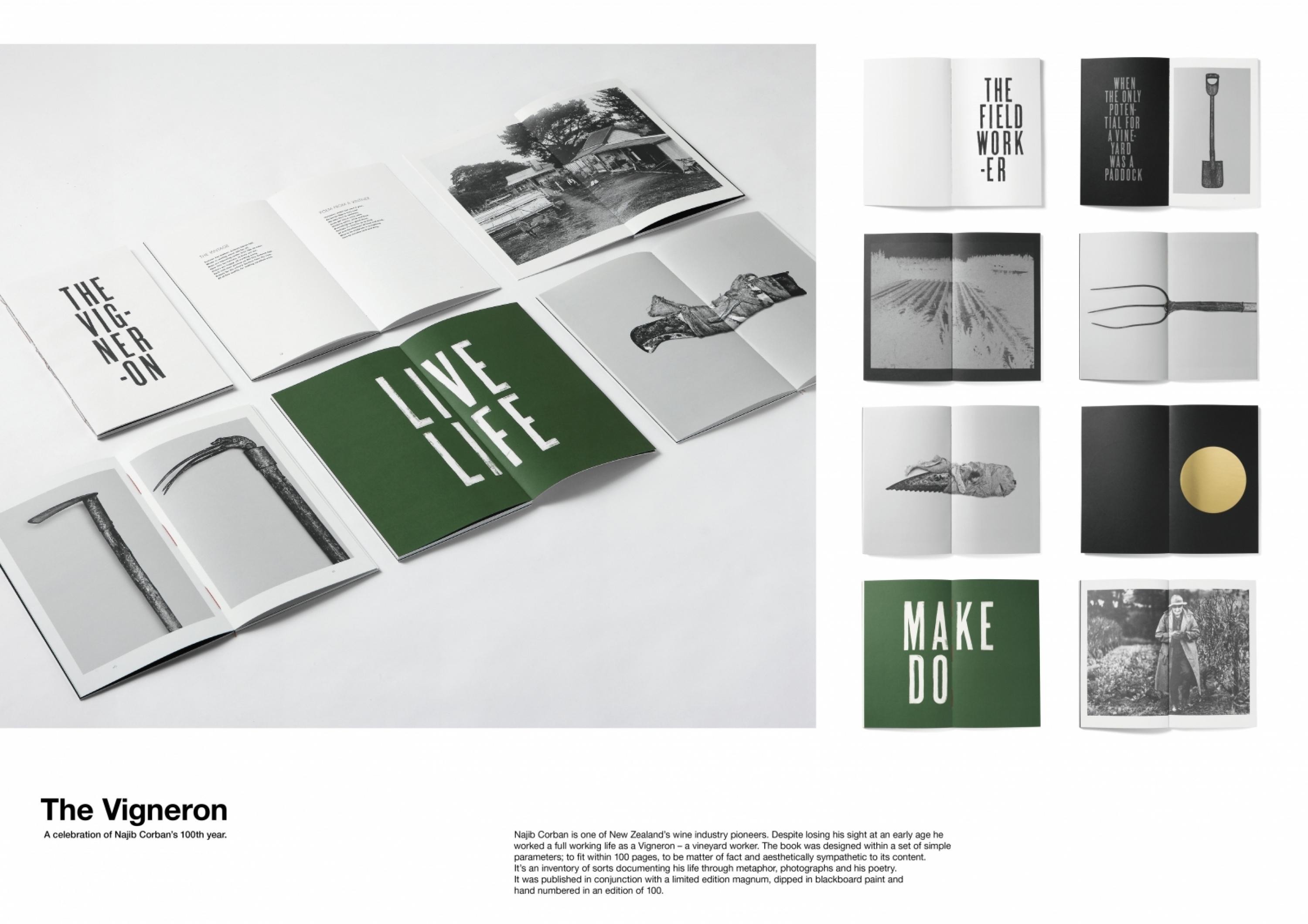
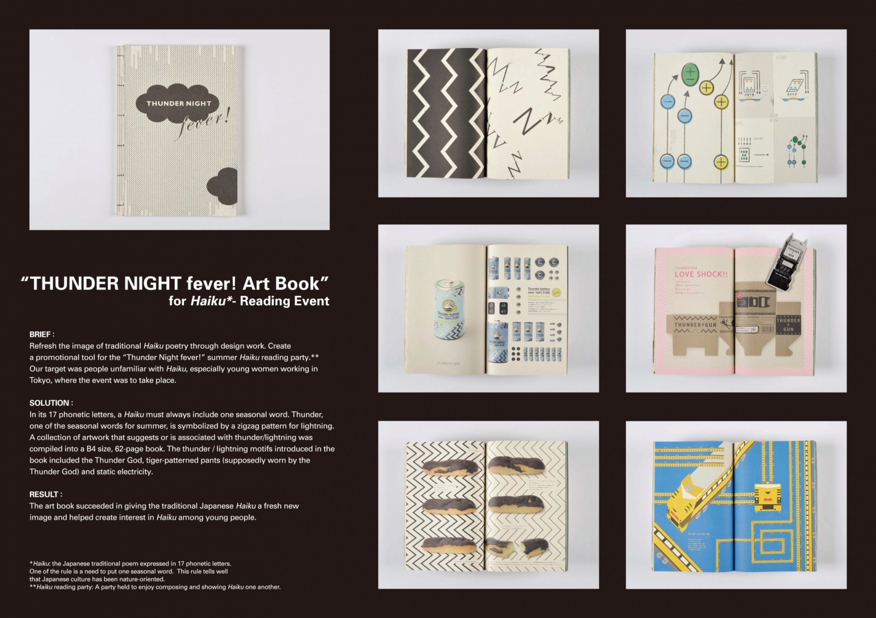
Design > Packaging Design
LASCALA
EDUARDO DEL FRAILE, Murcia / VIVANZA / 2010

Overview
Credits
OVERVIEW
BriefExplanation
A long-standing Spanish winemaker wanted to enter the Chinese market. This process had to be as harmonic as possible. French wines, which are the most popular in China, usually choose to keep their identity 100%, showing their authenticity.
ClientBriefOrObjective
We decided to merge the Western and Eastern cultures.
Effectiveness
The respect that the product represents towards the Chinese culture and the miscellany with the Spaniard was the whole success, the red wine has been most sold of the brand, however the acceptance of the image in the target of the white wine and the rosé wines have also had a great acceptance in the market and publicThe Lascala, at present and a few months before inaugurating the new mark on the Asian market, it's begining the process to sell in Japan with this new concept adapted to his culture.
Execution
LASCALA is what the Chinese call the theatre.
A face painted all over imitating a theatre mask with Eastern eyes represents China, and the merger is represented by 'LA PEINETA' (the ornamental comb) Rosé Wine, 'EL ABANICO' (the hand fan) White Wine, 'La BAILAORA DE FLAMENCO' (the Flamenco dancer) Red Wine.
Products that are not originally manufactured in China cannot bear Chinese writing on the front packaging.
The typography used is pending from a vertical axis, like the former Chinese alphabet.
More Entries from Alcoholic Drinks in Design
24 items


More Entries from EDUARDO DEL FRAILE
9 items