Design > Brand-building
REVIVING WETLANDS
DESIGN BRIDGE AND PARTNERS, Sao Paulo / AMAPARQUE / 2023

Overview
Credits
OVERVIEW
Background
If the Amazon is Earth’s lungs, wetlands are its vascular system, a source of life for billions. Wetlands store 50xs more carbon than rainforests, but are disappearing 3xs faster. The world needs a plan to protect & revive this ecosystem. AMAPARQUE, an important socio-environmental, urban project led by the Government of the State of Amapá, Brazil, will improve life for the region’s inhabitants and highlight Amapá as a sustainable tourism destination. It’s a remarkable endeavor, resulting in the largest urban conservation area in the world – 20xs larger than Central Park-NY.
AMAPARQUE is a project that embraces local community whilst elevating the conservation project globally. We designed a visual identity system to win over the minds and hearts of politicians to achieve their backing & funding. The identity also needed to appeal to the community & global advocates setting the vision for what the project can achieve.
Describe the creative idea
The identity is inspired by local nature & culture, mixing inspiration from the native buriti tree’s grandiose leaves, the waters that surround and support the people of Amapá & giant water-lily leaves. Mapping the veins of the giant lily leaf, we discovered the word Ama, which means ‘love’ in Portuguese. This formed the foundation for the logo – a strong & unique symbol, with love at its heart.
Describe the execution
The first manifestation of the brand identity was during the public consultation, thus the importance of the cultural identification for the local people was paramount. The colours, the materials choices, the graphic elements, and imagery language are all tied to the people and landscape. The printed materials, such as textiles, were produced with natural inks as used by the native people, such as urucum seeds for red and mix of leaves for green.
The identity was also designed to be seamless integrated to the architecture of the park facilities and nature.
List the results
The project, with its new identity system was successfully pitched to and gained support from government funders, resulting in the official launch of Amaparque at this year’s United Nations COP27. The identity system helped to create credibility and inspire passion for the project, enabling it to get the necessary backing to proceed to the next phase of development.
Is there any cultural context that would help the jury understand how this work was perceived by people in the country where it ran?
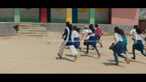
Amaparque’s purpose is to reconcile the needs of the local population with the process of reversing environmental degradation of the Ressaca (Portuguese for wetlands) areas of the Igarapé da Fortaleza Hydrographic Basin. The goal is to provide solutions for the ecological rehabilitation of degraded areas, improve urban mobility & reduce unhealthy conditions in & around the wetlands.
More Entries from Creation of a New Brand Identity in Design
24 items
More Entries from DESIGN BRIDGE AND PARTNERS
24 items