Design > Brand Building
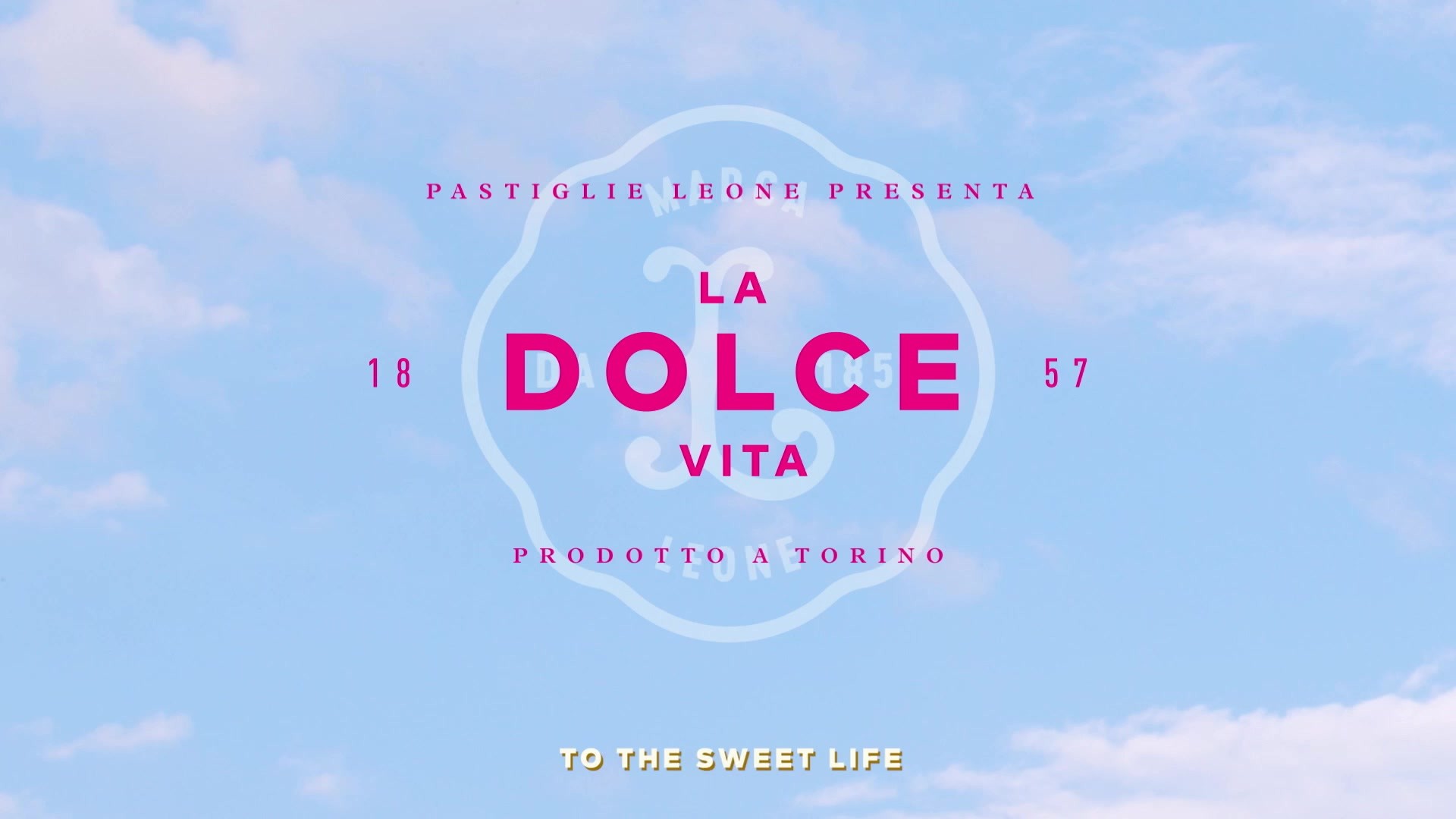
LEONE PASTIGLIE - LA DOLCE VITA
DESIGN BRIDGE AND PARTNERS, London / LEONE PASTIGLIE / 2024
Overview
Credits
OVERVIEW
Why is this work relevant for Design?
Reinvigorating an Italian national treasure, Leone’s rebrand defines the next chapter in its history, capturing the rich heritage of a loved iconic brand, infused with decadent Italian craft and contemporary quirks. The design communicates Leones core promise to customers; the rediscovery of a world full of exploration and discovery, enticing and inspiring all the senses with indulgence and a magical joy. The reimagined, unique visual identity has successfully captured the wild imagination behind the brand, loved by consumers and trade around the world.
Is this product available for purchase?
Leone’s rebranded portfolio of products is available online through their website. Leone now appears in retailers across every region of Italy, featured on the shelves of 7675 stores across Europe, from The Westin Palace Hotel in Milan, to the Le Fromager des Halles in Paris and has a growing presence across the United States too.
Please provide any cultural context that would help the Jury understand any cultural, national or regional nuances applicable to this work.
Founded in Turin in 1857 by Luigi Leone, Pastiglie Leone was acquired by Michela Petronio and Luca Barilla in 2018, changing hands from one historical Italian family to another. Their goal was to rejuvenate the 160-year-old brand while preserving its authentic artisanal heritage. With plans for global expansion and e-commerce growth by popular demand, the rebrand aimed to uphold Leone's high – end, Italian, premium appeal to compete with the most desirable regional and international confectionery brands. The rebrand seeks to visually unify Leone's diverse portfolio while honouring its rich heritage, ensuring its legacy for future generations. At a time of ambitious brand growth, a new factory is being built, blending ancient confectionery techniques with cutting-edge technologies for a seamless transition, Leone’s reinvigorated identity came at time of huge investment to propel the brand into the future.
Background
The idiosyncratic brand has always been loved by Italians, but as the love for Leone spread around the world, practical issues (lack of brand awareness and visual inconsistency) were becoming a hindrance for the brand and growth. The brand needed to change, but without changing a thing.
By diving into the history and beautiful family story of Pastiglie Leone we discovered that the solution was within their DNA. Leone’s rebrand captures the rich heritage of a loved iconic brand, future proofing it for younger audiences and market expansion. Leone has been reimagined with the same enticing character, elevated to a global delight. A sweet world full of exploration, Leone seeks to inspire all the senses with indulgence and magical joy, inviting all to revel in it’s timeless charm.
Describe the creative idea
Capturing the wild imagination of Leone, the surprising and innovative flavours, the detailed, intriguing, and idiosyncratic pack designs are brought to life through the creative idea ‘Sensory Escapism’. As the antidote to all the stresses, anxieties, and uncertainty in the world consumers yearn for moments of pure happens that allow us to escape, even for a short moment. Only a real dedication to creativity and craft can give all consumers the truly transportive experience that they deserve. Masterfully uniting a complex portfolio steeped in heritage and nostalgia, the creative idea helps to tactically target a range of audiences. By transforming the portfolio architecture and product navigation into four key persona pillars, Sensory Escapism brings clear design rational for each consumer mindset and core consumption occasion. The extensively joyous portfolio appeals to new markets and retailers with greater consistency, expressed with Italian flair.
Describe the execution
As one of the most iconic Italian family manufactures, an Italian sign writer’s craft brings the identity more stature and recognition. Each pack holds character and quirks inspired from a different style of street sign in Turin; bringing both iconic consistency and variety across the portfolio. Inspired by the original factory, the filigree detailing found throughout the architectural ironwork is reflected on the packaging as a further mark of regional quality and decadence. The introduction of Luxor Gold foiling brings an elegance and quality to the much loved sweets, elevating the visual aesthetic in-line with the historic artisanal production of the confectionary.
List the results
+10% business growth VS 2022
+40% sell – in VS 2022
5500 retail points reaches with assorted displays
LinkedIn post from the Leone Brand:
We share with great enthusiasm the double-digit growth figures for our company, with the words of our CEO, Massimo Pozzetti:
"Driven by rebranding and a well-defined commercial strategy, we have affirmed our leading position in super premium Confectionery. The company is experiencing a period of extraordinary growth and expansion, driven by the iconic pastilles, both in Italy and in the rest of the world.”
The reconfirmation by NielsenIQ of the certificate for the highest retail sales in value on the Italian market in the pastilles segment.
More Entries from Rebrand/Refresh of an Existing Brand in Design
24 items
More Entries from DESIGN BRIDGE AND PARTNERS
24 items