Design > Brand Building
THREDD - WEAVING PARTNERSHIPS
DESIGN BRIDGE AND PARTNERS, London / THREDD / 2024
Overview
Credits
OVERVIEW
Why is this work relevant for Design?
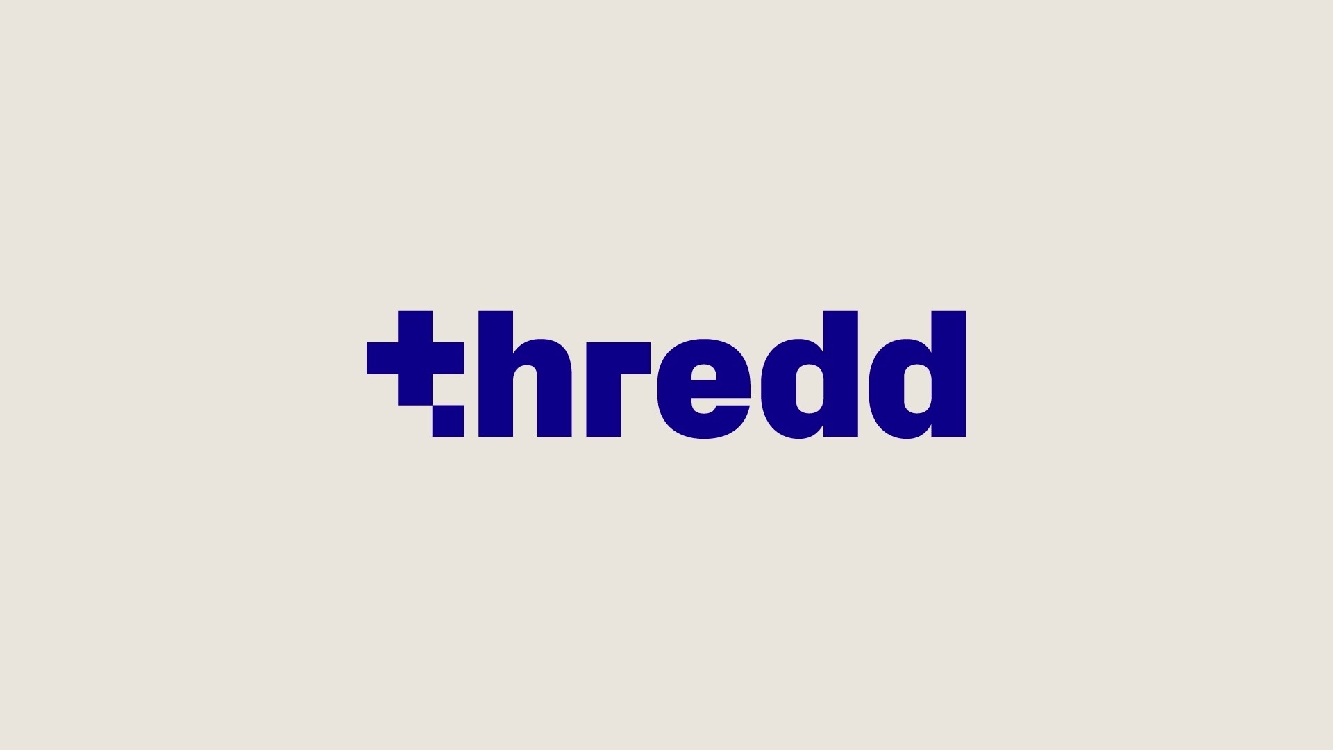
Thredd: a new name and visual identity all about weaving partnerships in fintech.
Background
Rebranding Fintech’s trusted payments partner:
Global Processing Services had been at the heart of the digital finance revolution since 2007. As the trusted technology partner for the world’s leading fintechs and challenger banks GPS processed billions of transactions per year, working hand-in-hand with their innovative clients, such as Revolut and Starling Bank, to create ground-breaking payments products and experiences.
With recent investment and growth GPS needed a new name and visual identity to match their long-held reputation as the leading paytech partner.
Global rebrand: new name and visual identity.
Describe the creative idea
We drew inspiration from the history of computing: In 1804 the Jacquard loom revolutionised the weaving industry, it used binary code patterns on interchangeable punch-cards to automate the process. This weaving technology directly influenced the first programmable computers.
We renamed the brand Thredd and created a visual identity all about weaving partnerships.
You can’t weave with a single thread, for every vertical ‘warp’ there is a horizontal ‘weft’ coming together to create a stronger whole. Thredd work in close partnership with their clients to create tailor-made tech solutions. Every partnership is different, but Thredd is the common thread.
Woven patterns represent Thredd’s many partnerships. We digitally generated a multitude of binary code brand patterns. Thredd is represented by the constant dark blue vertical threads while the variable, brightly coloured horizontal threads represent their innovative fintech partners.
Describe the execution
Woven patterns represent Thredd’s many partnerships. We digitally generated a multitude of binary code brand patterns. Thredd is represented by the constant dark blue vertical threads while the variable, brightly coloured horizontal threads represent their innovative fintech partners.
The colour palette can adapt to the brand colours of Thredd’s clients for specific partnership applications.
Individual patterns can feature one partner colour or multiple partners, and bespoke one-off patterns are created for visual storytelling.
Many individual patterns can come together to form a tapestry of partnerships representing Thredd’s full spectrum of work.
The patterns can reduce down to square glyphs and the typeface, icon style and layout principles echo the square grid of the binary patterns.
List the results
The brand has been enthusiastically received by Threddsters, their customers and potential employees alike.
2023 delivered the best performance in company history. Thredd expanded its existing customer base, increasing transaction growth across several regions. In a difficult year for the industry, Thredd’s organic growth from existing customers in Europe/APAC increased 20%, and new client sales tripled.
Thredd expanded geographically (Japan, Australia, Hong Kong, Singapore, Thailand, Malaysia, New Zealand, the Philippines and US) and experienced exponential growth across various industries, with a record-breaking 150% increase in new sales. The rebrand also renewed Thredd’s focus on securing the support of ecosystem partnerships such as Visa and Mastercard.
“Rebranding to Thredd marks a new era for our company as we begin the next phase of our growth… our new brand reflects our renewed focus on enabling our clients to create a more interconnected, accessible, and seamless payments ecosystem” Kevin Schultz, CEO.
More Entries from Rebrand/Refresh of an Existing Brand in Design
24 items
More Entries from DESIGN BRIDGE AND PARTNERS
24 items