Cannes Lions
An unusually caring bank
NORD DDB, Stockholm / SBAB / 2020

Overview
Entries
Credits
Overview
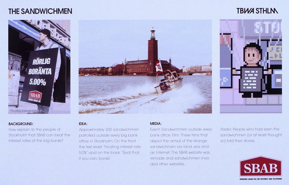
Background
In a world where "The Bank" is perceived as a greedy, blurry "necessary evil", SBAB has always challenged… With honesty, caring, transparency and credibility.
Positioned primarily as a mortgage player, SBAB has developed its offering in recent years. By now including Booli (Houses for sale + historic sales data) and Hittamäklare (“Find a real-estate agent”) - an ecosystem of services with relevance throughout the house-buying-ownership journey is created. In this way, SBAB lay the foundation for better “housing” decisions and achieve a more sustainable personal financial situation.
Also, SBAB was challenged by other niche banks (and brokers) offering lower interest rates, and it was necessary to clarify SBAB's role, create greater preference and "direct lenders".
The brief was not only to embrace the new brand position, but also to create an identity that could visually link all brands, and thereby position SBAB beyond just an interest rate level.
Idea
Through ethnographic in-home visits, consumer diaries and quantitative studies, a key insight emerged: Not only did consumers feel that the banks are never on their side, most feel that they are unable to understand not only what they can afford to live in today, but also how their housing can evolve. That they need someone to both teach them and to provide clarity on how to achieve personal financial sustainability. A friend.
And through that emerged an SBAB as the unsually caring bank – helping customers make better and more informed decisions about their living and housing: Through transparent loans, pedagogical explanations, access to all housing sales data and stats on real estate agents performance and sales records.
So how do you make a bank appear unusually caring without ending up with the usual faces of happy bank employees and smiling customers?
Execution
• The strongly recognized orange color was modernized. Constantly present but used in a more eclectic and sophisticated way.
• The exclamation mark went from being part of a wordmark to becoming a stand-alone symbol - embracing everything that is SBAB and charges it with more self-confidence and playfulness. And in its functional role, it connects all brands in the ecosystem.
• The playfulness of the symbol's "homemade” shape humanizes the brand down to the icons where elements of the exclamation mark are found in content or form.
• The exclamation mark is also found in the illustrations and in combination with the illustration style manages to capture SBAB as the caring friend.
• And the custom font used accentuated ink traps to connect the font to the symbol and give it character
Outcome
SBAB.se traffic has grown by 21% and Booli.se traffic by 47%. Traffic between the sites show equal results:
• Traffic from Booli to SBAB has increased by 41% and for new visitors to SBAB.se by 50%.
• Commercially, during the same period, the conversion has increased by 54% for Renewal Applications and 29% for New Loan Promises.
• Traffic from SBAB to Booli has increased by 46% during the same period, with 39% more visitors filling in the valuation form and 42% more staying more than 10 minutes at Booli.
• The user experience has also increased as the app's rating in the app store since the launch of the new brand profile has risen from 4.4 to 4.7 in customer ratings.
• The measured accessibility of SBAB's channels (measured by Google Lighthouse) has also increased from 57 to 90 since its implementation.
Similar Campaigns
12 items