Cannes Lions
BATTERIES
GREY WORLDWIDE INDIA, Mumbai / DURACELL / 2015
Awards:
Overview
Entries
Credits
OVERVIEW
Execution
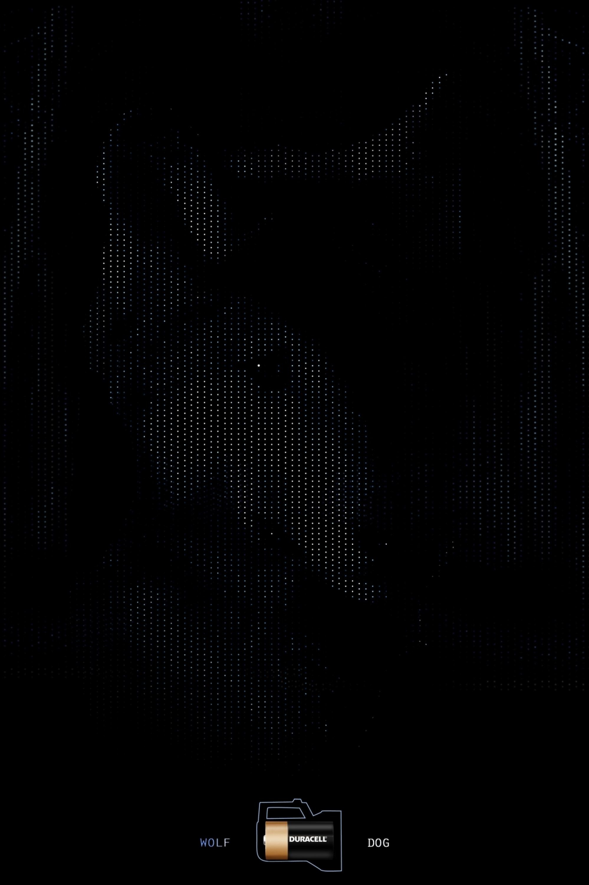
THE IDEA: Everything has a positive and a negative, even the longevity of Duracell Batteries. So if a toy or a gadget keeps going, then it’s good in some ways but bad in others.
THE DESIGN: As most people know, Duracell Batteries’ iconic design keeps the Positive in Copper and the Negative in Black. What if these colours could be a code to what’s good or bad in the device? Here, each ad tells a Positive and Negative story through just two colours: Copper and Black. We made the ads in the same proportions as the actual battery and also placed the Positive and Negative symbols exactly in the same position as they appear on it. The art direction was kept graphic and simplistic. And because Duracell’s battery design is so well known, we didn’t need to use the logo.
Outcome
This was the third rendition of an already popular campaign and it got all the attention and popularity it deserved.
Similar Campaigns
12 items


