Cannes Lions
'Collisions Typestyle'
UNBOUND, London / HAMMERSON / 2024

Overview
Entries
Credits
OVERVIEW
Background
The brief was to come up with a look that represented 6 UK shopping centres under the Hammerson brand, that had consistency, as well as flexibility.
The shopping centres each house 100’s of brands. Every brand has its own unique design and typography. Each different from the other.
So what do you use typographically for a group of shopping centres that house these brands in 1 place?
Answer: You use ALL of them.
It represented a diverse retail offering, as well as the diversity in our UK culture.
That’s why 'The Collision Alphabet. The A-Z of brands' worked perfectly.
Execution
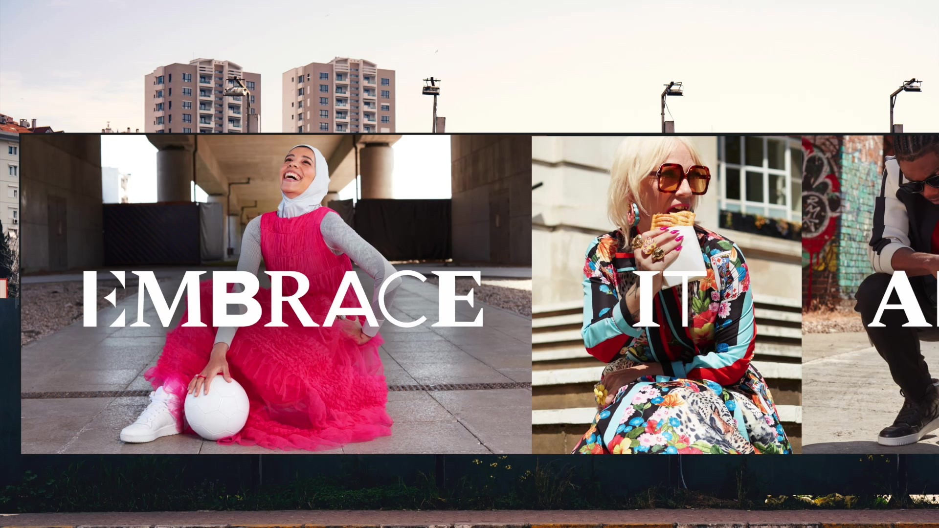
The typography style is inspired by the 100’s of iconic fashion brands that we all know and wear every day.
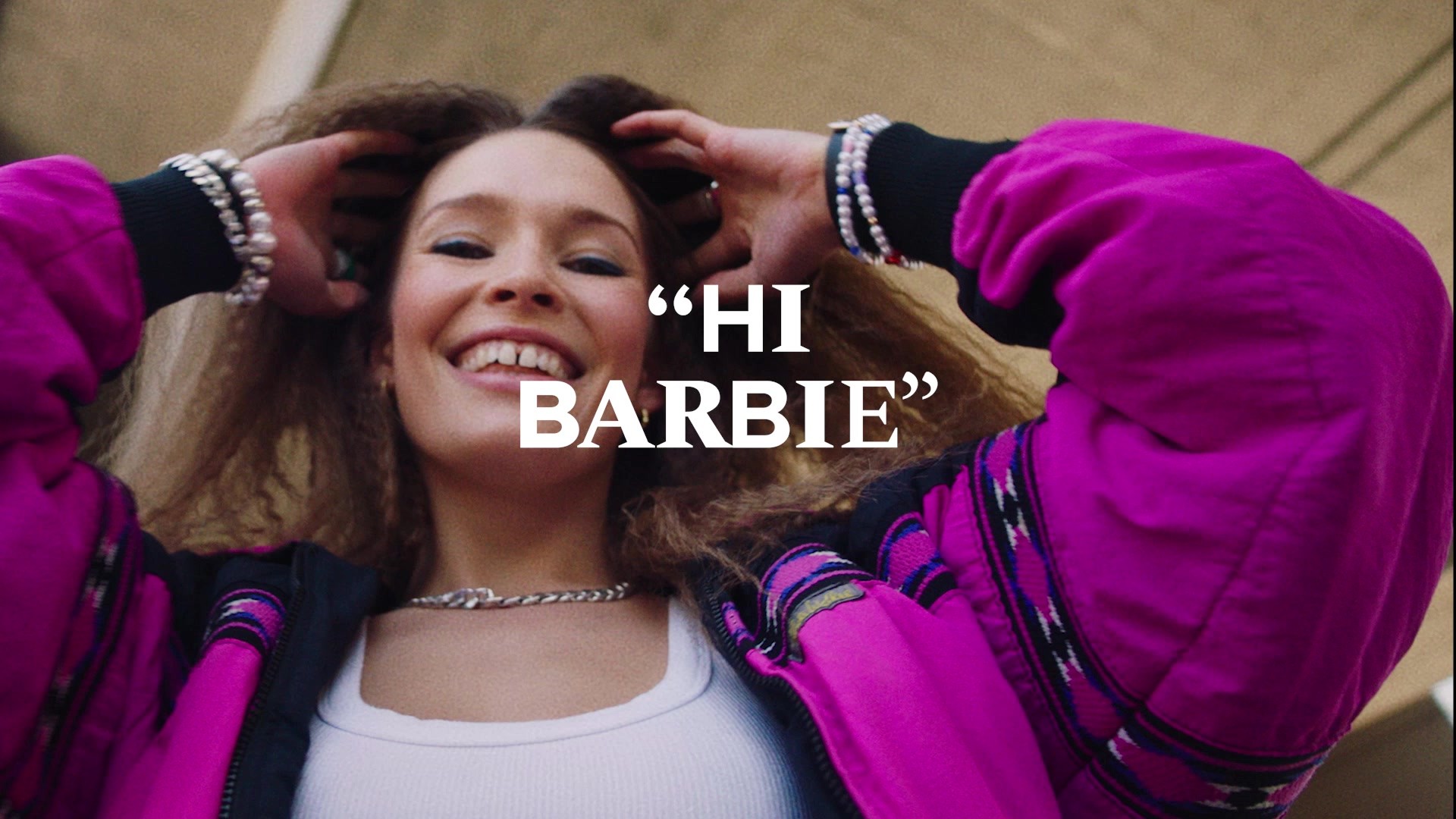
We created a impactful headline alphabet that incorporated the characteristics of their brand’s typographic features into one style, that represents all the brands in one place. A style that’s unique every time you see it, and is defined by the diversity of brands within.
Each character has a variety of fonts to choose from giving the brand an infinite number of options. A style with diversity built into its core. That’s why we created the 'The Collision Alphabet'.
Similar Campaigns
9 items


