Cannes Lions
CORPORATE DESIGN
JAEGER AND JAEGER, Uberlingen / JAEGER LECOULTRE / 2012

Overview
Entries
Credits
Overview
Description
To redesign the corporate design of the agency.
Execution
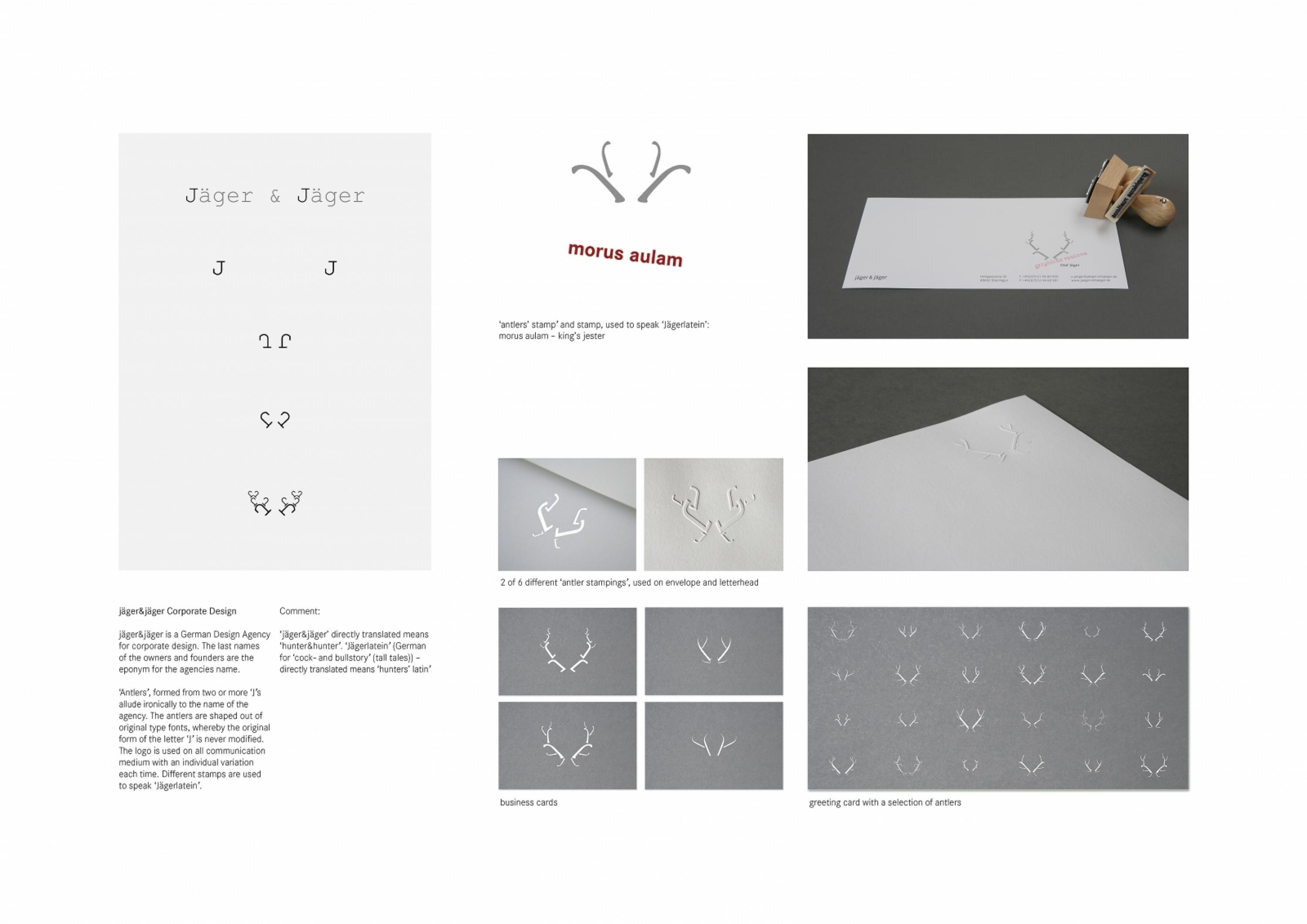
Antlers formed from two or more ‘J’s allude ironically to the name of the agency. The antlers are shaped out of original type fonts, whereby the original form of the letter 'J' is never modified.
The logo is used on all communication medium with an individual variation each time. Different stamps are used to speak 'Jägerlatein'.
Outcome
We have had many positive, even enthusiastic responses, but sorry, it is too new.
Similar Campaigns
12 items


