Cannes Lions
HSBC Global Rebrand
SAATCHI & SAATCHI, London / HSBC / 2019


Overview
Entries
Credits
Overview
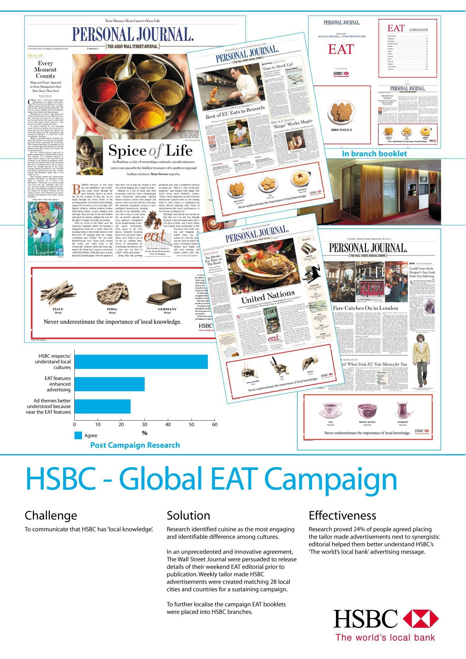
Background
In 2017 HSBC had a problem to combat - its identity was fractured and inconsistent. Across markets, products, sub-brands and business lines there was no common identity. Logos appeared differently depending on the context, colour palettes varied, user journeys were confused and some parts of the business looked like other companies altogether. This led to a mass of inconsistent branding that failed to unite HSBC globally as a brand. As a result, there was a lack of pride in the icon at the heart of the business.
The brief was to create a simple and consistent identity that could transcend borders and business lines. It needed to flex to let the different sub-brands have their own look, but still feel part of the same family. The ultimate aim being to create something that would be instantly recognisable and restore the prowess of one of the world’s great banks.
Idea
The approach was to simplify the brand, make it work and then make it iconic. This was done by elevating HSBC’s red hexagon to be the main feature of the logo. By using the hexagon as the cornerstone of the brand, a simple identity was created that meant consistency across regions, sub-brands and propositions. The also hexagon became something through which HSBC could live its brand promise of Together we thrive as a global symbol of prosperity. This was achievable by treating the hexagon shape as a lens to thrive. When laid over the top of imagery it could become a window into a prosperous alternative and tell positive stories by comparing a current reality with a more prosperous version made possible by HSBC. From trade and sustainability to education and inclusion, HSBC’s programmes and beliefs could be represented through the shape of its own logo.
Execution
Using the hexagon, as a design asset and as a window to prosperity soon appeared across all touchpoints globally. From app loading screens and social media to branches, brochures, DOOH and TV. It created a consistent, relevant and flexible asset that has been applied to over 130 different topics so far. Local markets have been able to tell their own local prosperity stories too - whether that be emerging street art in Hong Kong or innovative tech companies in LA, each market could tell bespoke stories within the lens of the hexagon shape.
Similarly, this was applied to the HSBC sub-brands by treating the hexagon as the front door to the brand. Although each sub-brand had its own unique identity, the main asset at the centre was the hexagon. Each sub-brand hexagon reflects the strategy and core principles for that particular audience whilst maintaining consistency as a family.
Outcome
Creating a simplified identity for HSBC has enabled the whole business to get behind a symbol that works across markets and channels and also can be used to represent their global strategy of prosperity. They now have a consistent way of making all parts of the business align and an icon in the use of the hexagon to rally behind.
The hexagon as a lens to thrive has a massive cultural reach, traversing subjects from business, sport, food, art, religion, energy, education and tech across 11 markets. From Melbourne to Montreal the thriving hexagon is a visible symbol of prosperity in airports around the world.
In the latest Brand Finance report, HSBC’s brand value increased by 10%. Whatever criteria brand value is measured by, one thing is clear – that HSBC’s new identity gives them a symbol to be proud of and the ability to compete in a digital world.
Similar Campaigns
12 items