Cannes Lions
KID'S MEALS
BLACK RIVER F.C., Johannesburg / NANDO'S / 2010
Overview
Entries
Credits
Overview
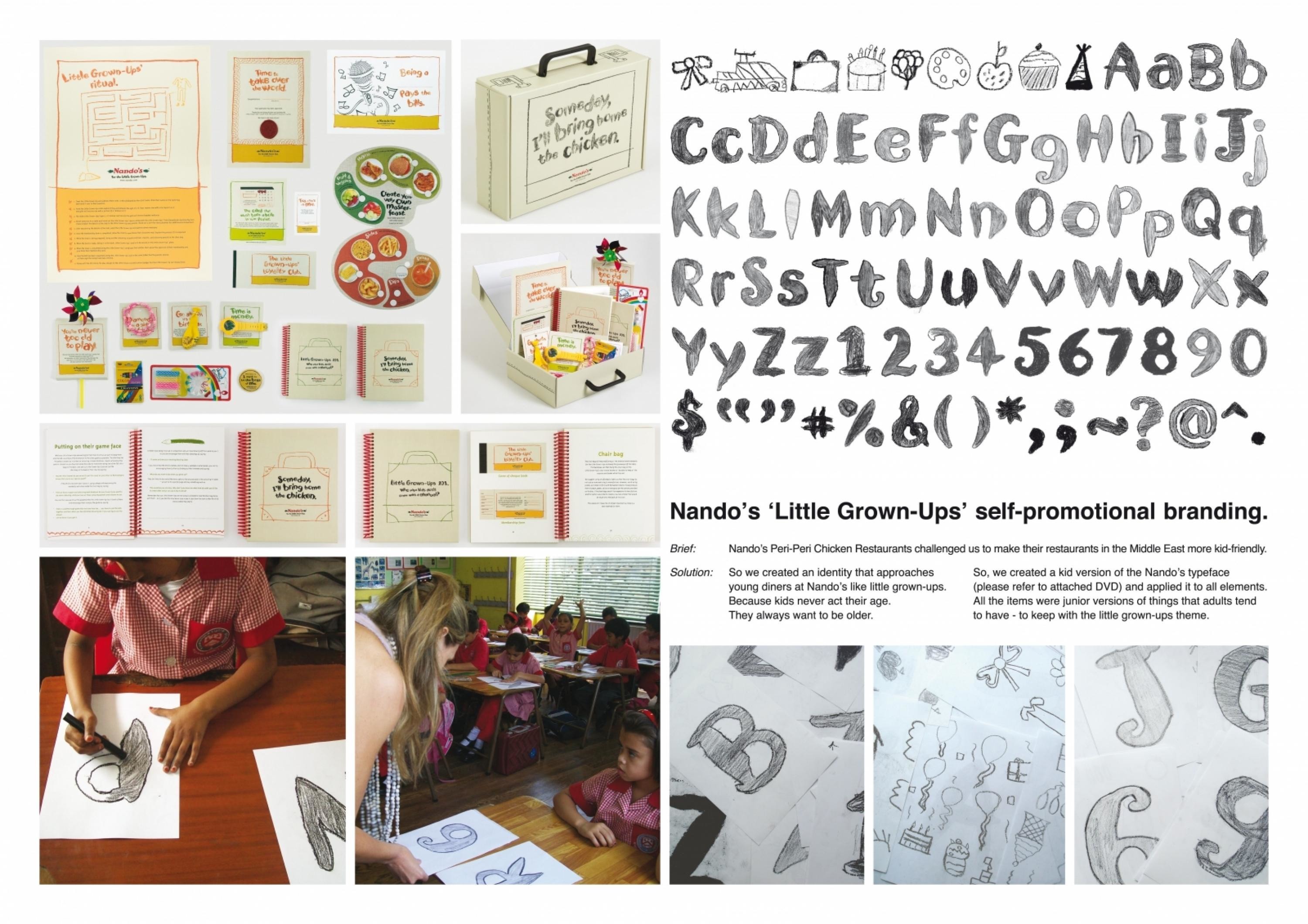
Description
Nando's restaurants in the Middle East, wanted to increase their appeal to families. (More bellies means more people enjoying their delicious chicken).
Execution
Our approach was to create an identity that approaches young diners at Nando’s like little grown-ups. Because kids never act their age. They always want to be older.
So, we created a kids version of the Nando’s typeface (please refer to attached DVD) by visiting a local primary school and having the kids colour in the Nando's proprietary typeface for us. This was applied to loads of interactive goodies (including the menus) for kids could enjoy while waiting for their food.
Outcome
It's a font - so far all applications of it have been succesfully applied to all printed material.In terms of the actual communication - it has only been in place this month so no results are available as yet.
Similar Campaigns
12 items