Cannes Lions
SKI RESORT
HORNALL ANDERSON, Seattle / MAMMOTH MOUNTAIN RESORT / 2009
Overview
Entries
Credits
Overview
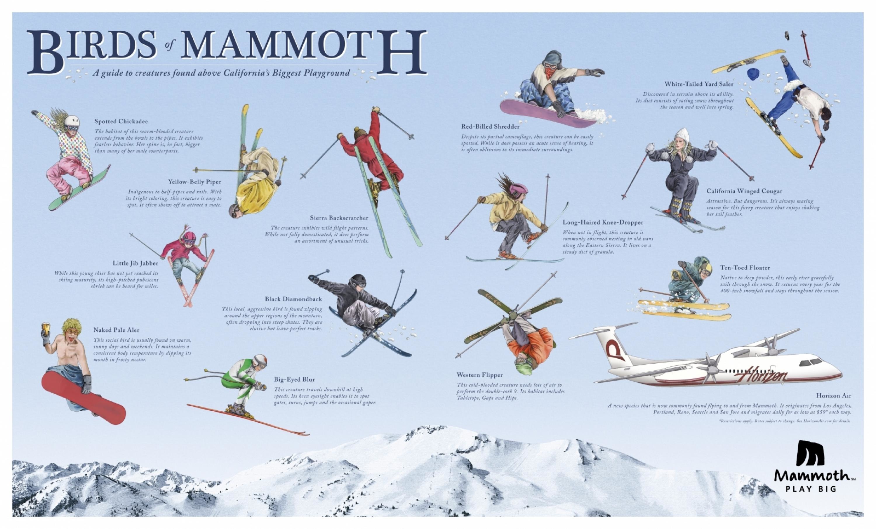
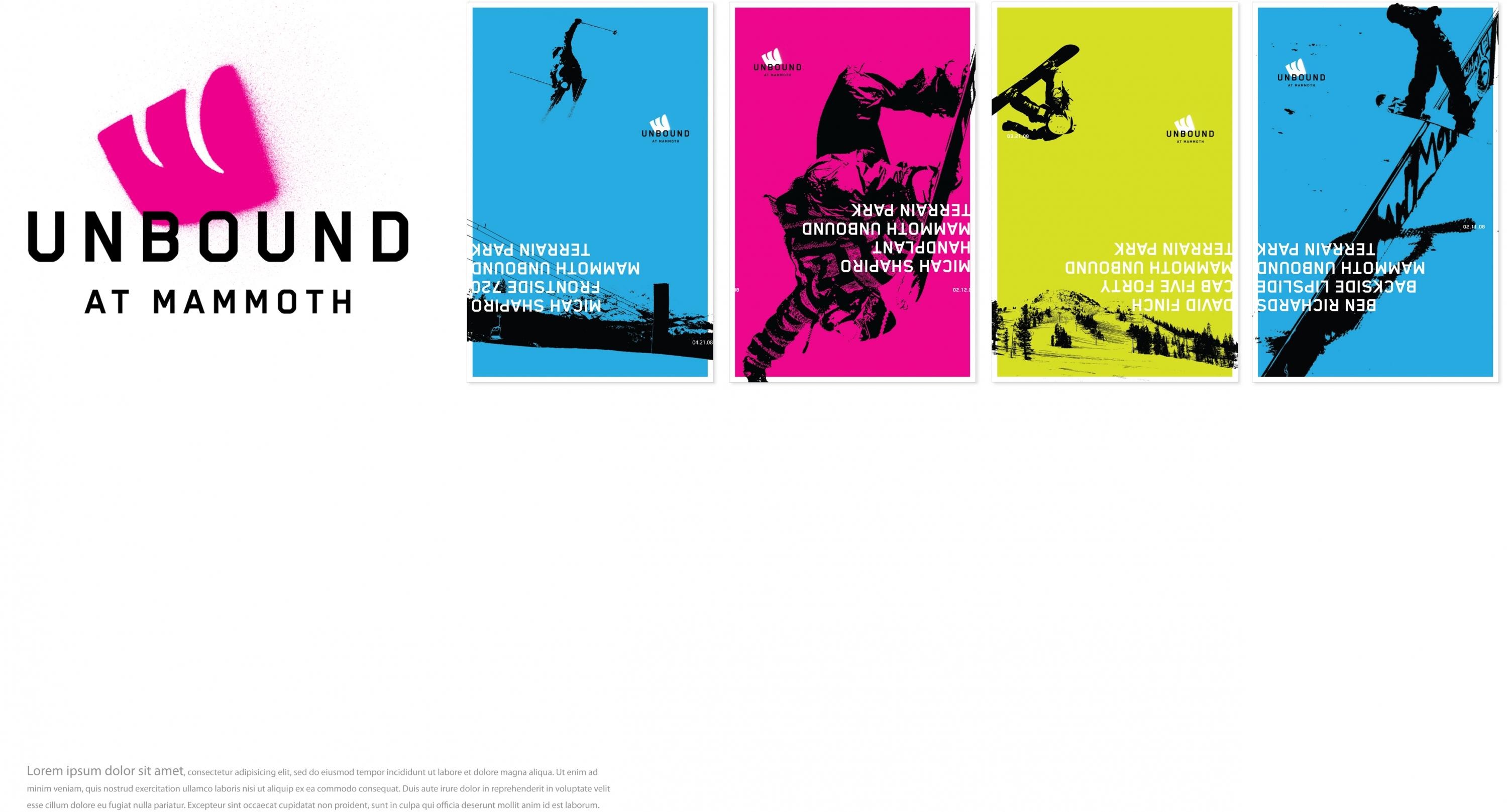
Description
Having already introduced three different logos over a span of ten years, Mammoth tasked us with creating an all-inclusive brand – identity, gondola graphics, environmental signage, posters, and business cards – that would encompass and trickle down over the entire mountain. While the initial creative scope focused solely on a visual system, we were soon asked to help execute their message, leading to a more comprehensive rebrand.
Execution
We began designing the identity as a straightforward shape with a knock-out silhouette of tusks that form an M, but from another perspective, you might see a profile of a Mammoth or perhaps a set of ski tracks- it’s all part of letting people discover their own meaning. The abstract shape lets you take away your own impression; much like the mountain experience itself. The block is more of a nod to the mountain; its uneven quality exudes a vibrant energy. We also kept the feel casual by creating a unique, handwritten typeface.
Outcome
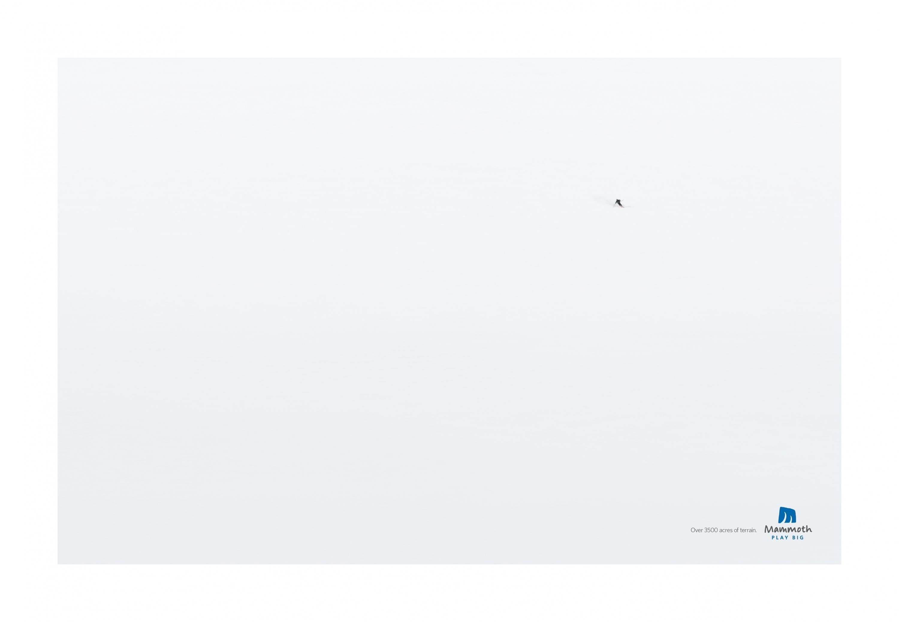
The re-brand helped elevate Mammoth as a more international ski destination.
Similar Campaigns
11 items