Cannes Lions
SODA
GOODBY SILVERSTEIN & PARTNERS, San Francisco / PEPSI / 2010
Overview
Entries
Credits
Overview
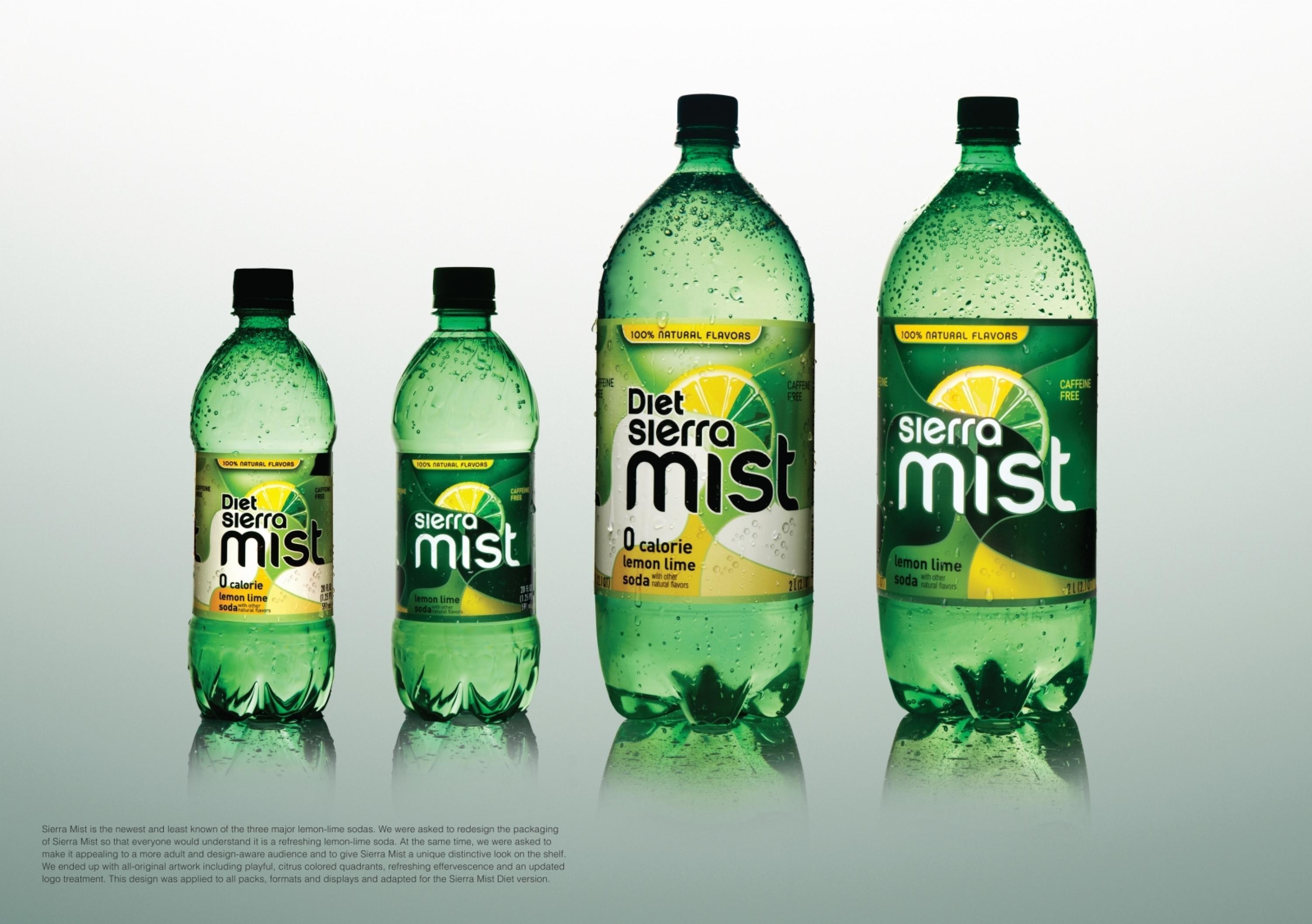
Description
We were asked to redesign the packaging of Sierra Mist so that everyone would understand it is a refreshing lemon-lime soda. At the same time we were asked to make it appealing to a more adult and design-aware audience – an audience that rejects the kiddy, punchy and cartoonish lemon-lime designs of 7Up and Sprite.
Execution
We started off with a more complex tile-design repeating the different elements mandated in the brief and we progressively evolved to a simplified, softly balanced, elegantly rounded set of puzzle pieces. We ended up with an all-original artwork including playful, citrus coloured quadrants, refreshing effervescence and an updated logo treatment. This design was applied to all packs, formats and displays and adapted for the Sierra Mist Diet version.
Outcome
The recently launched new packaging and logo has been well received by both the bottling system and consumers who appreciated its ‘clearly lemon-lime but unique look’ and described it as: “new and fresh yet retro,” “clear and crisp,” “fresh and modern.”
Similar Campaigns
12 items