Cannes Lions
TELSTRA PACKAGING
INTERBRAND AUSTRALIA, Sydney / TELSTRA / 2012

Overview
Entries
Credits
OVERVIEW
Description
From its early roots as a government division, Telstra has grown into Australia’s biggest telecommunications company, employing over 40,000 people.Recently Telstra had fallen out of favour with customers who felt that Telstra had lost relevance for them, losing credibility with key audiences including the youth. In 2011, we rebranded Telstra around the new positioning, ‘It’s how we connect’. Colour was used to represent the diversity of people, products, and services, which Telstra touches.
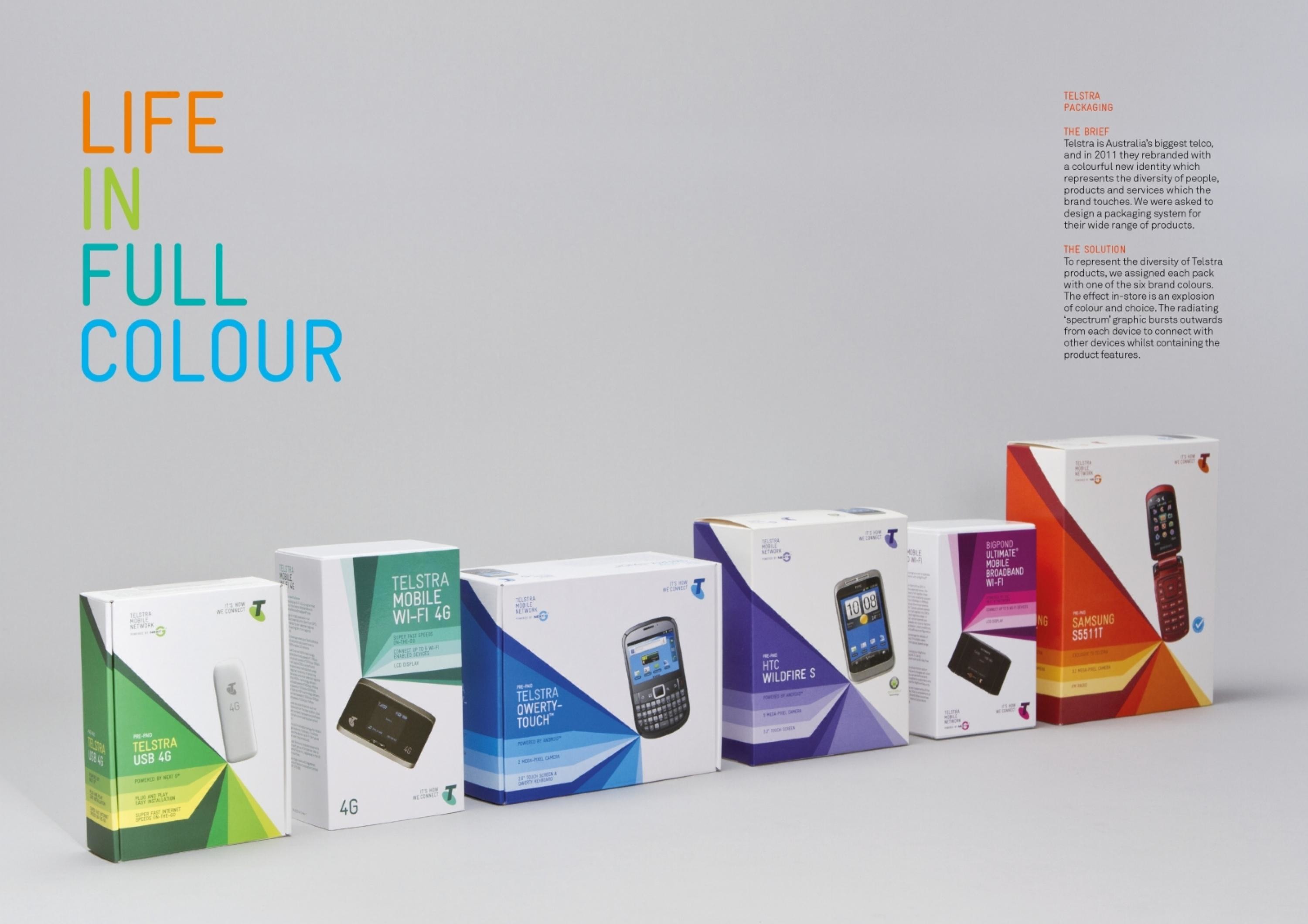
As part of the rebrand, we were asked to design a new packaging system to be applied to over 50 products of varying shapes and sizes.
Execution
To represent the diversity of Telstra products, we assigned each pack with one of the 6 brand colours. The effect in-store is an explosion of colour and choice. A key component of the new brand is the ‘spectrum’, which graphically connects all parts of the brand together. It bursts outwards from devices to connect with the things in customers’ lives. The rays of the spectrum also contain product features.
Outcome
Since launch, the new packaging has been well received by customers. Although it’s too soon after the launch to gather accurate metrics on the performance of the packs, the branding as a whole has seen encouraging results. As a significant touch point of the new branding, the packs have contributed to significant rises in customer consideration, including:-+5% Consumer consideration-+6% Business consideration-+5% non-customers-+7% youth consideration These figures represent unprecedented consideration improvements in Telstra’s history.
Similar Campaigns
12 items


