Cannes Lions
Welcome to the World of Guinness
VAULT 49, New York / GUINESS UDV / 2023

Overview
Entries
Credits
OVERVIEW
Background
Guinness is one of the world’s most iconic brands. Instantly recognisable and loved by drinkers everywhere, its black and white silhouette is justly famous.
But this level of fame can bring fixed attitudes.
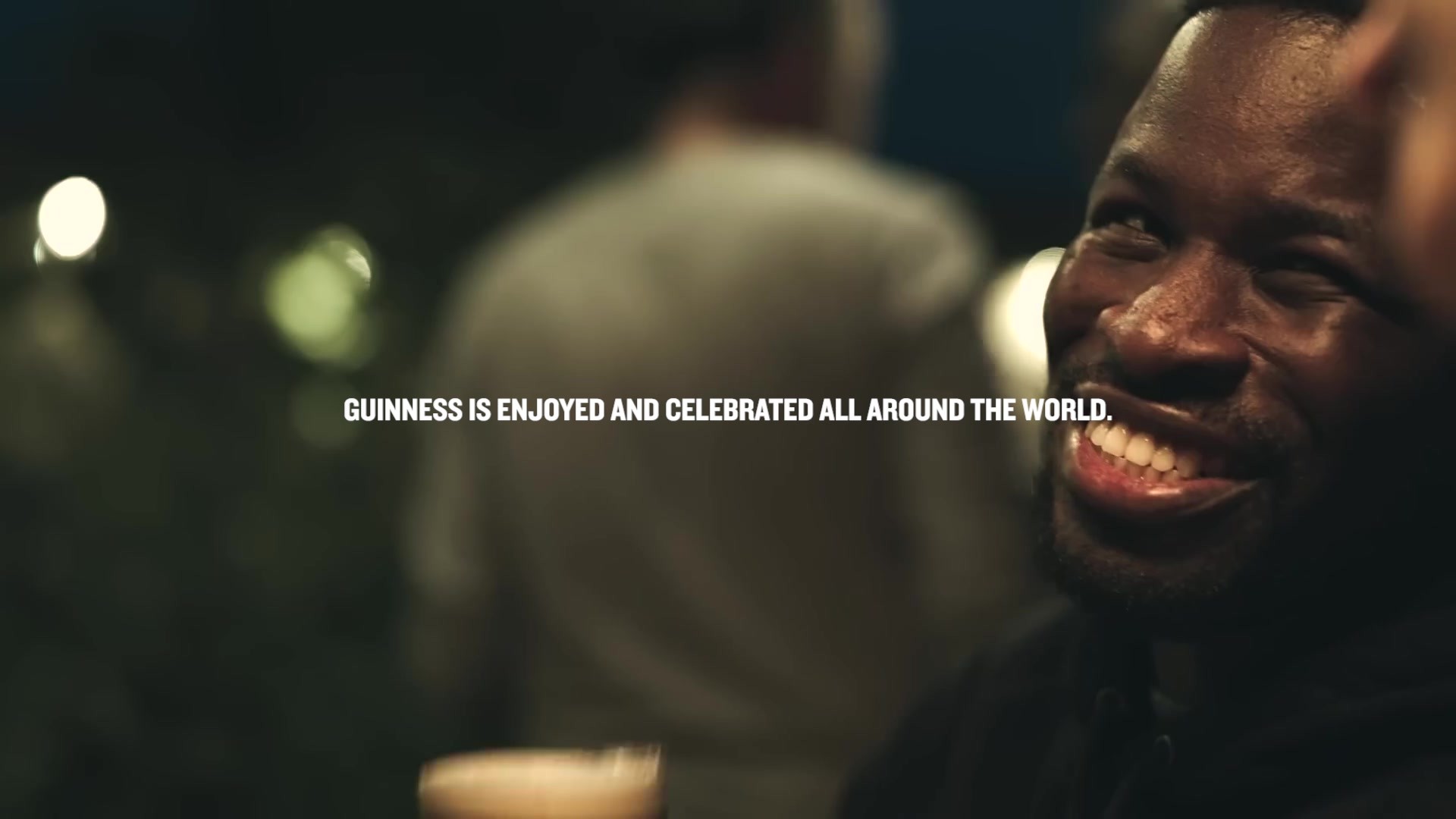
With its heavy monochrome look, many people felt the drink would also be heavy and not for them, and much of the imagery and associations with the brand had become old, masculine, and not relevant to a new, more diverse group of potential drinkers. At the same time, whilst many think of Guinness as Irish, it’s now just as popular in Lagos as it is in Limerick.
To support the next phase of brand growth, as Global Design Agency of Record our brief was to develop new design principles, visual identity, brand world, and a brand book for Guinness to reflect what it is now, not what it had been in the past.
Budget: £250k
Idea
Historically associated with older male consumers, Guinness recognised the need to connect with broader and emerging audiences – particularly women and under 35s – without alienating existing drinkers.
Our creative idea was inspired by the liquid itself. Look closely and you’ll discover that Guinness is not heavy and black, it’s full of life and colour. Surging with passion, energy, and magnetism, the textures, movements, colors, and dynamism of the unique Guinness liquids informed our design strategy.
Using design, we’ve moved Guinness from fixed to fluid, shifting the brand out of its block monochrome look and feel and into a new, globally unified world of “Glowing Gold and Vibrant Blacks”.
Our new design principles and visual identity system allow for limitless expression and executions across everything from packaging to events and sponsorships, retail and advertising, ensuring that Guinness is equally at home in physical and digital spaces.
Execution
We began by creating bespoke handmade textures using a mix of traditional and modern techniques. Set in a vibrant new colour palette, our textures dramatise the famous liquids and unique ‘surge and settle’ ritual of Guinness Draught, representing the brand’s rich history and connecting with today’s global drinkers.
Our new global brand book provides clear guidance for local markets and agency partners. Key brand assets – harp, wordmark, vibrant black and white colour palette – are at the heart, applied consistently for instant brand recognition. More flexible expressions, including the textures, typographic styling, and a framing device, allow the creation of multiple touchpoints and communications. There’s room to stretch whilst still achieving brand consistency.
From its Irish roots to the vibrant bars of Ghana, we’ve been putting our Guinness redesign into practice across everything from Key Visuals to packaging, NPD and innovation workstreams, experiential design, digital content, licensing, and beyond.
Outcome
This rebrand and our new design principles have been implemented at a time when all Guinness marketing has worked together to deliver the best years in the brand’s history.
Latest results show that:
- Guinness has gained share in markets across the world;
- Global sales grew by 32%;
- The brand became the best selling beer in pubs and bars across Great Britain for the first time ever;
- The age and gender balance has also shifted, with the female drinking base growing by 20%.
Similar Campaigns
12 items