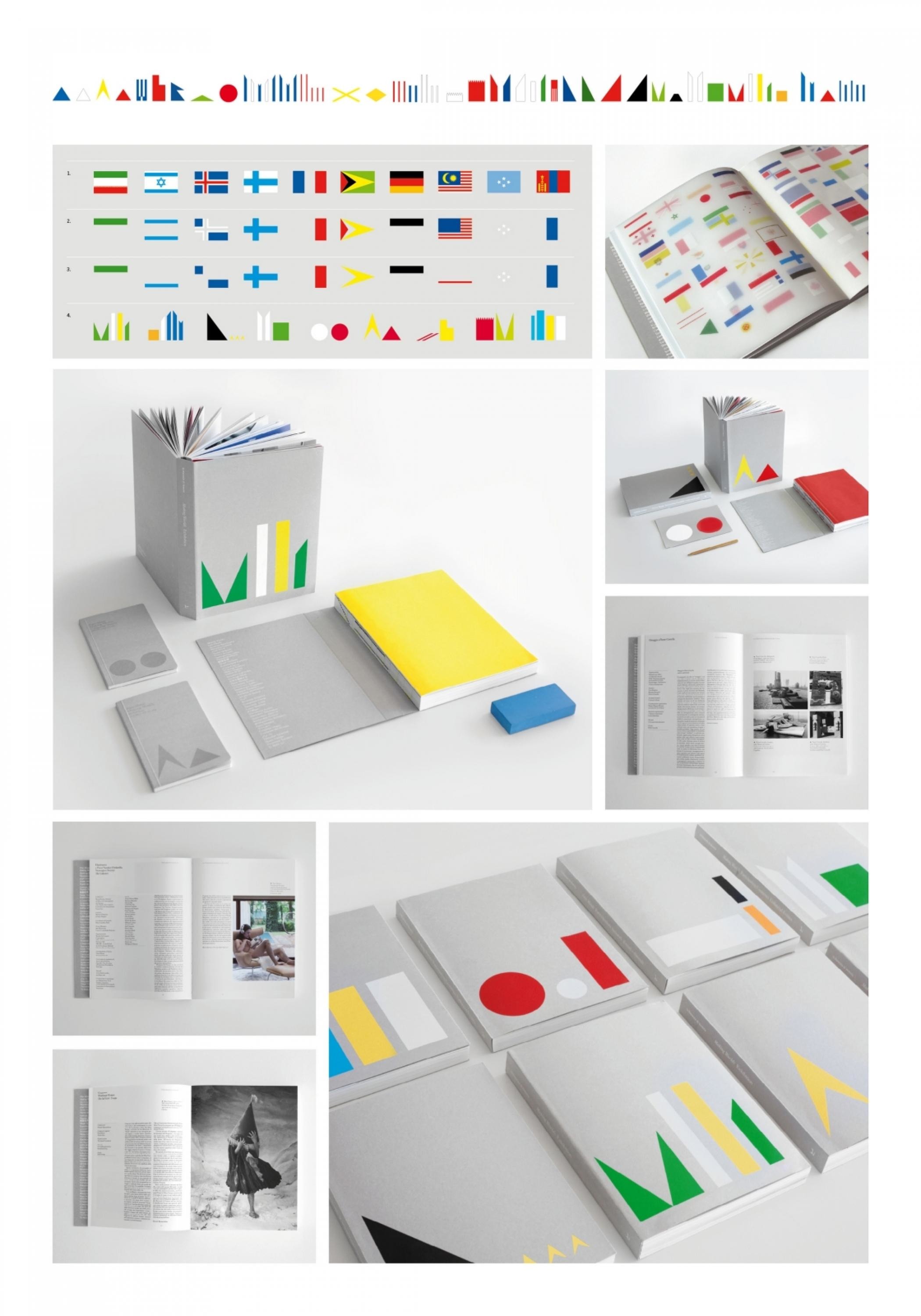
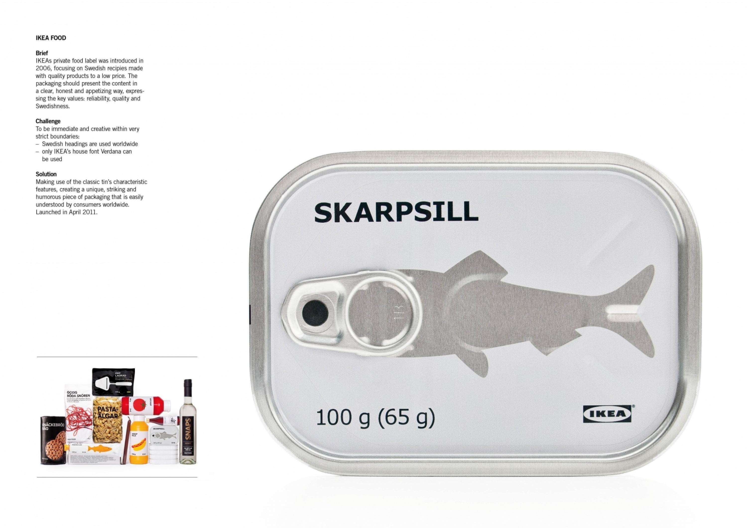
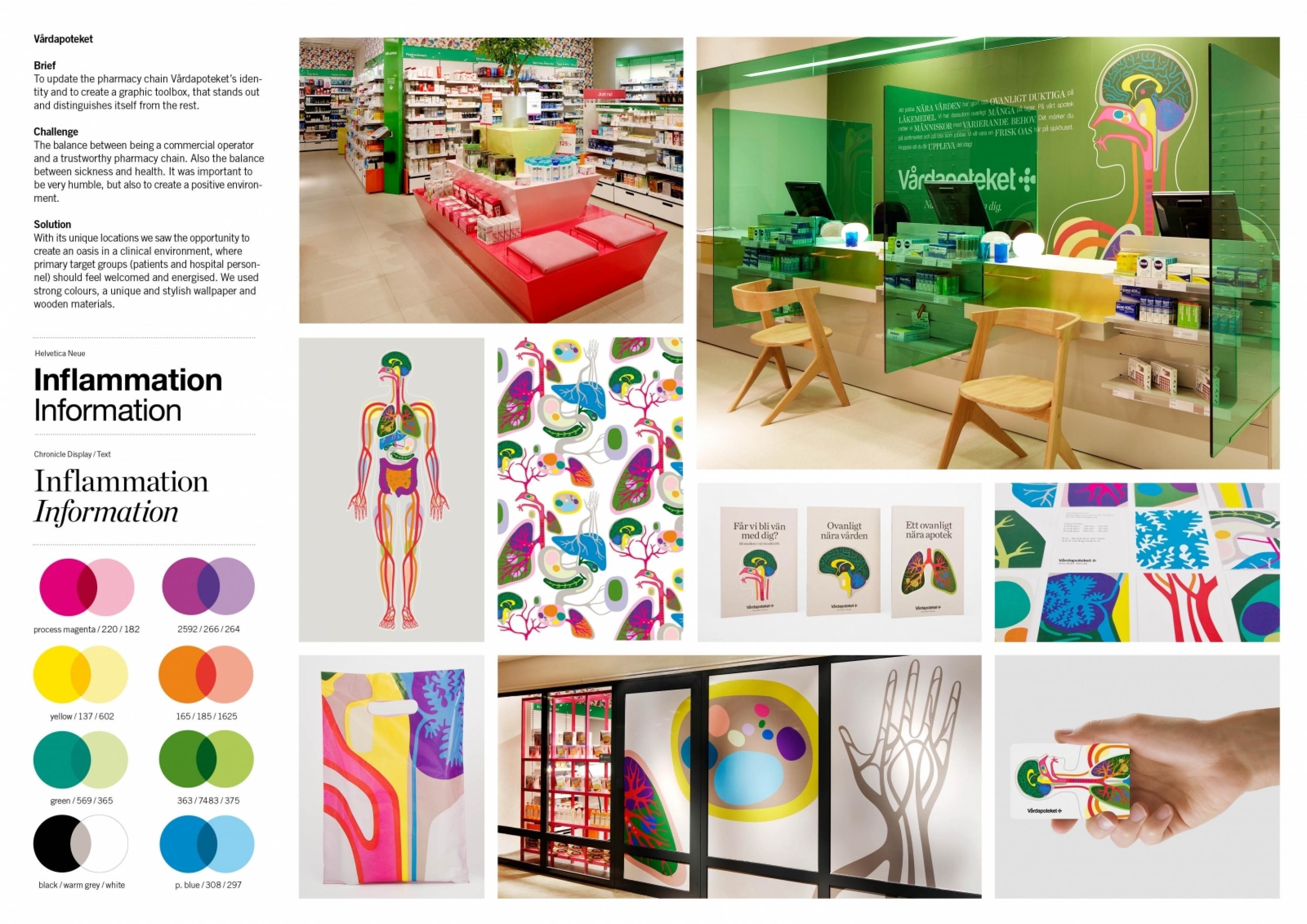
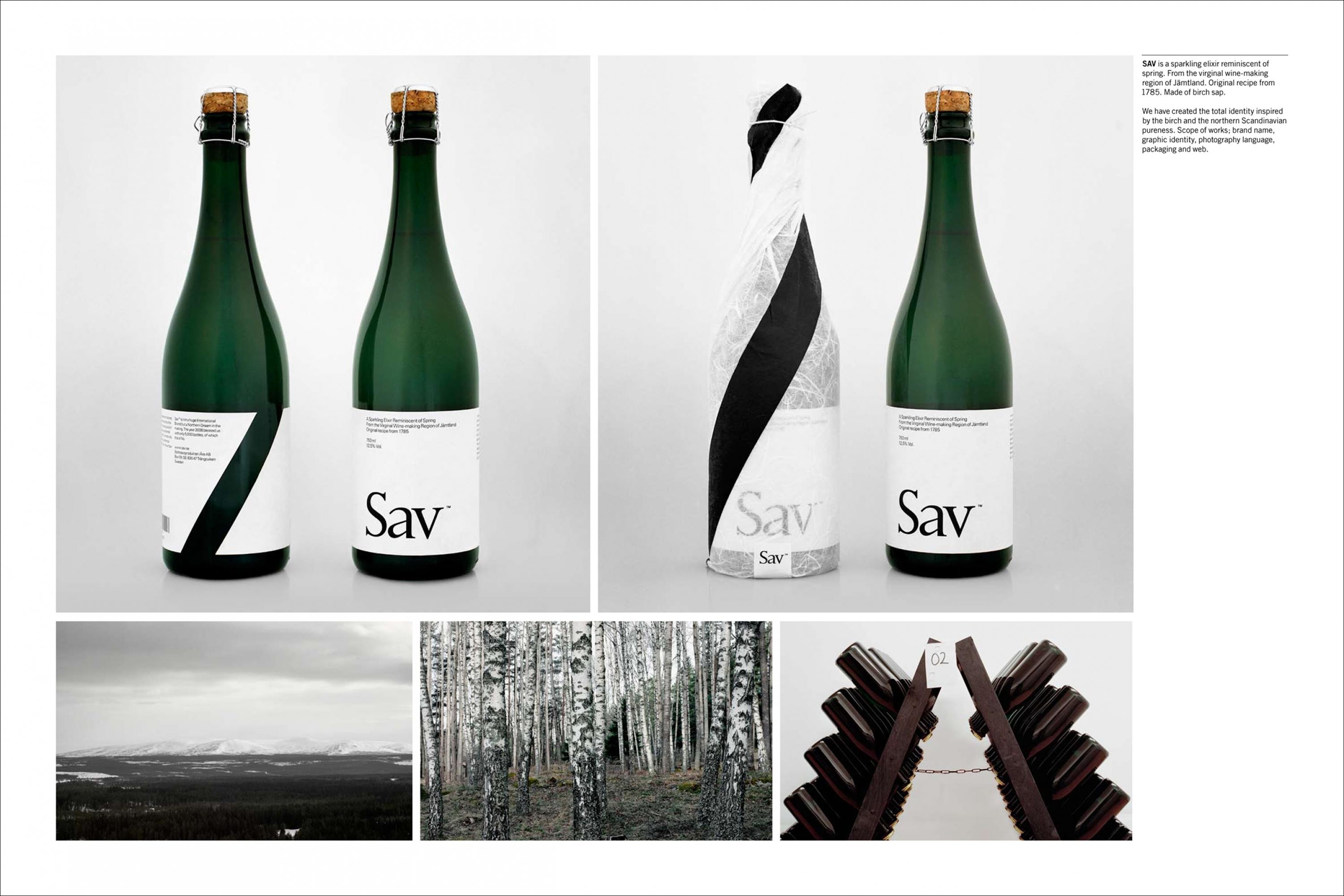
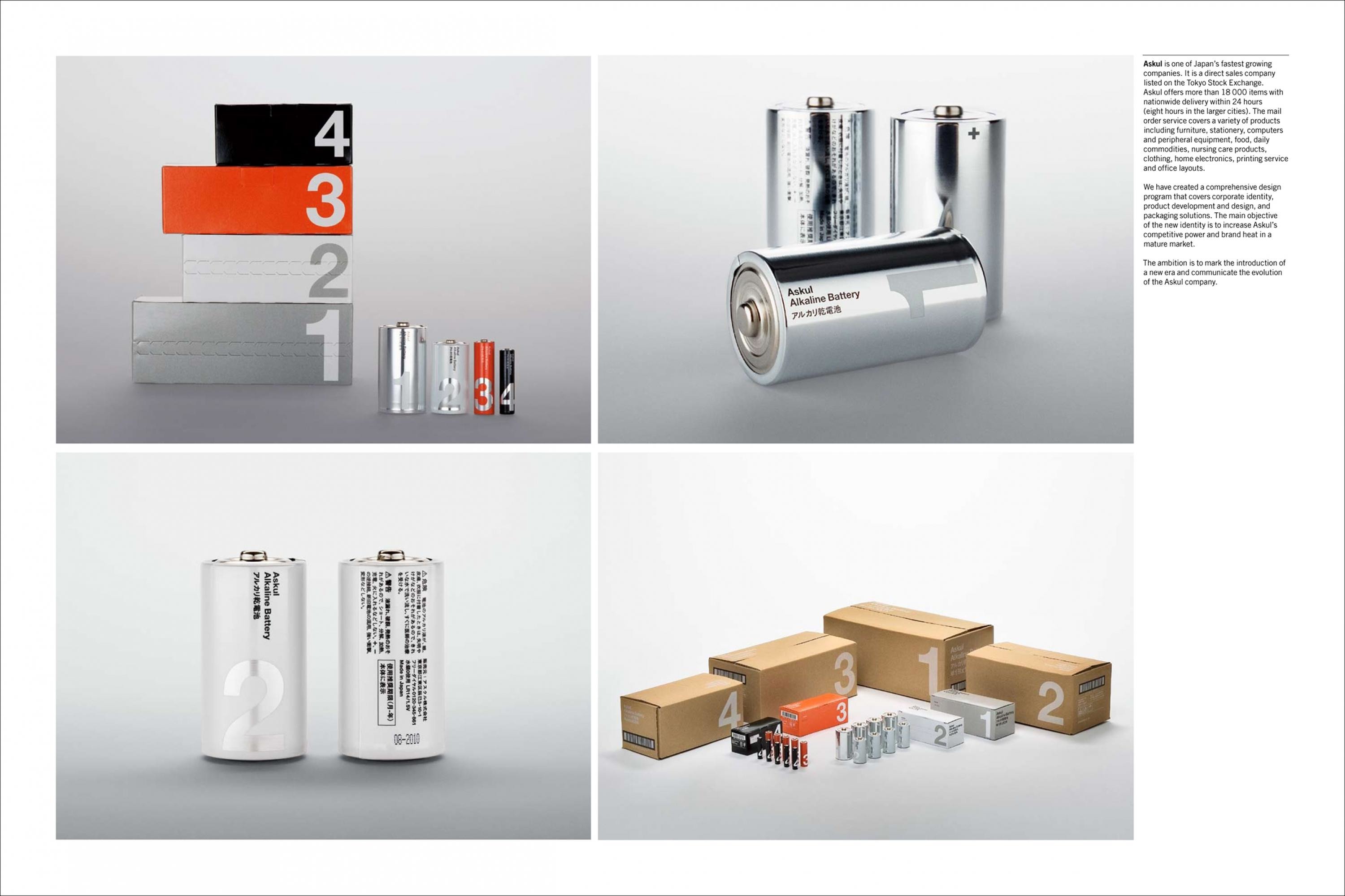
Design > Comprehensive Branding Programs

A–TO–B

STOCKHOLM DESIGN LAB, Stockholm / VENUE RETAIL GROUP / 2016

CampaignCampaignLayout(opens in a new tab)
Supporting Images
Supporting Images
Supporting Images
Presentation Image
Case Film
Supporting Images
1 of 0 items

Overview

Credits

OVERVIEW

CampaignDescription

With the vision and strategy in mind, A-TO-B was named and created for todays retail market – with the challenges and possibilities that comes with it, in store and digital. A new concept of today needs a modern identity created to live long in a rapidly changing retail environment – where digital is growing, the brand experience, store concept and offer needs to be composed, consistent and appealing to the audience. It also needs to be flexible.

The world of traveling, with maps and geography forms the basis of the creative idea of the moving logo, the symbol/fifth element that visualizes the journey and patterns reminiscent of maps and its graphic elements. There is an inherent playfulness that pervades the whole identity – based on joy. Just like the concept; the joy of traveling, dream, explore and purchase.

Execution

We created a modern toolbox; adapted for digital applications as well as useful in everything from physical objects and playful elements that can alter the expression over time. The logotype is both a symbol of our times (a conceptual intepretation of the brand with a responsive feature for digital experience) and a symbol for the concept of travelling from A to B. Instead of stamping a logotype on everything branded, we wanted to surprise the consumers in every application. We implemented the toolbox in things not obvious; shelving systems, signage format, nametags and furniture proportions. It is in the details – to hero our products. Color scheme and materials were chosen to become a calm background, but also provide tactile experiences of the brand.

Scope of work: Brand strategy and platform, Naming, Brand identity, Retail design and architecture, Signage, Packaging design, Application design, Communication system, Copy, Identity guidelines.

Outcome

The first A-TO-B locations were opened in 2015. And more stores are already in production, planned. And with a new stock of bags, accessories and knowledge A-TO-B are both happy and proud and have blow a breath of fresh air into the entire company. The objective was from the start to create a one-stop-shop, a place where customers could go and find reliable and stylish travel products. This has been much welcomed, as people no longer have to run around to different retailers to find what they need for their journeys. The retail concept has been vastly appreciated and sales have sky-rocketed.

Rewards

Silver Egg in the Golden Egg Award, Sweden

Second place in the Design of the Month prize, executed by the magazine Resumé.

Strategy

Concept: On The Move

The brand will always be on the move, seeking new things to explore and experience in the world. The brand spectates the world with open eyes and allows itself to move with it. Consumers are also always on the move and it is here, in the journey from A to B, the reason for being comes to life. Because wherever people may be heading, there is a need for their gear to help them along the way – all in one place.

Mission: To organize the mobile part of your life.

Vision: To be top of minds and in the hands of millions.

Core values: Relevant, passionate and knowledgeable

Target Group: The Traveler. On shorter and longer trips. 25-50 years. Mid- to upper middle income. People living in urban and suburban areas. Travel in business and/or to and from work. Holidays 2-3 times a year.

Synopsis

Venue Retail Group approached us with a request: they wanted to create something ‘new and refreshing’ in the bag retail market. Market research, competitive analysis and meaningful conversations with our clients soon revealed that today’s market didn’t offer any go-to locations which provided ‘everything you need for traveling’. We began looking for something new, something that could help people travel, wherever they were going.

Everything new: from concept to name, strategy to brand, identity to retail design. A place that gathers and provides great, smart and helpful products for people on the move. With this vision in mind, A-TO-B was created, and it is every little bit of its name. We built a modern, mobile and flexible brand with a clear purpose: to be there when you move from point A to point B, and every step in between.

More Entries from Creation of a new Brand Identity: Consumer / Corporate in Design

24 items

Grand Prix Cannes Lions
LIFE IS ELECTRIC

Brand Collateral

LIFE IS ELECTRIC

PANASONIC, DENTSU

(opens in a new tab)

More Entries from STOCKHOLM DESIGN LAB

11 items

Gold Cannes Lions
LA BIENNALE DI VENEZIA

Small Scale Corporate Identity Schemes

LA BIENNALE DI VENEZIA

LA BIENNALE DI VENEZIA, STOCKHOLM DESIGN LAB

(opens in a new tab)