Design > Use of Design Craft
FALTER/INFERNO
JUNG von MATT, Hamburg / FALTER NEWSPAPER / 2016
Awards:

Overview
Credits
Overview
CampaignDescription
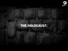
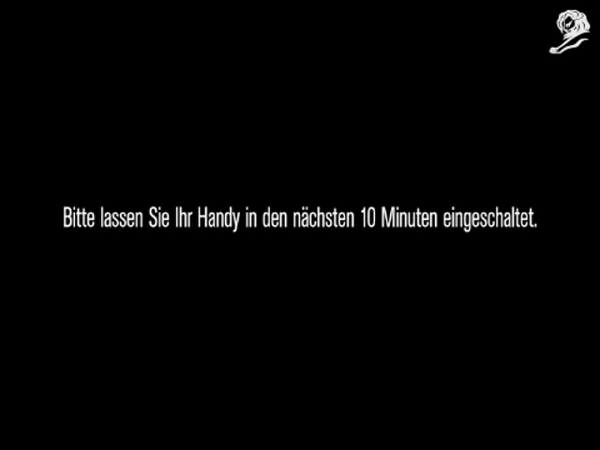
Inspired by Dante’s Inferno, we took the user on a journey through the levels of modern hell.
Each level metaphorically addresses a topic omnipresent in today’s world. Such as the addiction to smartphones, genetically modified food, freedom of speech or surveillance. The user dives deep into a dark, dystopian world, not so very different from ours. But there’s light at the end of the tunnel – it’s the knowledge and well-founded opinion Falter can provide you with.
Execution
The website was brought to life in a dark and gritty look. To get a more realistic feel, each frame was first created as a limited palette colour image and later narrowed down to black and white. It was crafted with a combination of traditional and digital media, which allowed the necessary freedom in production and animation while keeping the roughness of analogue drawings. Every background and every character was hand drawn and then brought into a 3D environment. Using Photoshop and some footage created in Cinema 4D, each scene was created as a single layered painted illustration, then deconstructed, animated and composed in After Effects. To further emphasize the journey through hell, the textures applied to the characters and object were photographed using a macro lens. For instance the texture of the tree was a close up photograph of an old oak.
Outcome
The campaign hit a nerve with the public. The topics of genetically modified food, deforestation and addiction to smartphones are a global issue - unfortunately. It has since been featured not only in trade publications, but has been shared by many readers of Falter as well as other journalists through social media channels such as Facebook, Twitter and Vimeo. AND – it made people aware of a small, independent newspaper in Vienna, not afraid to talk about uncomfortable issues.
Strategy
Since Falter is known for holding up the mirror to society, that’s exactly what we did with the website. By creating a dystopian world, closely modelled to our own and untypically dark for advertising, we reached a hard-to-impress target audience of intellectual and culturally interested people all around Austria and beyond. To further boost the recognisability of the brand, we gave the key visual of Falter’s long running ‘Get me out of here!’ campaign, a red helping hand, a vital role.
Synopsis
Falter is an independent newspaper from Vienna, Austria. It’s well known for its investigative and socio-critical journalism. With the campaign 'Get me out of here'; having run for 7 successful years, the client asked for an impactful way to promote Falter's image as an independent & investigative newspaper. Knowing they had a low budget, they asked for a creative and brave idea that would get people talking.
More Entries from Illustration: Digital in Design
24 items
More Entries from JUNG von MATT
24 items