Industry Craft > Art Direction
CHANNEL 4 IDENTS
4CREATIVE, London / CHANNEL 4 / 2024
Awards:
Overview
Credits
Overview
Why is this work relevant for Industry Craft?
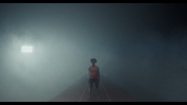
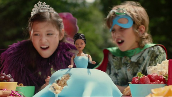
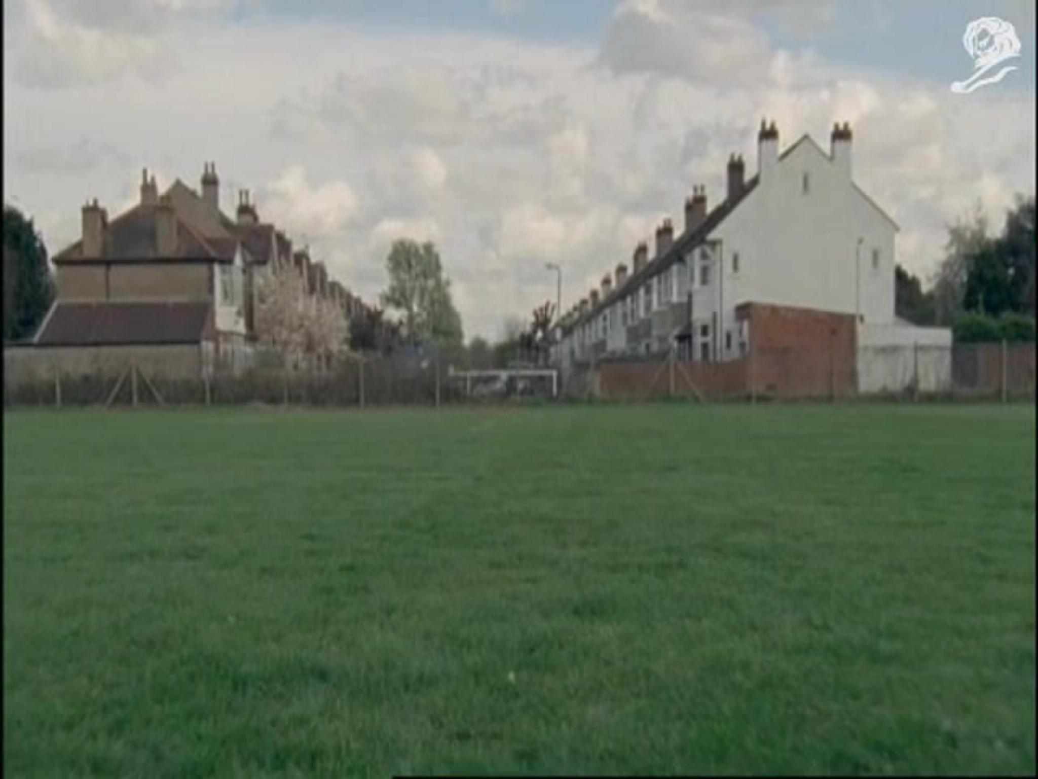
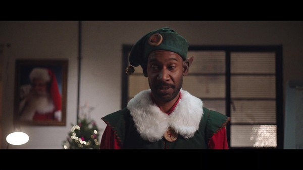
To reignite public love for Channel 4 and reconfirm its role as a flag bearer for creativity in Britain, we were tasked with creating a new set of idents that reflect our brand positioning of ‘Altogether Different’. Working with 17 diverse artists and filmmakers, we created a striking portrait of modern Britain, where 25 wholly different and distinct worlds exist harmoniously together in an infinite loop, with our iconic logo central to the action. Purposefully contrasting live action, animation, CG and many visual elements (scale, texture, tone, colour, light etc), the idents were combined for this launch film.
Please provide any cultural context that would help the Jury understand any cultural, national or regional nuances applicable to this work.
Channel 4 is the UK’s alternative public service broadcaster. As a not-for-profit organisation owned by the public, Channel 4 exists to challenge the status quo, champion unheard voices and take bold creative risks.
Channel 4’s brand line ‘Altogether Different’, reflects the broadcaster's point of view that difference is not the divisive force today’s culture wars have led us to believe. Channel 4 believes difference is a good thing – ultimately a uniting force that sparks debate and creates progress – and that even the most contrasting ideas and opinions can exist side by side.
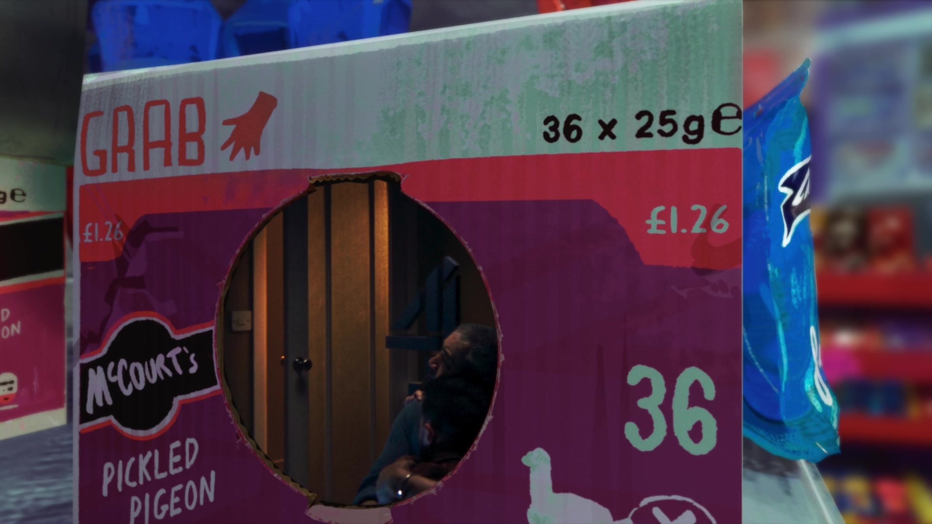
This whole piece is distinctly and intentionally British, both nostalgic and modern. The worlds depicted reflect imagery deeply familiar in British culture, such as an urban fox in a disused public telephone box, a school leaving day where all the excited leavers sign each other’s shirts, or a frozen tableau of revellers at the end of a classic British high street saturday night out. They also portray less mainstream parts of our culture, such as a ceremony for the UK’s smallest registered religion, Zoroastrianism, or a spiritual gathering in an ancient forest.
The words that accompany the piece are equally as specific to British culture, from calling out anything from old football rivalries “Blackburn, Burnley”, to famous news anchors “Guru-Murthy”, as well as turns of phrase you might find on seaside souvenirs “I’d rather be beside the sea” or the initials of our four countries “the N-I-R, E-N-G, W-A-L, S-C-O-T” (Northern Island, England, Wales, Scotland).
Background:
Channel 4 is the U.K’s alternative public service broadcaster. In an ever-expanding world of broadcasters and streamers, our brand love and recognition is critical. This had declined in recent years as our on-screen branding consisted of a deconstructed version of our logo, and didn’t align with our current brand positioning of ‘Altogether Different’.
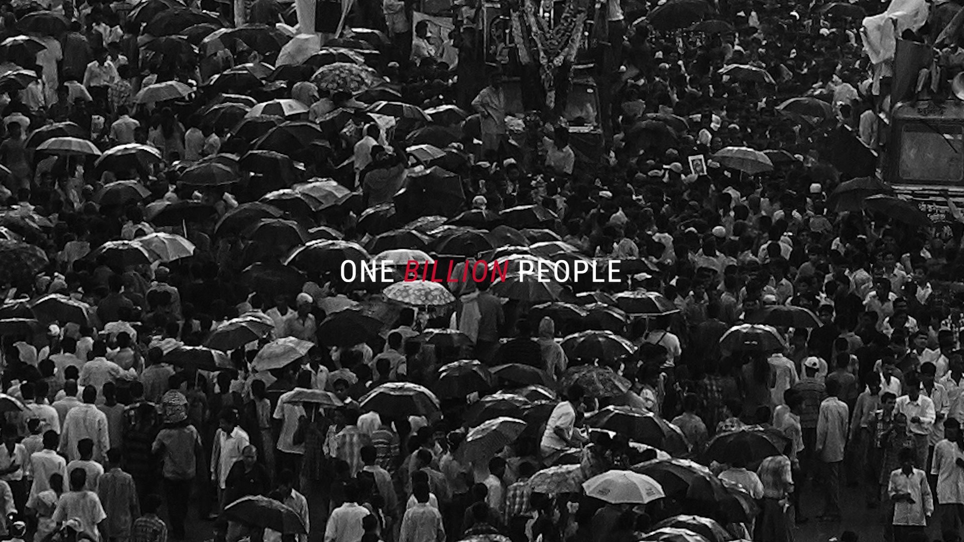
We embarked on a major rebrand, pulling together our linear and streaming offering under one Channel 4 masterbrand. Within this, our idents are the jewel in our brand crown, seen 40+ times a year by 80% of the UK population.
We were therefore tasked with creating new idents for the TV channel (and its online service), that put the iconic ‘4’ back at the heart of the visuals and connected it to the spirit of ‘Altogether Different’ – a positioning that celebrates the diverse, inclusive, and alternative nature of the U.K.
Tell the jury about the art direction.
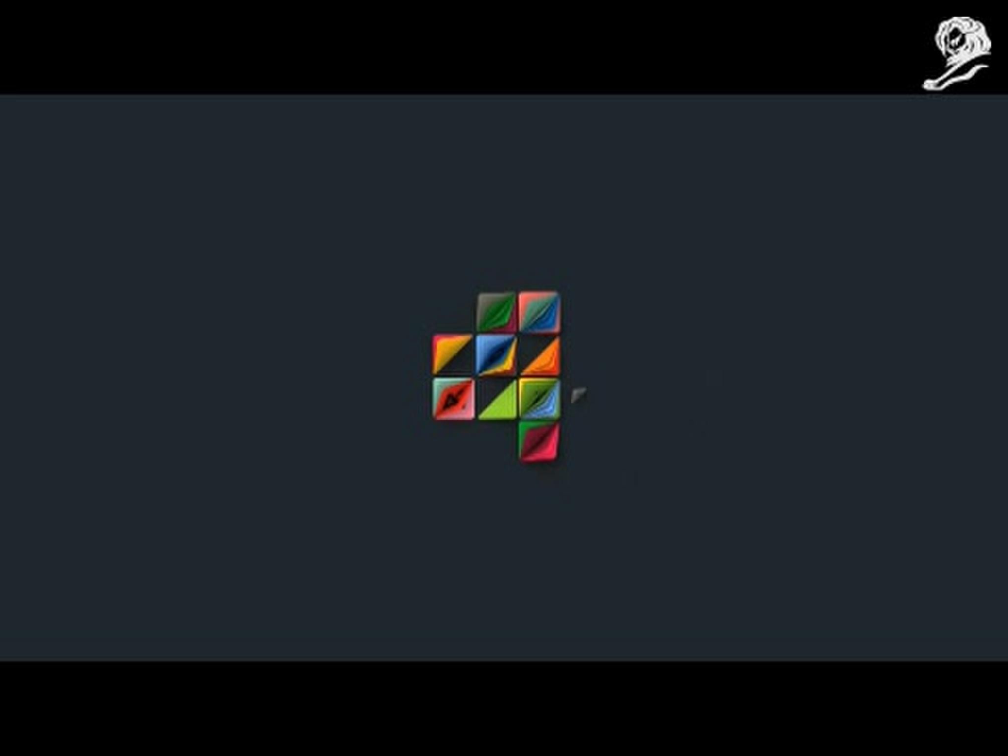
The new wider Channel 4 rebrand design focused on the 4 logo and the cube motif (that is taken from the foot of the 4), and we wanted the idents to share a common visual thread with this new branding. Inspired by the golden ratio and the fibonacci spiral, the infinitely looping 4 puts the logo centrally but also allows the cube motif to become a repeating framework. The result feels hypnotic and complex whilst also being beautifully simple.
To visually demonstrate ‘Altogether Different’, we created intentionally contrasting worlds, playing with different textures, scales, camera orientation, tonal moods and composition to name just a few. The 4 is embedded within each scene, taking on the lighting and mood from within that world, and being treated without reverence – it is written on, set alight, buried in sand and weathered from a stormy sea. The incoming scene intentionally affects the outgoing.
More Entries from Art Direction: Brand & Communications Design in Industry Craft
24 items
More Entries from 4CREATIVE
24 items