Industry Craft > Typography
ROM’S IMMORTAL TIMELINE
LEO BURNETT, Toronto / ROM (ROYAL ONTARIO MUSEUM) / 2024
Awards:
Overview
Credits
Overview
Why is this work relevant for Industry Craft?
This work is relevant for Industry Craft because we re-imagined every detail of ROM’s visual identity to express the museum’s vision in an iconic and simple way: to help people understand the past, make sense of the present and come together to shape a shared future. We needed to modernize ROM, while possessing the longevity to be timeless. The identity had to help express and encompass the enormous scale of ROM’s collections, while establishing a distinct visual perspective for the museum and its continual transformation.
Background:
Royal Ontario Museum (ROM) is Canada’s largest museum, a world-renowned institution of art, world culture and natural history. However, its expansive collections with over 13 million artifacts were simply not enough to appeal to a more diverse and younger audience anymore. Our objective was to jolt and overhaul every touchpoint of the museum to help transform ROM into a dynamic presence for the 21st century.
Our purpose was to convey the enormous scale of ROM’s collections — objects dating from prehistoric civilizations to modern art over the past 4.2 billion years — in a distinct brand identity that could encompass it all. And it needed to be adaptive to work across every touchpoint of the visitors’ experience, across hundreds of applications, from museum signage to wayfinding, to collateral, editorial, and advertising.
Tell the jury about the typography.
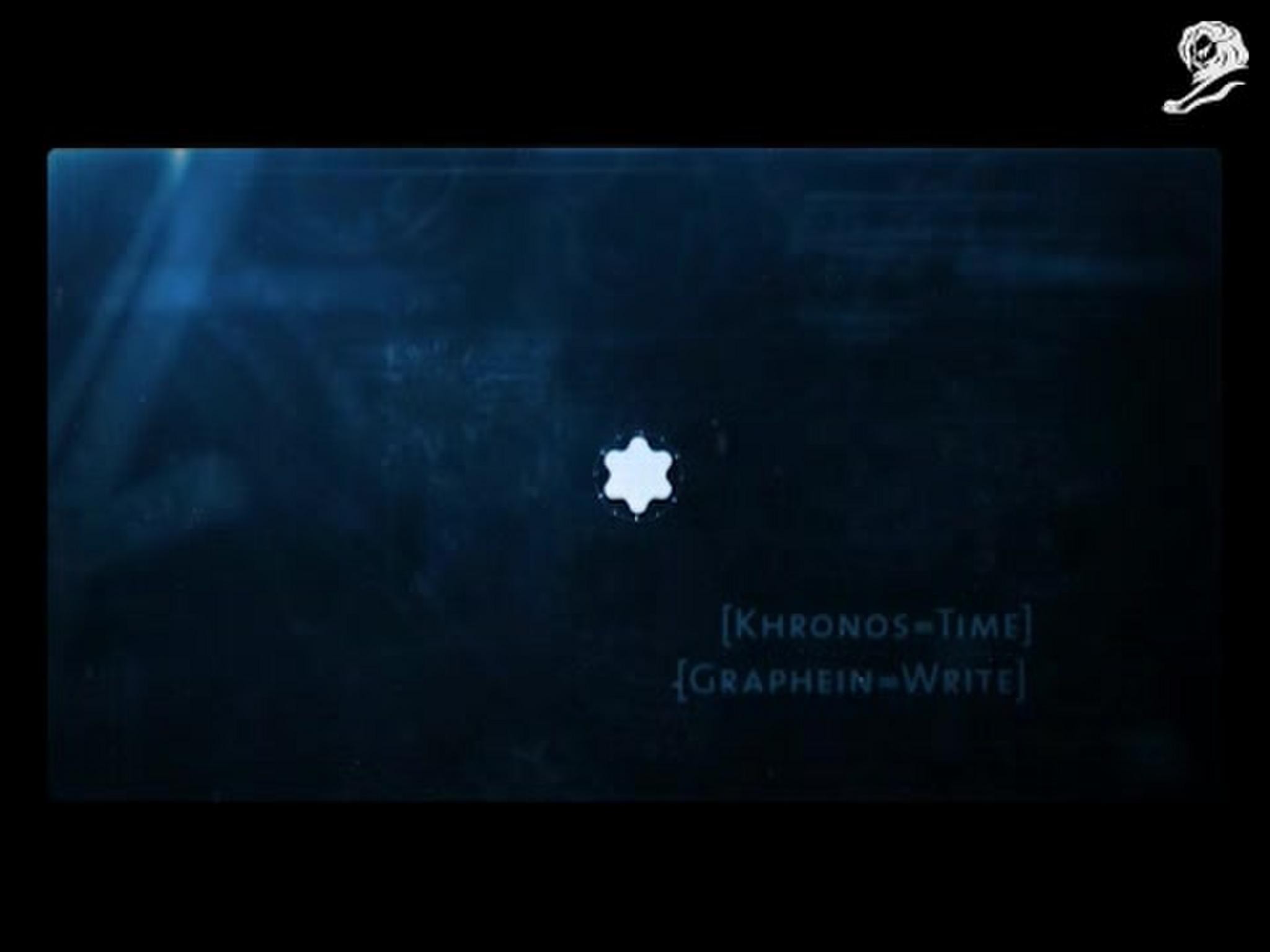
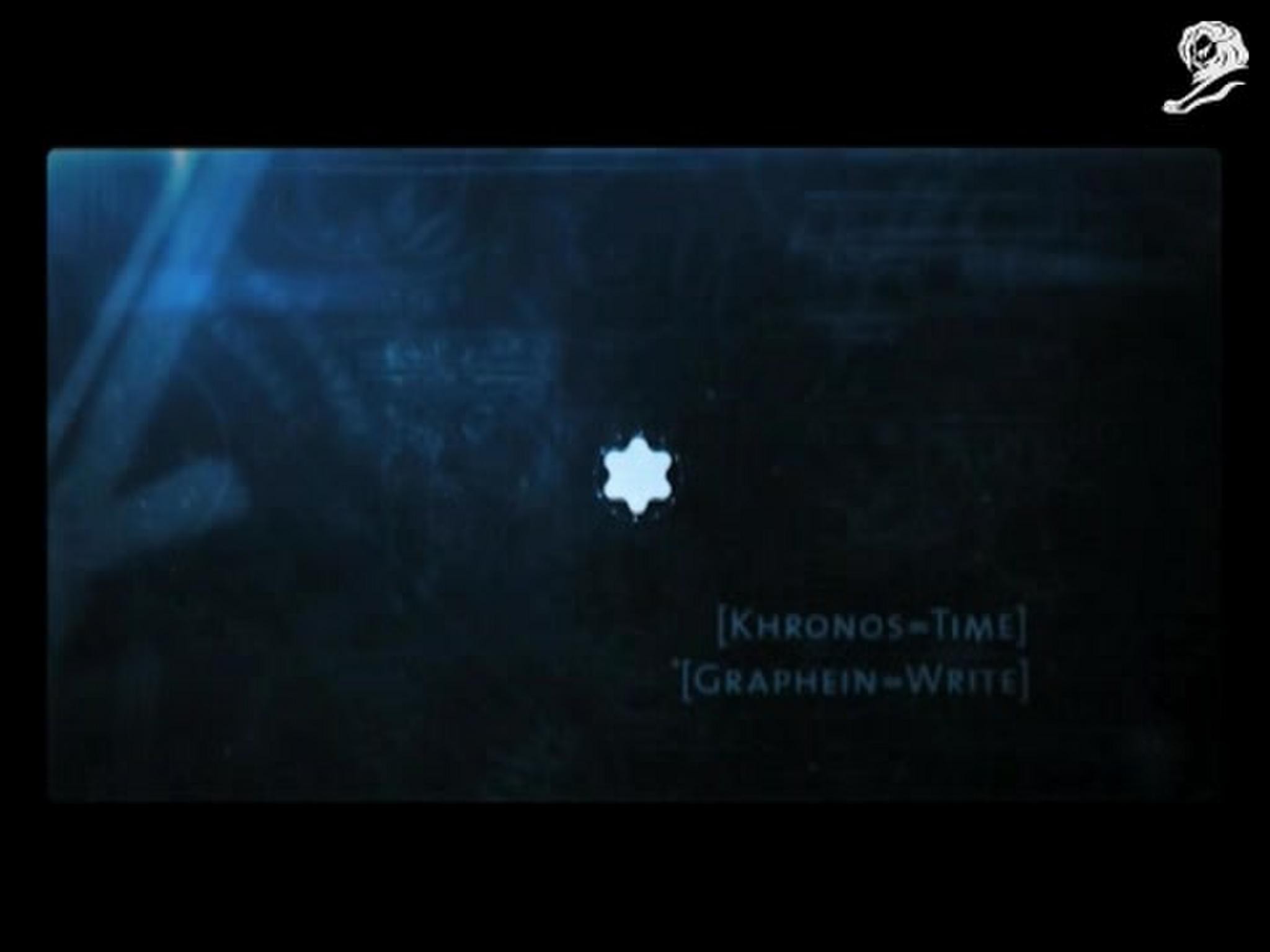
The new visual identity of ROM captures the history of our planet. Thirteen million moments in time — bones, beasts, butterflies, portraits, sculptures, textiles, art, culture, nature — from the past 4.2 billion years. Each object is like a stitch along the vast timeline of our collective history. Key to this visual identity was the creation of a new custom typeface — ROM Coign — designed to evoke the timeline. This typeface pushes the absolute limits of condensed typography, with seven weights and four different widths, all super condensed. Designed to expand and contract, it can create the sensation of diving into single moments of our collective history, then pulling back to reveal its immense scope. Every character representing a single stitch in time, all knit together in one immortal timeline.
Bold and impactful, ROM’s custom typeface has established a distinct visual perspective for the museum and its continual transformation.
More Entries from Typography: Brand & Communications Design in Industry Craft
24 items
More Entries from LEO BURNETT
24 items