Industry Craft > Typography
GROWING UPTEMPO
LANDOR, Milan / ORCHESTRA SINFONICA DI MILANO / 2024
Overview
Credits
OVERVIEW
Why is this work relevant for Industry Craft?
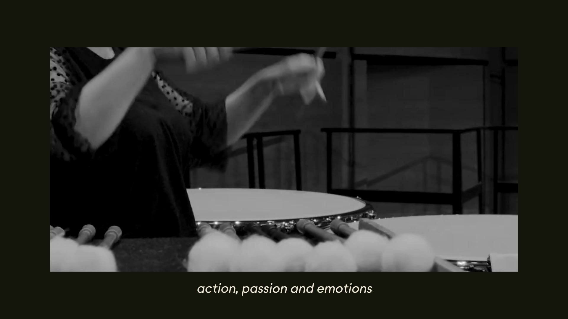
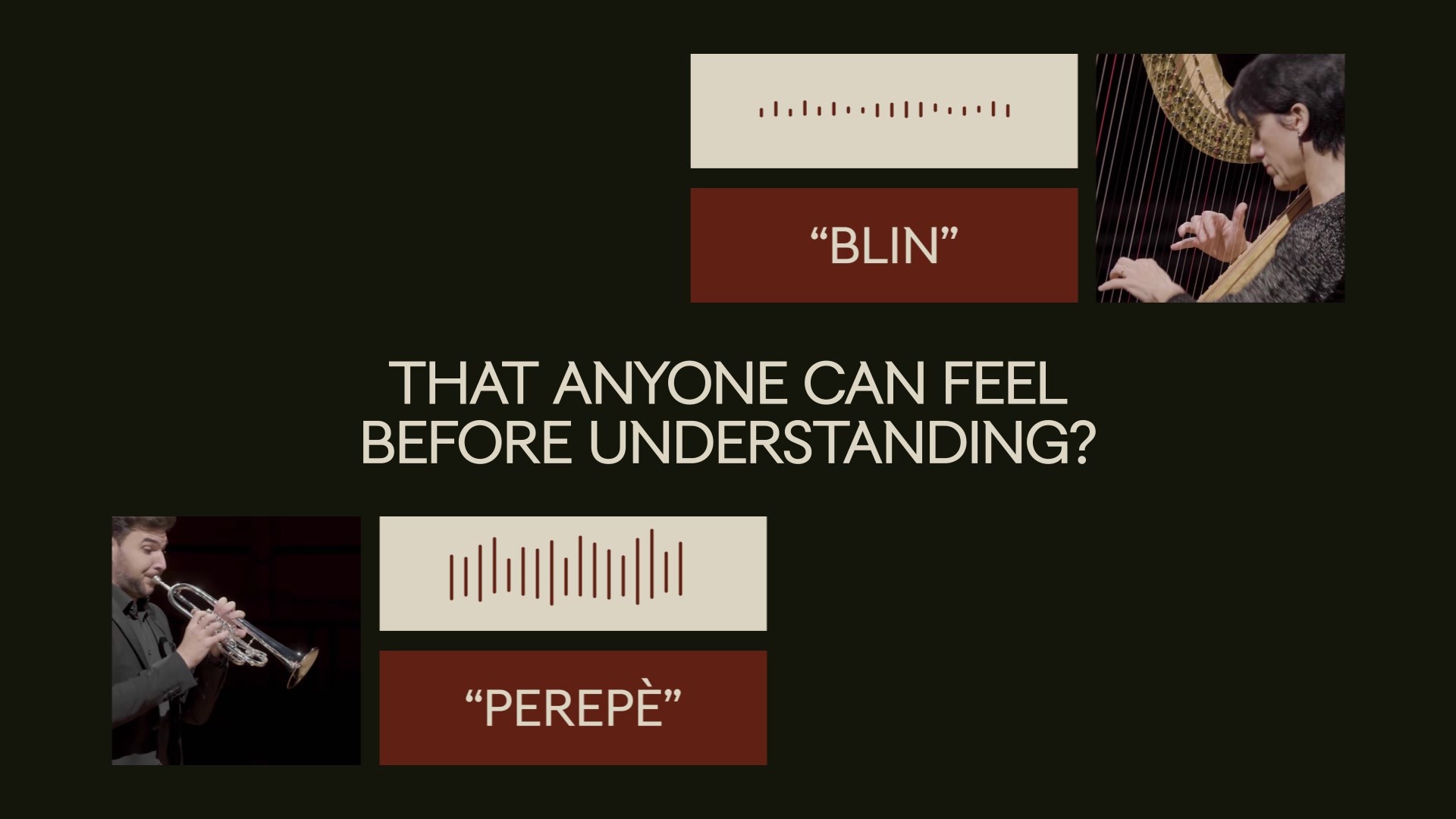
A visual language as universal as music. Understood by everyone. Where typography acts as a key protagonist. Rooted in the most avant-garde movement celebrating dynamism as a way of life – Milanese Futurism – and using the onomatopoeias to express sounds with words. Our “TUMB TUMB” Typeface translates music into "sounding visuals". Each glyph orchestrates a symphony of creativity. An unprecedented sensory experience that anyone can feel before understanding. An identity designed to live in motion, making music alive, visually tangible, and vibrant.
Please provide any cultural context that would help the Jury understand any cultural, national or regional nuances applicable to this work.
The Orchestra Sinfonica Foundation is one of the most important symphonic realities of Milan and Italy. Its "home" is the Auditorium of Milan. Opened in October 1999, it has a capacity of 1253 seats. In a few years, it has established itself as one of the main cultural centers of the territory. The hall is designed as a multifunctional space for concerts of symphonic, choral and chamber music, jazz and light music. The Orchestra Sinfonica Foundation promotes and spreads expressions of culture and art, with particular focus on music, symphonic, concert, lyric or otherwise musical performance, in Milan and in the Lombardy Region. Since its aim is to educate the public to music, the Orchestra has gradually assumed the function of Ambassador in Italy and abroad of the cultural values expressed: dynamism, openness to borders and internationalization. To reach its goals, the Orchestra needed a new dynamic, flexible, and innovative approach to an increasingly wide public and transversal repertoire, which is well suited to the economic and social cultural role that the city of Milan has, in Italy and abroad.
Background:
Since 1993, the Orchestra Sinfonica di Milano has become an essential reference for the great Milanese symphonic repertoire and included exceptional events and prestigious halls.
Its former name was "La Verdi", heritage of the repertoire of the composer Giuseppe Verdi. This name and identity no longer indicated who they are - a great orchestra - what they do - symphonic music - and where they came from - Milan. "La Verdi" did not respond to the need to be inclusive and accessible to everyone, from insiders to beginners, from individuals to families.
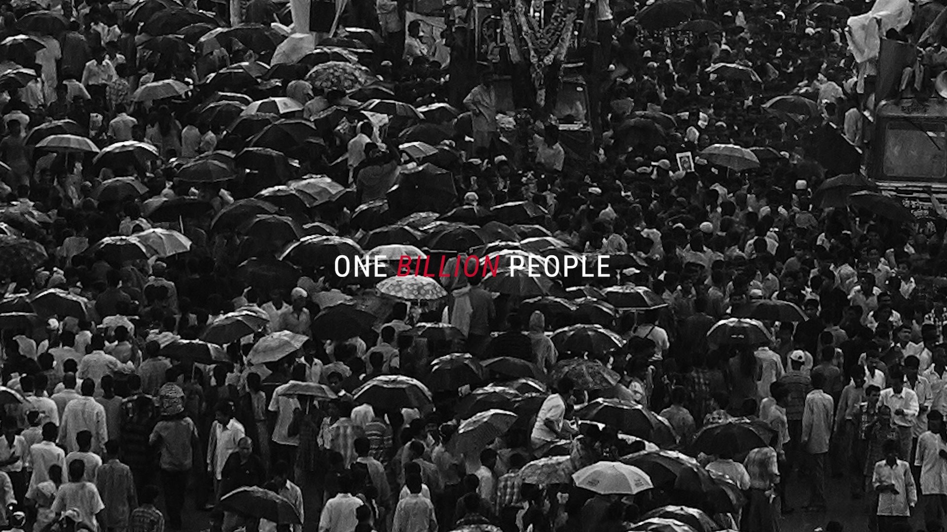
The task was to create a universal identity, strongly inclusive and representing different audiences. An identity that conveys an emotional but contemporary look&feel, opening to an international environment, and welcoming a wider audience. An effective design system, where the typography plays a major role, being visible and tangible expression of the Orchestra’s core activity: music.
Tell the jury about the typography.
We started from the Orchestra’s hometown, Milan, and the birthplace of Futurism, an avant-garde movement celebrating dynamism as a way of life. We studied “Words in freedom”, a poetic technique by the writer Marinetti using onomatopoeias to express sound into visual poetry.
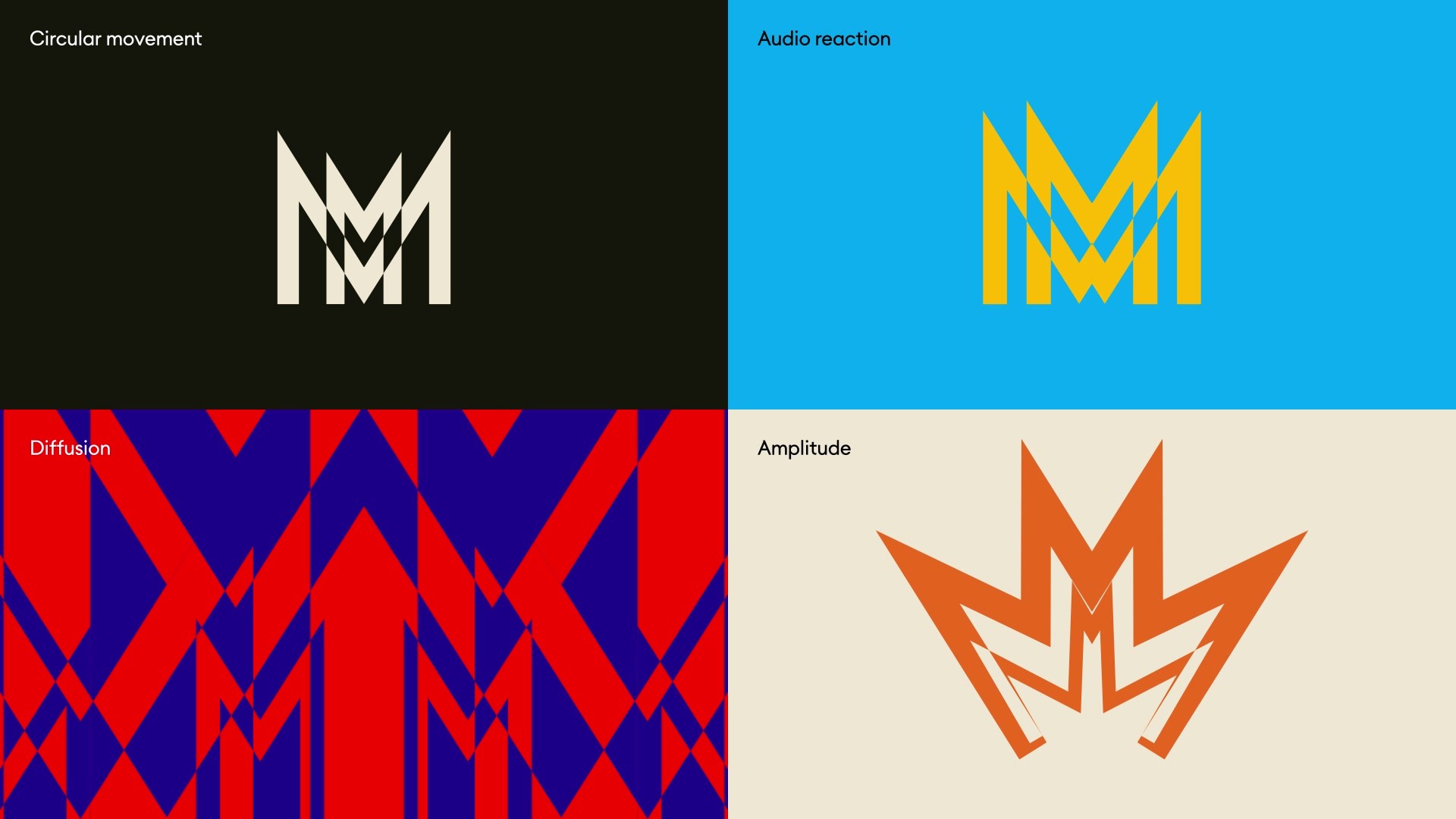
TUMB TUMB, our bespoke typeface, honours Milanese aesthetics and Futurism's vitality, transforming music into a visual symphony. The "M" glyph, as an ode to Milan’s famous Cathedral with its iconic silhouette, is the hero of the identity. Each letter of the typeface dances in motion, reinterpreting 1920s rationality with contemporary flair. Infused with subtle grace inspired by the Duomo’s architecture, our design echoes the city's angular beauty.
TUMB TUMB isn't just type; it's a harmonious fusion of art, culture, and innovation, resonating with the rhythm of Milan's soul.
More Entries from Typography: Brand & Communications Design in Industry Craft
24 items
More Entries from LANDOR
24 items