Industry Craft > Art Direction
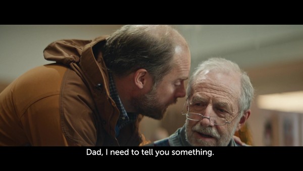
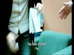
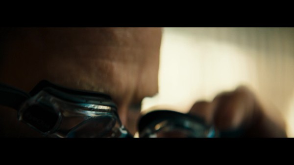
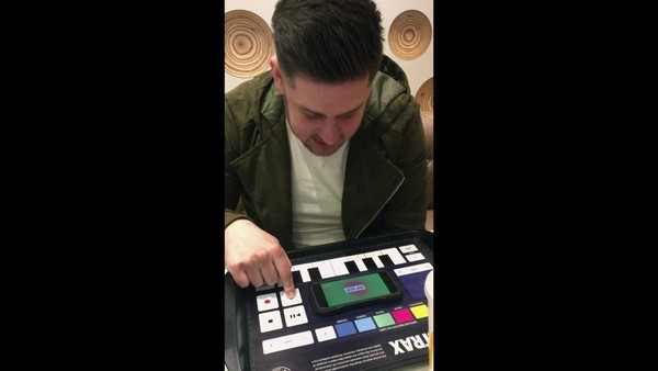
THE 26 SIGNS

TBWA\NEBOKO, Amsterdam / ALEXANDER MONRO HOSPITAL & BREAST CARE FOUNDATION / 2024

Awards:

Bronze Cannes Lions
CampaignCampaignLayout(opens in a new tab)
Presentation Image
Demo Film
Supporting Content

Overview

Credits

Overview

Why is this work relevant for Industry Craft?

‘The 26 Signs’ uses a unique style of 3D typography, with poster layouts specifically made to fit the medical aesthetic. The unapologetic breast letters combined with a striking color palette captivates anyone who sees it, while communicating the signs and factors of breast cancer. It invites engagement with a serious topic in a human manner.

Please provide any cultural context that would help the Jury understand any cultural, national or regional nuances applicable to this work.

In the Netherlands, one in seven women will receive a breast cancer diagnosis at some point in their lives. While many are aware of someone affected by the disease, fewer know that 20-25% of patients are under 50 years old. Unfortunately, this percentage is increasing due to modern lifestyles.

Meanwhile, individuals under 50 in the Netherlands are not included in the government's breast cancer screening programs. Since breast cancer may not be top of mind for young adults, diagnoses often occur at later stages, complicating treatment.

Additionally, most breast cancer awareness initiatives only highlight the well-known lump, neglecting other – more visible – symptoms related to early stages of the disease.

It's crucial for young adults to be aware of the variety of signs and symptoms. Early detection saves lives!

Background:

Breast cancer isn't top of mind for people under 50, even though 25% of cases affect this group. Furthermore, young adults are not aware that there are more symptoms and factors than the infamous lump. Most existing initiatives neglect the other – more visible – symptoms that are related to early stages of the disease.

Young adults must recognize early signs for timely intervention. This can save lives because with an early-stage diagnosis, there are better options for treatment and higher chances the treatment will work.

Alexander Monro Hospital, the first ever hospital specialized in breast cancer, asked us to use our creativity to reach young adults and educate them about the various signs to look out for.

With a small budget, we had to make sure we were seen and talked about in spaces where young adults spend their time: their social media feeds, media, and daily outdoor routines.

Tell the jury about the art direction.

Given our client is a hospital, our designs blend in with the medical environment. With layouts inspired by traditional GP posters, featuring a vintage and didactic look and feel.

Through extensive research and collaboration with medical professionals, the various textures, shapes, and colours were translated into typography. Since breast cancer symptoms can be off-putting to look at, we struck a balance between form and function. Our 3D approach offered numerous opportunities to incorporate animations, resulting in an accurate portrayal of the symptoms, without losing its visual appeal. With its vibrant color palette and quirky breast letters, it invites engagement with a serious topic in an approachable manner.

The letters are designed in all shapes and colors, ensuring the initiative spoke to people of all ages, genders and cultural backgrounds.

More Entries from Art Direction: Brand & Communications Design in Industry Craft

24 items

Grand Prix Cannes Lions
THE 100TH EDITION

Photography: Print & Publishing

THE 100TH EDITION

FRANKFURTER ALLGEMEINE ZEITUNG, SCHOLZ & FRIENDS

(opens in a new tab)

More Entries from TBWA\NEBOKO

24 items

Silver Cannes Lions
WALK-IN FRIDGE

Alcoholic Drinks

WALK-IN FRIDGE

HEINEKEN, TBWA\NEBOKO

(opens in a new tab)