Design > Brand-building
THE THROWN OUT FLAG
SAATCHI & SAATCHI WELLNESS, New York / OUT NOT DOWN, LGBTQ YOUTH RESOURCES & SERVICES / 2019

Overview
Credits
OVERVIEW
Background
The Rainbow Flag has been the symbol of freedom, unity and pride for millions of LGBTQ people worldwide. And more recently, they’ve been embraced by a wider community with great fanfare.
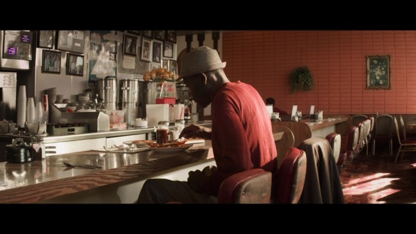
But not everyone is celebrating. The fact is 40% of homeless teens in the United States who come out of the closet are thrown out onto the streets by their parents. Abandoned. Alone. In desperate need of housing, counseling and health care.
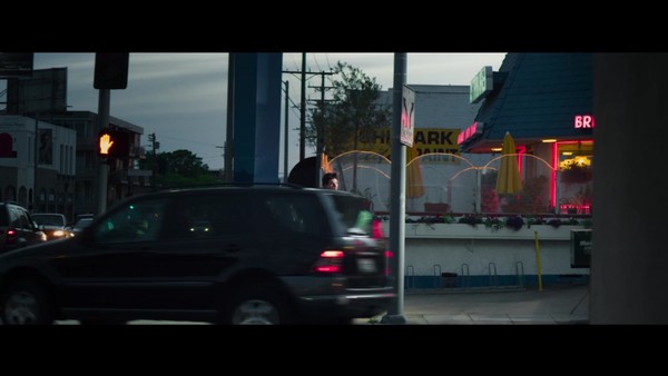
Our charge was to communicate the real truth. That we’re not there yet with compassion and love. To reach the thousands of homeless LGBTQ teens, aged 15-19, living on the streets of New York City through a message of authenticity. Then directing them to an online repository of services and hotlines called Out Not Down.
That meant creating a new visual icon that brought them together in solidarity to forge ahead with determination and hope.
Describe the creative idea
We created The Thrown Out Flag. Made of discarded scraps of fabric and designed with the traditional rainbow colors, it represents the struggle, conviction and solidarity of LGBTQ homeless youth.
With each stain and tater, the flag symbolizes the determination of being true to yourself no matter what the price. And builds upon the insight that only through acknowledging suffering can we rise up to take on life’s challenges.
As depicted in outdoor posters, we present the teens wrapped in the flag in all its tattered glory. Tragic yet heroic, these young people hide not their troubles but own them with each grasp of the fabric.
Not falling prey to ubiquitous imagery, the campaign of outdoor, social, online and film embodies the boldness of the teens themselves.
Providing direction to those castoff and bewildered. Giving hope that even though they’ve been thrown out, they will pick themselves back up again.
Describe the execution
Transforming the brightness of the rainbow flag, our flag is slightly faded from overexposure to the elements. Instead of crisp horizontal lines found in nylon, the material we used is cotton–full of wrinkles and creases. Blemished too with tears, rips and holes.
Its tattered look is by design constructed with thrown out fabric. Much like the discarded tribe it represents, these scraps now come together with renewed purpose.
Given out to community centers throughout the US. Featured in outdoor posters, online blogs, social media and direct mail that were developed with the talents of teenage photographers and LGBTQ homeless teens.
For all who encountered it, the flag made a bold honest statement and powerful emotional connection.
List the results
In just a few short months, the flag established a powerful symbol of awareness, interest and connection. Challenging prejudices and initiating discussions around LGBTQ homelessness, our campaign produced significant results:
Output/Awareness:
From January 2019 through April 2019, the poster campaign utilized outdoor media channels that created the following impressions:
NYC Bus Shelters & Times Square Digital Billboards: 68,817,166
Action/Business Impact:
As of mid-April 2019, we saw the following substantial increases:
33% increase in online site visits
31% increase in users going to one or more pages
17% increase in site sign-ups
With more than $1.5 million dollars donated in media space, design support, creative resources and tools, the campaign for Out Not Down has emerged from its roots in New York City with plans to spread out to other cities including San Francisco, Boston, Chicago and Austin.
More Entries from Creation of a New Brand Identity in Design
24 items

More Entries from SAATCHI & SAATCHI WELLNESS
24 items