Design > Brand Building
JOAN REDESIGN
JOAN CREATIVE, New York / JOAN CREATIVE / 2024


Overview
Credits
OVERVIEW
Why is this work relevant for Design?
How do you honor the past, but create the future? In developing the rebrand for JOAN Creative, there were so many stories to tell. To grow a creative firm that houses advertising, design, production, and media. And to do it all with compassion and a commitment to inclusion and diversity.
Needing to appeal to both big business and culture-creators, the JOAN identity bridges the gap between these two worlds: sophisticated enough to be trusted by big business, but creative and forward-thinking enough to resonate with the cultural space.
Is this product available for purchase?
Not at the present time
Please provide any cultural context that would help the Jury understand any cultural, national or regional nuances applicable to this work.
JOAN Creative was known as one of the first woman-founded creative agencies in the United States. As they expanded their offerings to include global media, design, and production, they needed a new identity to communicate the fighting spirit required to not only have gotten them this far, but take them into the future.
Background
JOAN Creative was known as one of the first woman-founded creative agencies in the United States. As they expanded their offerings to include global media, design, and production, they needed a new identity to communicate the fighting spirit required to not only have gotten them this far, but take them into the future.
The new identity is intended to break the mold of what an agency can, and should, feel like. It is a bridge from the influences that have created JOAN to an expansive future. As such, it intentionally evokes a culture-leading brand, inspired from fashion, art, and music.
The identity applies across all of the JOAN experience, from office signage to our communication forms and templates. Ongoing merch for all employees, and limited-edition collab drops with other culture-leading partners.
Describe the creative idea
As a leading global creative agency, the identity needed to appeal to both big business and culture-creators, clients who need trust and polish, and future partners, employees, press who need to desire the JOAN experience.
The JOAN identity bridges the gap between these two worlds: sophisticated enough to be trusted by big business, but creative and forward-thinking enough to resonate with the cultural space.
Describe the execution
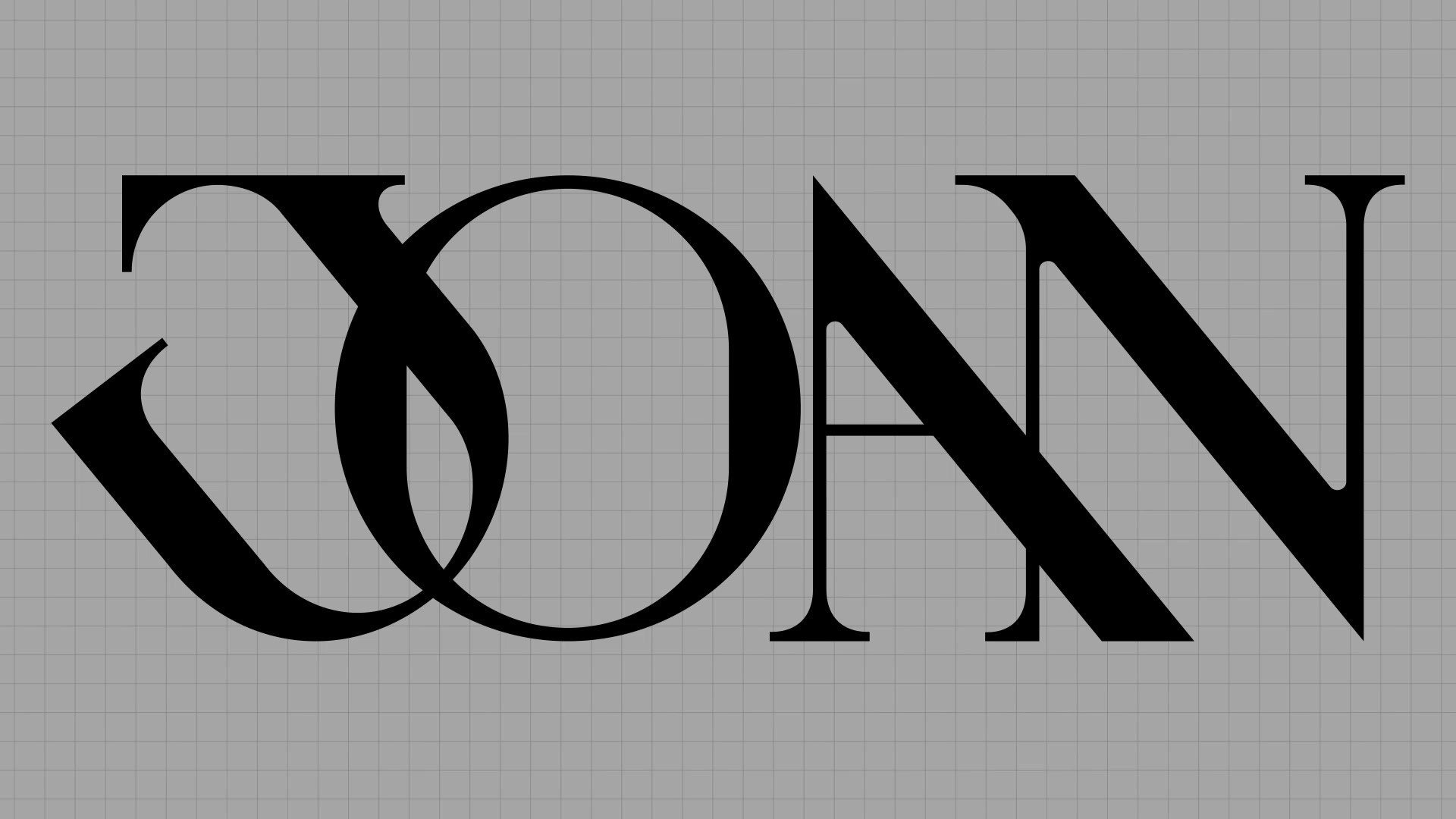
Starting with the logo, the new design draws inspiration from the iconic JOAN sword, paying homage to Joan of Arc and the origin behind the agency name. The new design system signifies so much more…an architectural frame the company can continue its global expansion from.
Everything from the edgy, highly-saturated typographies and color palette, to the contemporary digital design, animation and 3D, is complemented by the sleek materiality of metal. Elements once combined create a brand reflecting JOAN’s bold personality.
The identity includes a full suite of touchpoints - a refreshed website and social channels, new signatures, new office signage, letterhead. But it extended beyond traditional touchpoints to include unexpected assets like one-of-a-kind merch through a collab with Ray’s, a New York bar on the edge of creative cultural collabs.
List the results
While the new identity has only been live for a few months, we saw nearly 4 million earned impressions from news of the rebrand, and a 4.5x increase in visitors to our website immediately following the launch.
More Entries from Rebrand/Refresh of an Existing Brand in Design
24 items
More Entries from JOAN CREATIVE
24 items


