Design > Brand Building
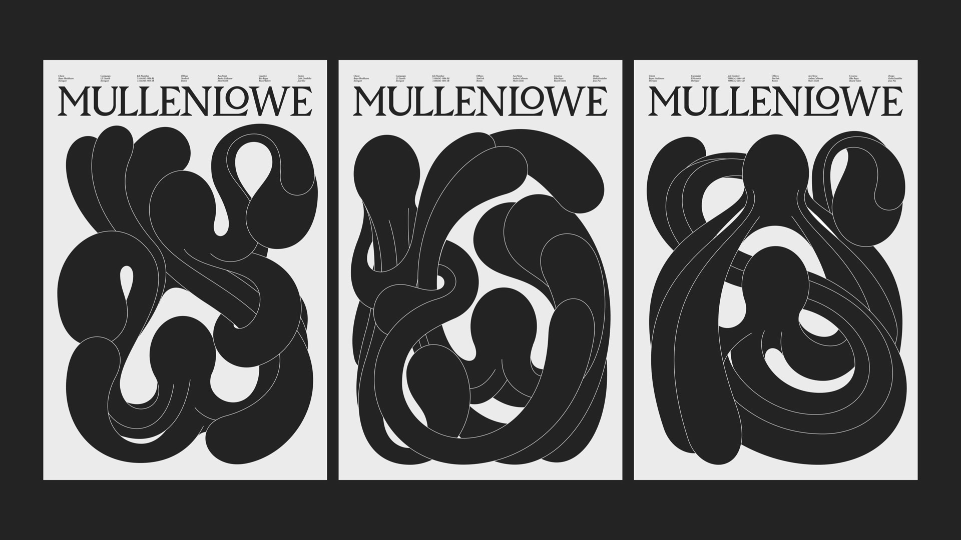
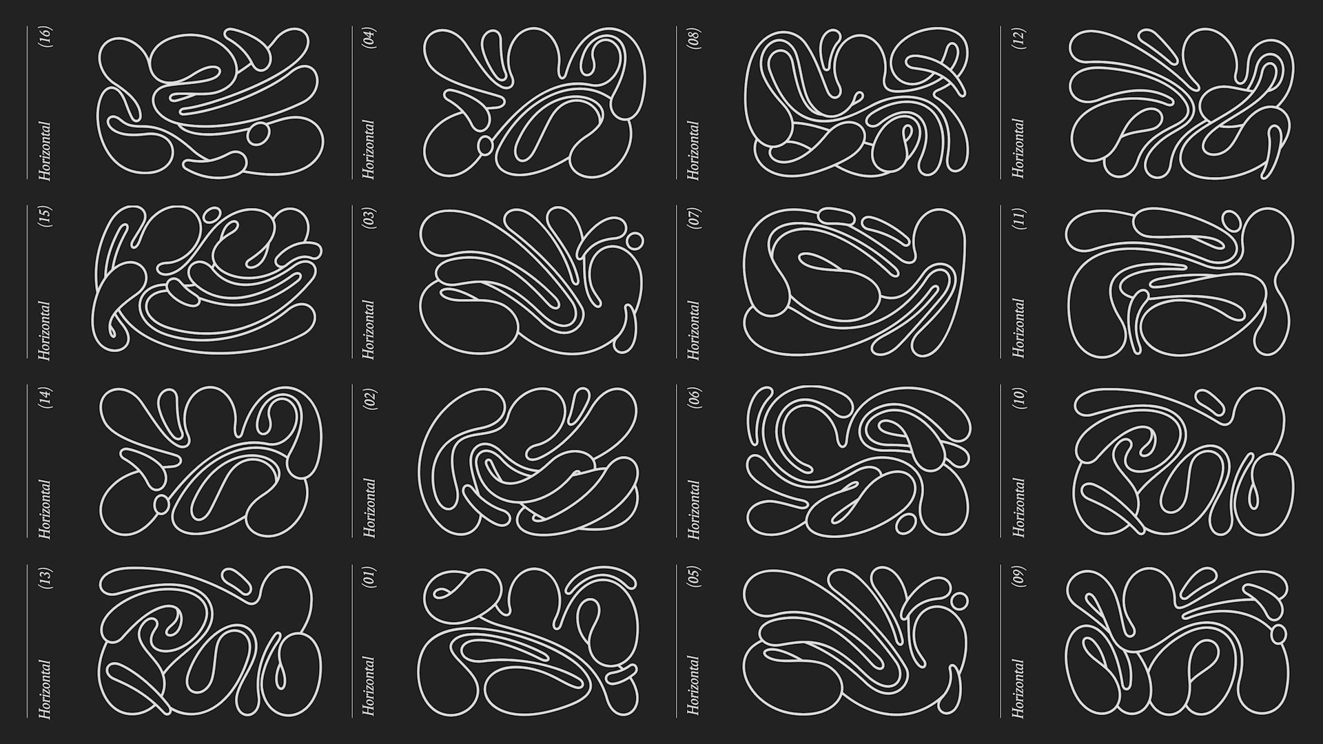
MULLENLOWE GLOBAL REBRAND
MULLENLOWE U.S., New York / MULLENLOWE GLOBAL / 2024
Awards:
Gold Cannes Lions
1 of 0 items
Overview
Credits
More Entries from Rebrand/Refresh of an Existing Brand in Design
24 items
More Entries from MULLENLOWE U.S.
24 items