Design > Brand Building

TOLEDO MUSEUM OF ART

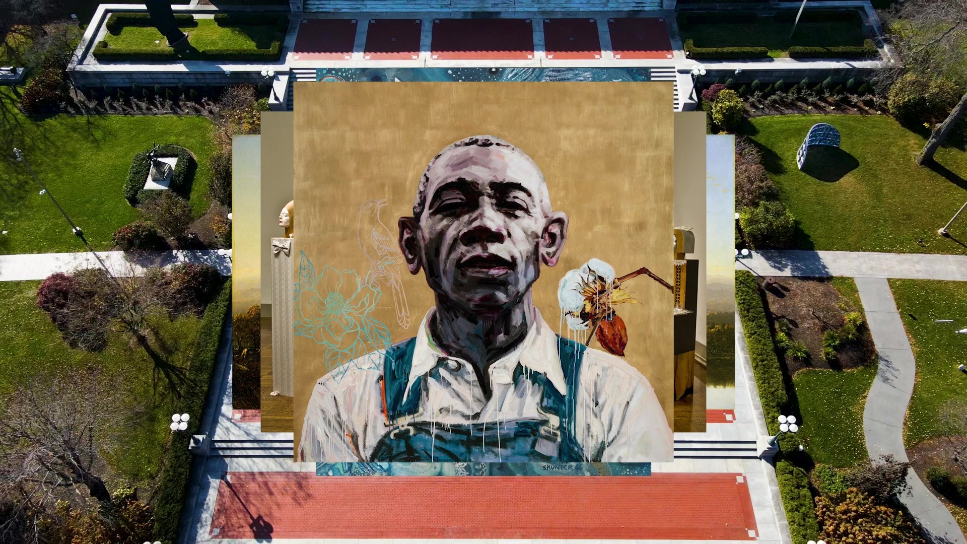
LAFAYETTE AMERICAN, Detroit / TOLEDO MUSEUM OF ART / 2024

Awards:

Bronze Cannes Lions
CampaignCampaignLayout(opens in a new tab)
Case Film
Supporting Images
Supporting Images

Overview

Credits

Overview

Why is this work relevant for Design?

Isn’t it nice to see the power of Design in action? TMA’s brand work leverages Design’s strengths to create a blueprint for all museums, showing how you can balance different elements: the DNA of an institution, its physical presence, emerging technologies, etc., to lift an unimaginably heavy museum up from the weight of its legacy. To face its community, and the world, with a fresh confidence.

Is this product available for purchase?

Like all the best things in life, admission to the museum is free. Tickets to exhibitions are available for purchase, along with annual memberships.

Please provide any cultural context that would help the Jury understand any cultural, national or regional nuances applicable to this work.

The Toledo Museum of Art serves as a critical crossroads, commons and cultural town square for a city that has seen radical shifts in the landscape over the past half century. Toledo’s demographics, politics, and economy combine to create one of the truest portraits of the complex life of a 21st century American city.

Also, Toledo Museum of Art, like so many others, is emerging from a complex history that was not always equally inclusive or accessible to the city’s whole population. Even today, the demographic attributes of the museum’s 380,000 annual visitors skew Caucasian, female, older, affluent, and highly educated – markedly different from the diverse and working-class neighborhood it calls home.

Over its history, TMA has broadened its view and its reach, but the 21st-century demands greater and more fundamental changes. The Museum’s incoming director launched an ambitious strategy to embrace a more inclusive vision – expanding the museum’s view to tell a truly global and broad history of art, while also ensuring that local voices stay strong, with their outreach, visitor experience, team and suppliers all reflecting their Northwest Ohio community.

Their goal was to embrace these important changes, while creating a sense of welcomeness, comfort and openness — to build a sincere culture of belonging.

Background

TMA has one of the richest art collections in the world, but was ailing from all of the baggage of an “Art Museum” —seen as academic, dated, and elite— implicitly creating a divide between the museum and their community.

The museum's brand and visual identity hadn’t been touched for decades. As the Museum’s strategy to become the “Model Museum of the 21st Century” crystalized, it became clear that they needed the brand to be more welcoming, dynamic, and ambitious. It was time to evolve this powerful 120-year-old institution into a more inviting, lively, and future-facing brand.

What unfolded was a deep, wide ranging, 13-month brand refresh that began with a strategic deep dive, and concluded with an overhaul of the entire brand into a holistic new system. It was activated across their campus, sub-brands, promotional materials, digital properties (including a full website redesign), and an integrated launch campaign.

Describe the creative idea

TMA’s collection is a great source of pride for Toledoans. It’s the one place where the city’s past glory and emerging future are equally alive. We drew inspiration from that pride to create a brand as welcoming as it is ambitious.

Through research from the museum’s diverse audience, we found a tension between the desire to define the “model museum of the 21st century” and the need to honor their legacy as a cornerstone of the community.

Art is never static—it’s always dynamic. Art connects, enlightens, and emboldens. Just as a viewer’s perspective on a piece of art shifts as they cross the room, we wanted our work to continually drive a change in perspective – sparking new ideas about what art is, who artists are, and who art is for. We wanted to show that this transformative power of art lives at TMA for all of Toledo to enjoy.

Describe the execution

Grounded in the campus’ “T-shaped” footprint, and set in motion to reflect the continual reframing of art history and its emerging future, the new TMA logomark is a dynamic, multifaceted icon built for the digital age.

In addition, key strategic design moments in the system tap into TMA’s DNA. A couple of examples include:

Typography: The typography draws inspiration from historical styles employed by the museum over the years. The combination of a refined sans-serif typeface with a supporting serif typeface has been evolved to give flexibility to the new identity.

Glass: Paying homage to Toledo’s history as the City of Glass, the alchemy, translucency, and symbolism of glass is infused within the identity and applications.

Color: The identity is expressed through an adaptive color palette – reflecting the artwork within view. Two color fields are sampled, each expanding into three color saturation options.

List the results

Since launching the new brand identity, TMA has seen increases in year-over-year museum visitation of 20% and year-over-year exhibitions ticket sales have grown 140%.

In this same period, social media campaigns have seen a strong year-over-year growth in impressions (+116%) and engagement (+105%).

Don’t just take our word for it – in the short time that the work has been live, it’s received mass acclaim from the global design community. UnderConsideration called it “one of the best museum identities [they’ve] seen in a while.”

More Entries from Rebrand/Refresh of an Existing Brand in Design

24 items

Grand Prix Cannes Lions
SIGHTWALKS

Wayfinding & Signage

SIGHTWALKS

SOL CEMENT, CIRCUS GREY

(opens in a new tab)

More Entries from LAFAYETTE AMERICAN

1 items

Bronze Cannes Lions
TOLEDO MUSEUM OF ART

Rebrand/Refresh of an Existing Brand

TOLEDO MUSEUM OF ART

TOLEDO MUSEUM OF ART, LAFAYETTE AMERICAN

(opens in a new tab)