Design > Communication Design
THE CLIMATE CHANGED LOGO
PUBLICIS KITCHEN, OSLO / THE UNITED NATIONS / 2024
Awards:
Overview
Credits
OVERVIEW
Why is this work relevant for Design?
In this work, design is not only at the very core of the idea, it is the main tool of communication.
The design also serves as a universal language, making the message instantly understandable across the whole world. In this case, design is not used to beautify or embellish, on the contrary. In its rawest and simplest form, the graphic design is used to uncover the ugly truth. Proving that design, even stripped down to the bare essentials, can be a powerful tool in triggering emotions and new perspectives.
Is this product available for purchase?
This is an open source campaign that anyone could download from the web site to use for free.
Please provide any cultural context that would help the Jury understand any cultural, national or regional nuances applicable to this work.
As one of the largest communication groups in the world, we have offices all over the globe. Sadly, this also means that many of our employees and colleagues will be critically affected by sea level rise within the near future. With cities, homes, livelihoods, and even the offices itself, being in danger of washing away, the call to raise awareness on this world altering subject felt close to our hearts as creative experts on communication.
Leading up to the UN Climate Conference in Dubai (COP28), we wanted to highlight the prognosis behind one of the world's most critical challenges. Since the future of our world is everybody's business, the campaign is designed for anyone to freely use - whether it's for non-profit organizations fighting for the same cause, grassroots activists needing an impactful new visual, or simply one of the hundreds of millions witnessing their homes disappear into the sea.
With the whole world as our potential target audience, we based the campaign on the universal language of design, centered around the most unifying symbol we all have in common - We visualized complex data in a simple and instant manner that literally has no borders.
Background
People tend to find consequences set in the future abstract and hard to relate to,
making climate communication easy to ignore. Important studies on climate projections, and the future state of the world, tends to drown in ever growing stacks of complex climate reports. Our main objective was to raise awareness by translating the reports on sea level rise into something more available and relatable to people.
Zero budget initiative. Driven by passion.
Describe the creative idea
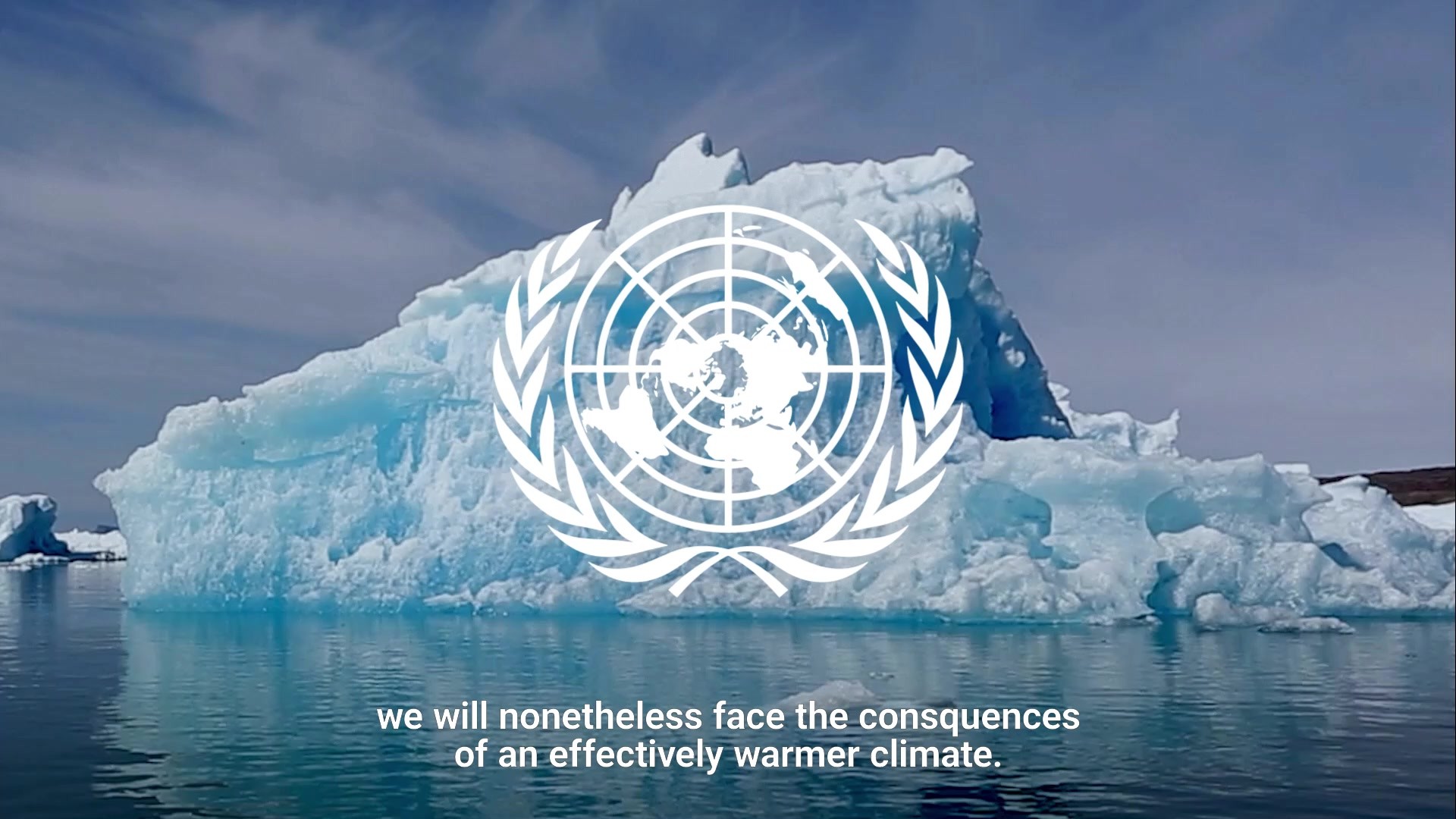
In 1945, the United Nations unveiled its iconic logo – a map of the world, symbolizing a unified effort for global stability. But while the logo has stayed the same for 78 years, the world has certainly not. With the UN predicting a 2.9-degree increase in temperature by 2100, and the consequential sea level rise, the world as we know it is rapidly changing.
Based on UNs own prediction we climate changed their iconic logo, as a symbol of the one threat that truly should be uniting us all. The updated logo guidelines details changes made to a selection of affected areas, and the social, economic, and humanitarian consequences that follows.
Since the future of our planet is everybody’s business, we created a campaign made to be available for anyone to use to create awareness in the fight for more unified action on climate change.
Describe the execution
All the elements in this campaign are based on the updated UN logo.
The communicative value and strength of the campaign lie in the simple graphics visual in contrast to the complex geographic consequences. By giving each pixel and vector point a new context and value, every minor adjustment in the design process gives a chilling effect.
In true design guideline fashion, The Updated Logo Guideline samples a selection of adjustments describing the reasons behind the updates, and the effect of “the design choices” made, using red as the color of correction.
In other words, the whole campaign is styled as a simple but ruthless design update of an iconic logo, ready for download.
To launch the project, we created a concept film around the UN's own Dennis Francis' recent appeal to the general assembly on sea level rise, using the logo update as a visual amplifier of his message.
List the results
In the first weeks we organically reached over 15 different countries from all parts of the world, generating 50+ (and counting) international editorial coverages.
With the campaign being available for download, people started taking ownership of the message. Some even translated all the material into Chinese, while others created their own take on the content based on the available assets, or published the material directly on their channels. This included environmental organizations, grassroots activists, politicians and influencers, as well as engaging designers all over the world.
During the UN Climate Conference in Dubai, COP28, the Nature Conservation Association (Naturvernforbundet) used the campaign as a visual aid to highlight the dramatic consequences of climate change as a strong visual talking point, and a conversation starter in meetings with decision-makers, as well as distributing the material to conference attendees.
All on a zero budget.
More Entries from Data Visualisation in Design
24 items
More Entries from PUBLICIS KITCHEN
16 items