Industry Craft > Typography
NORDSTROM RACK
JONES KNOWLES RITCHIE, London / NORDSTROM RACK / 2024


Overview
Credits
OVERVIEW
Why is this work relevant for Industry Craft?
The Nordstrom Rack rebrand introduces a comprehensive new design system across all touch points.
Please provide any cultural context that would help the Jury understand any cultural, national or regional nuances applicable to this work.
We are living in a time where the social currency in how we shop and how we express ourselves is shifting.
What was influential and aspirational once came from how much things cost or how exclusive a brand might be, and shopping off-price or off-label was seen as a compromise, even shameful. But we are now seeing off-price or thrift shopping as savvy, even cool. We’re coming to understand that if we make smart choices in how we spend our money, we have the freedom to do more and say more.
This puts more power in the hands of everyday consumers than we’ve ever seen before—and it means the Rack customer is more savvy and more empowered than ever, too. Shopping at Rack enables them to experiment while also feeling like they’re making smart choices.
Background:
We were briefed to develop a new creativity strategy and new brand identity that would transform the Rack brand at every touchpoint, and in the process, elevate and modernize the brand in a sea of sameness.
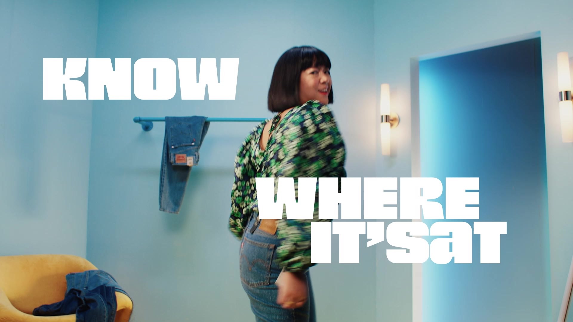
The creative idea behind the Rack rebrand was coined as Real Swagger, which is all about celebrating its smart, savvy, and pretty badass customers, inviting them in to express their full, authentic selves. This idea drove the execution of the new logo and custom variable typeface that are just as expressive as Rack’s customers.
Tell the jury about the typography.
Bold typography at large is a centerpiece for the re-brand. Using the logotype as a base, we created an ownable display typeface to amplify Rack’s voice, along with a secondary font to provide flexibility and practicality. For large scales, we developed a dynamic type approach for both the logo and typeface that allows short words and phrases to stack, stretch, and hold imagery. This treatment is used sparingly for maximum impact in editorial content, paid media, and seasonal launches.
Alongside the new type, the new logo can appear horizontal and stacked, both with multiple variations built against a modular scaling system. This enables Rack to grab attention at huge scales, like billboards or store signage, while still standing out in smaller applications like app icons and clothes tags. The logo is responsive and changes in digital touchpoints, and can transform into dynamic, seasonal 3D sculptures.
More Entries from Typography: Brand & Communications Design in Industry Craft
24 items
More Entries from JONES KNOWLES RITCHIE
24 items