Industry Craft > Typography
MANISCHEWITZ
JONES KNOWLES RITCHIE, London / MANISCHEWITZ / 2024
Overview
Credits
OVERVIEW
Why is this work relevant for Industry Craft?
The Manischewitz rebrand introduces a comprehensive new design system across all touch points. This includes crafted design elements such as typography, illustration, photography and overall art direction.
Please provide any cultural context that would help the Jury understand any cultural, national or regional nuances applicable to this work.
As an American Jewish food brand, Manischewitz has been a staple for the kosher-keeping community for over 130 years. But the brand’s core audience was starting to shrink—with Manischewitz’s market relevancy alongside it.
Manischewitz recognized that it was time to pivot. It needed to push beyond the kosher-aisle to drive broader awareness of Jewish cuisine. After all, many Americans use food as a form of cultural and geographic exploration, so why shouldn’t Jewish food have a seat at the table?
Background:
From movie quotes to Halloween costumes, Manischewitz holds a special place not only in Jewish culture, but American culture—they’re part of the zeitgeist. But while people know the Manischewitz name, they don’t necessarily know what it is, and probably can’t name a product.
The Manischewitz brand has not always looked as flavorful, outspoken, or fun as their fame would suggest. We saw an opportunity to create a distinct strategy and brand identity to reassert Manischewitz as THE Jewish food brand for mass market consumers, all while maintaining our existing loyal consumers. Even the subtle nuances of our logo treatment (inspired by Hebrew letters) provided the opportunity for everyone to broaden their understanding of Jewish culture and in turn take up the invitation to experience Jewish cuisine.
Tell the jury about the typography.
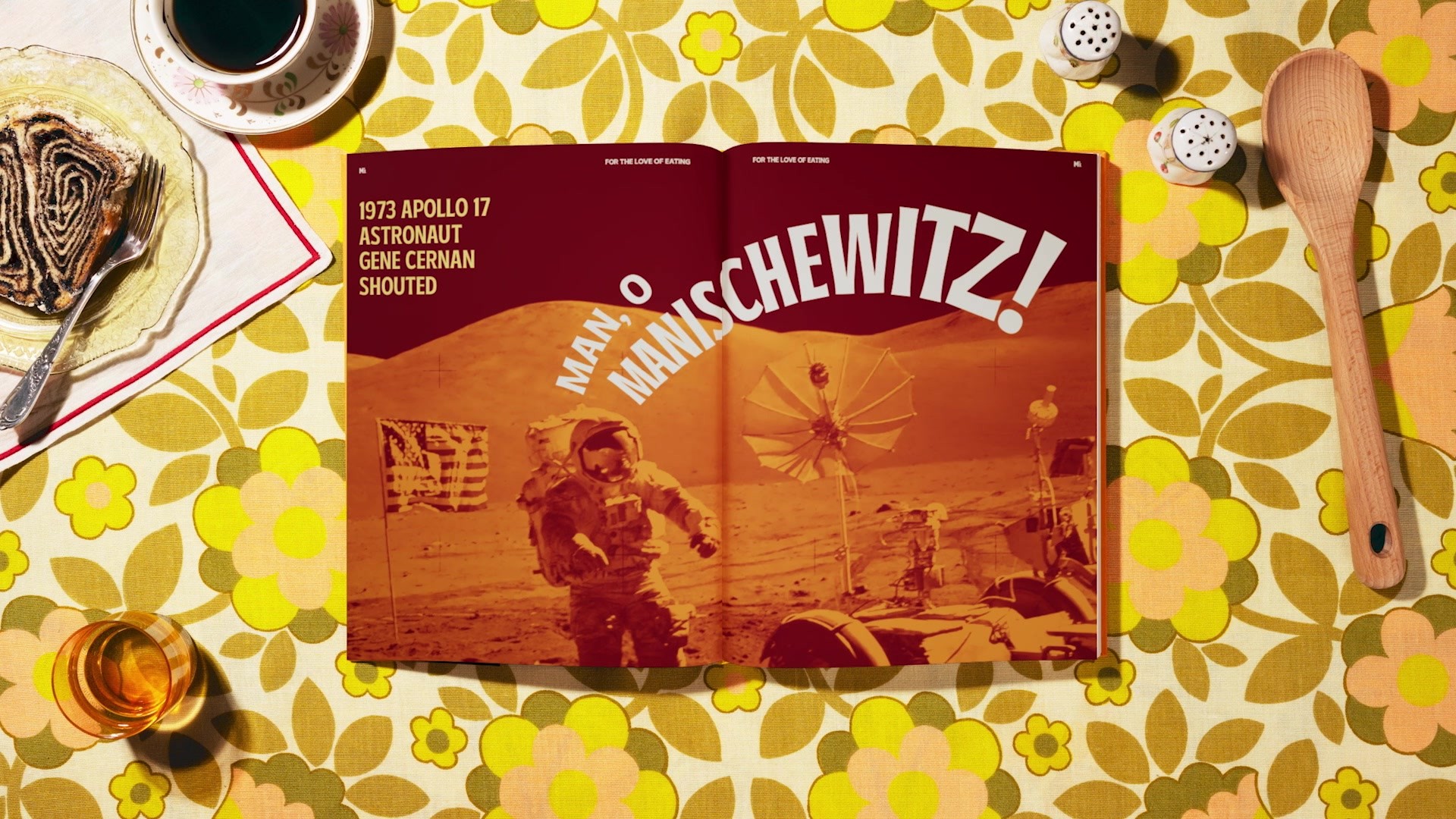
Taking inspiration from Manischewitz’s 130 year history and Hebrew calligraphy, the new typography system is expressive and unique, capturing tradition while still maintaining a broad audience appeal.
The letterforms take on a flared structure inspired by the flourishes of Hebrew calligraphy. For example, characters like the A, S, and C incorporate details from the Hebrew letters “ה” and “א”. While the reference may only be obvious to our core audience, it also provides a small window into the world of Judaism.
More Entries from Typography: Brand & Communications Design in Industry Craft
24 items
More Entries from JONES KNOWLES RITCHIE
24 items